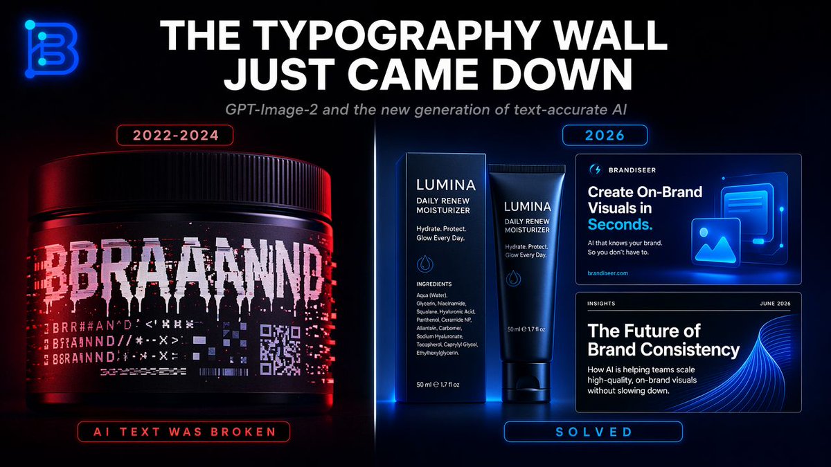
排版墙对比信息图
一张充满未来感的对比图,展示了破碎的 AI 文本生成与适用于社交媒体或科技评论的精准品牌排版之间的差异。
Goal: Create a sleek dark tech infographic about the breakthrough in AI-generated typography accuracy, contrasting broken text generation from 2022–2024 with solved, brand-ready text generation in 2026.

Canvas: Wide 16:9 social media graphic, black background with subtle blue/red glow, cinematic product-ad lighting, high contrast, crisp typography, futuristic SaaS/brand design aesthetic.

Top area: Place a glowing neon monogram logo in the upper-left corner, shaped like a stylized letter B in electric blue. Center a huge bold all-caps white headline: {argument name="headline text" default="THE TYPOGRAPHY WALL JUST CAME DOWN"}. Beneath it, add a smaller italic gray subtitle: {argument name="subtitle text" default="GPT-Image-2 and the new generation of text-accurate AI"}.

Main layout: Split the image vertically into two comparison halves with a thin glowing divider line down the center. Use red lighting on the left side and blue lighting on the right side.

Left panel, broken era: At the top, add a small rounded red outlined label reading {argument name="left year label" default="2022-2024"}. Show exactly 1 large black cosmetic jar/product tub, lit with red highlights, occupying the lower-left half. Its label should look corrupted and glitchy: a huge fragmented white word resembling “BRAND” but broken into unreadable duplicated letters, plus multiple rows of hallucinated symbols, pseudo-letters, distorted barcode-like lines, and a small corrupted QR-code block. At the bottom of the left panel, add a rounded red outlined status label reading “AI TEXT WAS BROKEN”.

Right panel, solved era: At the top, add a small rounded blue outlined label reading {argument name="right year label" default="2026"}. Show exactly 3 clean brand-design examples with sharp readable text: 1 skincare box and matching tube in the center-right, plus 2 rectangular digital brand cards stacked on the far right. The skincare packaging brand name should be {argument name="brand name" default="LUMINA"}, with readable supporting copy such as “DAILY RENEW MOISTURIZER”, “Hydrate. Protect. Glow Every Day.”, an ingredients list, and “50 ml e 1.7 fl oz”. The upper digital card should read “BRANDISEER”, “Create On-Brand Visuals in Seconds.”, smaller text “AI that knows your brand. So you don’t have to.”, and “brandiseer.com”, with a glowing blue image/icon illustration. The lower digital card should read “INSIGHTS”, “JUNE 2026”, “The Future of Brand Consistency”, and smaller body copy about AI helping teams scale high-quality on-brand visuals without slowing down, with an abstract blue wave graphic. At the bottom of the right panel, add a rounded blue outlined status label reading “SOLVED”.

Element count: The composition must contain exactly 2 comparison panels, 1 neon logo, 1 main headline, 1 subtitle, 2 year labels, 1 corrupted product jar on the left, 3 clean brand examples on the right, and 2 bottom status labels.

Visual style: Photorealistic product rendering mixed with polished UI mockup design, glossy black surfaces, neon rim light, red/blue cyberpunk color contrast, ultra-sharp readable text, premium brand-design presentation, no extra objects, no watermark.
目标:制作一张简洁的深色科技风格信息图,展示 AI 生成排版准确性的突破,对比 2022–2024 年破碎的文本生成与 2026 年已解决的、可直接用于品牌的文本生成。
画布:宽屏 16:9 社交媒体图片,黑色背景配以微妙的蓝/红光,电影级产品广告布光,高对比度,清晰的排版,未来感 SaaS/品牌设计美学。
顶部区域:在左上角放置一个发光的霓虹字母组合 Logo,形状为电光蓝色的风格化字母 B。在中心放置一个巨大的粗体全大写白色标题:{argument name="headline text" default="排版墙刚刚倒塌"}。在其下方,添加一个较小的斜体灰色副标题:{argument name="subtitle text" default="GPT-Image-2 与新一代文本精准 AI"}。
主要布局:将图片垂直分为左右两个对比部分,中间有一条细长的发光分割线。左侧使用红色灯光,右侧使用蓝色灯光。
左侧面板,破碎时代:在顶部添加一个小的圆形红色轮廓标签,显示 {argument name="left year label" default="2022-2024"}。展示 1 个大型黑色化妆品罐/产品桶,带有红色高光,占据左下半部分。其标签应看起来损坏且有故障感:一个巨大的碎片化白色单词,类似于“BRAND”,但被拆解成不可读的重复字母,外加多行幻觉符号、伪字母、扭曲的条形码状线条以及一个小的损坏二维码块。在左侧面板底部,添加一个圆形红色轮廓状态标签,显示“AI 文本曾是破碎的”。
右侧面板,解决时代:在顶部添加一个小的圆形蓝色轮廓标签,显示 {argument name="right year label" default="2026"}。展示 3 个清晰的品牌设计示例,文字锐利可读:右侧中央有 1 个护肤品盒及配套软管,最右侧堆叠有 2 张矩形数字品牌卡片。护肤品包装上的品牌名称应为 {argument name="brand name" default="LUMINA"},并配有可读的辅助文案,如“DAILY RENEW MOISTURIZER”、“Hydrate. Protect. Glow Every Day.”、成分表以及“50 ml e 1.7 fl oz”。上方的数字卡片应显示“BRANDISEER”、“Create On-Brand Visuals in Seconds.”,较小的文字“AI that knows your brand. So you don’t have to.”,以及“brandiseer.com”,并配有一个发光的蓝色图像/图标插图。下方的数字卡片应显示“INSIGHTS”、“JUNE 2026”、“The Future of Brand Consistency”,以及关于 AI 如何帮助团队在不减速的情况下扩展高质量品牌视觉效果的较小正文,并配有一个抽象的蓝色波浪图形。在右侧面板底部,添加一个圆形蓝色轮廓状态标签,显示“已解决”。
元素数量:构图必须包含 2 个对比面板、1 个霓虹 Logo、1 个主标题、1 个副标题、2 个年份标签、左侧 1 个损坏的产品罐、右侧 3 个清晰的品牌示例以及 2 个底部状态标签。
视觉风格:照片级产品渲染与精致的 UI 模型设计相结合,光面黑色表面,霓虹边缘光,红/蓝赛博朋克色彩对比,超清晰可读文本,高端品牌设计呈现,无多余物体,无水印。