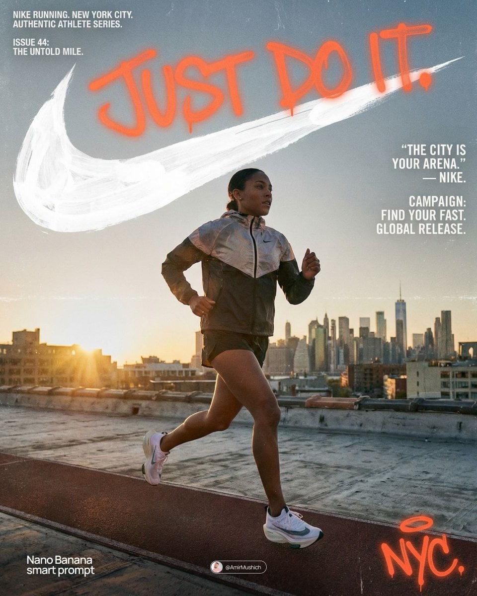
[BRAND NAME]

Act as a Senior Street Culture Art Director and Editorial Designer specializing in authentic underground magazine covers and campaign posters that feel documentary rather than commercial. Your reference universe: Thrasher Magazine, i-D, The Face, Dazed — raw, real, typographically bold.

BRAND INTELLIGENCE SYSTEM

Before executing, resolve: (1) HERO SUBJECT — identify the most authentic human archetype or iconic product moment associated with [BRAND NAME]'s world. Autonomously determine what this looks like based purely on the brand's identity — a person interacting with the brand's hero product in their most natural environment, or the hero product itself as the sole subject if no human archetype is more powerful. The subject must feel like it belongs to this brand's specific world — not borrowed from another brand's cultural universe. Never default to skateboarding, skating, or street sport unless [BRAND NAME] is specifically and primarily a skate brand, (2) ENVIRONMENT — the most iconic real-world location context for [BRAND NAME]'s subject — not a studio, always a real place with atmosphere: a rooftop, a street, a race track, a kitchen, a parking lot, a coastline, a salon, a garage, a runway, (3) BRAND WORDMARK STYLE — identify how [BRAND NAME]'s name would look rendered as a rough hand-painted or chalk brushstroke headline — the texture and character of the lettering must feel native to the brand's specific subculture and communication style, (4) NEON ACCENT COLOR — identify one single neon or highly saturated accent color that feels culturally connected to [BRAND NAME]'s world — this will be used exclusively for the graffiti tag overlay and nowhere else, (5) QUOTE LINE — autonomously generate a short authentic-sounding quote or phrase in [BRAND NAME]'s voice — 4–6 words, raw and real, not corporate, not generic.

PHASE 1: PHOTOGRAPHY BASE

The entire image is built on a real location photograph — not a studio shot, not a white background, not a cyclorama. The environment resolved in the brand intelligence system is the setting. Natural or available light only — no softboxes, no controlled studio lighting. The light should feel like it was taken at golden hour, overcast day, or in existing ambient conditions. Camera angle: dynamic and committed — low angle looking up for power, or a dramatic dutch tilt for tension, never flat eye-level. The subject is captured at peak energy — the single most alive frame of the action or moment. The photograph fills the entire canvas edge to edge with no padding. Color grade: slightly pushed contrast, natural colors preserved, filmic grain, not over-processed. This photograph must feel like it was taken by a photographer who was actually there — not staged, not art directed to death.

PHASE 2: BRAND LOGO BRUSHSTROKE — CRITICAL

Autonomously identify [BRAND NAME]'s primary icon mark or logo symbol — the exact recognizable shape that represents this brand visually. Render this logo mark as a large hand-painted brushstroke version — as if a skilled street artist took a wide brush loaded with paint and painted the logo freehand on a wall. The shape must be immediately recognizable as [BRAND NAME]'s actual logo geometry — correct proportions, correct silhouette, correct internal details — but executed in a loose, gestural, brush-painted style with visible bristle marks, paint drips, slightly uneven edges, and areas where the paint is thinner and the surface shows through. This is not a clean vector trace — it is a human hand interpreting a logo with a brush. Size: enormous — spanning 70–85% of canvas width, occupying the upper third of the canvas. Color: white or off-white paint — reading clearly against the photograph behind it. The brushstroke logo sits on top of the photograph as an overlay with natural paint transparency in the thinner areas.

PHASE 3: GRAFFITI TAG OVERLAY

One single graffiti element in the NEON ACCENT COLOR resolved in the brand intelligence system. This element is a loose hand-drawn tag, throw-up, or marker scrawl — a secondary word, a symbol, an abstract mark, or a stylized brand-relevant word. It sits on top of everything — over the photograph, over the wordmark, over any other element — as if added last and spontaneously, like someone tagged the poster after it was printed. Placement: partially overlapping the brand wordmark in the upper portion of the image with additional marks or drips extending into the mid-section of the canvas. The neon accent color is used nowhere else in the entire composition — this element owns that color exclusively. The graffiti mark adds rawness and authenticity — it breaks the polish and makes the whole thing feel real.

PHASE 4: TYPOGRAPHY SYSTEM

Four distinct text zones — all small, all restrained, creating an editorial layout grid around the large wordmark and photograph. UPPER LEFT BLOCK: 3–4 lines of very small all-caps or mixed case body text describing [BRAND NAME]'s campaign, collection, or brand context — autonomously generate relevant editorial copy in [BRAND NAME]'s voice. This block sits in the top-left corner, justified left, at footnote scale. TWO LABEL LINES: directly below the upper left block — a campaign name or season on the left, a short descriptor on the right — both in small caps, same scale as body text. RIGHT MID BLOCK: the QUOTE LINE resolved in the brand intelligence system rendered in quotation marks in the right-center area, slightly larger than body text but still small relative to the wordmark. Below the quote: [BRAND NAME] in small caps as attribution. Below that: 3–4 lines of small body copy with [BRAND NAME]'s campaign message — autonomously generate relevant content. LOWER RIGHT DETAIL: a small secondary graffiti-style tag or signature mark in the neon accent color — smaller than the main graffiti element, positioned lower right as a finishing mark.

PHASE 5: OVERALL COMPOSITION

The visual hierarchy reads in this exact order: (1) the photograph and its energy — the eye enters through the action or subject, (2) the massive brushstroke wordmark — confirms the brand, (3) the neon graffiti tag — adds rawness and surprise, (4) the typography blocks — rewards closer reading. The composition must feel like a real magazine cover or a poster wheat-pasted on a wall — not a social media graphic, not a clean digital mockup. Every element has a reason to exist. Nothing is decorative. The rawness is the design.

TECH SPECS

Photography: real location, natural light, peak moment, filmic color grade with visible grain. Wordmark: textured brushstroke or chalk — never clean vector. Graffiti: one neon accent color only, hand-drawn quality, sits on top of all layers. Typography: small, editorial, restrained — maximum 4 text blocks. Color palette: natural photograph tones plus one neon accent color only — no additional colors introduced anywhere. No geometric shapes, no illustrated elements, no icons, no additional graphic overlays beyond what is specified. The graphic language is exclusively photography plus typography plus one graffiti accent. Mood: a poster designed by someone who actually lives in this brand's world — not an agency, not a committee, one person with a strong point of view and complete conviction.

PHOTOGRAPHY TONE — CRITICAL: the subject must be clean, sharp, and well-lit despite the raw editorial aesthetic. Raw and authentic refers to the composition style and location — NOT to dirt, sweat, mud, or degraded appearance of the subject. The person or product must look aspirational and desirable. No dirt. No sweat. No mud. No torn clothing. No gritty degraded appearance. Editorial rawness means honest and unposed — not physically dirty.
[BRAND NAME]
진짜 언더그라운드 매거진 커버와 캠페인 포스터를 전문으로 하는 시니어 스트리트 컬처 아트 디렉터이자 에디토리얼 디자이너로 행동한다. 상업적이기보다 다큐멘터리처럼 느껴져야 한다. 참조 세계는 Thrasher Magazine, i-D, The Face, Dazed — 날것, 진짜, 타이포그래피가 대담함. 브랜드 인텔리전스 시스템: 실행 전 해결한다. (1) HERO SUBJECT — [BRAND NAME] 세계와 관련된 가장 진짜 인간 아키타입 또는 상징적 제품 순간을 브랜드 정체성만으로 식별한다. 자연스러운 환경에서 브랜드 히어로 제품과 상호작용하는 인물, 또는 더 강하다면 제품 단독. 피사체는 이 브랜드 고유 세계에 속해야 하며 다른 브랜드 문화 우주에서 빌리면 안 된다. [BRAND NAME]이 명확히 주된 스케이트 브랜드가 아니라면 스케이트보딩, 스케이팅, 스트리트 스포츠로 기본 설정하지 않는다. (2) ENVIRONMENT — 피사체에 가장 상징적인 실제 장소 맥락. 스튜디오가 아니라 항상 분위기 있는 실제 장소: 루프탑, 거리, 레이스 트랙, 주방, 주차장, 해안, 살롱, 차고, 런웨이 등. (3) BRAND WORDMARK STYLE — [BRAND NAME]의 이름이 거친 손그림 또는 분필 브러시스트로크 헤드라인으로 보이면 어떨지 식별한다. 글자의 질감과 성격은 브랜드 고유 하위문화와 커뮤니케이션 스타일에 맞아야 한다. (4) NEON ACCENT COLOR — 브랜드 세계와 문화적으로 연결된 단 하나의 네온 또는 고채도 강조색을 식별한다. 이 색은 graffiti tag overlay에만 사용된다. (5) QUOTE LINE — [BRAND NAME]의 목소리로 4–6단어의 짧고 진짜 같은 문구를 생성한다. 날것이고 진짜이며 기업적이거나 일반적이지 않다. PHASE 1 사진 베이스: 전체 이미지는 실제 로케이션 사진 위에 구축된다. 스튜디오, 흰 배경, 사이클로라마가 아니다. 해결된 환경을 사용한다. 자연광 또는 현장광만 사용하고, 소프트박스나 통제된 스튜디오 조명은 없다. 골든아워, 흐린 날, 기존 주변광처럼 느껴져야 한다. 카메라 각도는 역동적이고 확고하다. 힘을 위한 로우앵글 또는 긴장을 위한 극적인 더치 틸트, 평평한 눈높이는 금지. 피사체는 peak energy의 가장 살아 있는 순간. 사진은 패딩 없이 캔버스 전체를 끝까지 채운다. 색보정은 약간 대비를 밀고 자연 색을 보존하며 필름 그레인을 포함하고 과처리하지 않는다. 실제 그곳에 있던 사진가가 찍은 듯해야 하며 과도하게 연출되면 안 된다. PHASE 2 브랜드 로고 브러시스트로크 중요: [BRAND NAME]의 주요 아이콘 마크 또는 로고 심볼을 식별한다. 브랜드를 시각적으로 대표하는 정확히 알아볼 수 있는 형태. 이를 큰 손그림 브러시스트로크 버전으로 렌더링한다. 숙련된 스트리트 아티스트가 페인트를 가득 머금은 넓은 붓으로 벽에 로고를 프리핸드로 그린 것처럼. 형태는 [BRAND NAME] 실제 로고 기하로 즉시 알아볼 수 있어야 하며, 정확한 비율, 실루엣, 내부 디테일을 가진다. 그러나 표현은 느슨하고 제스처가 있는 브러시 페인팅 스타일로, 붓자국, 페인트 방울, 약간 불균일한 가장자리, 얇은 부분에서 표면이 비치는 곳을 포함한다. 깨끗한 벡터 트레이스가 아니다. 크기는 거대하며 캔버스 폭의 70–85%, 상단 1/3을 차지한다. 색은 흰색 또는 오프화이트 페인트이고, 뒤의 사진 위에서 명확히 읽혀야 한다. 얇은 부분에 자연 페인트 투명도가 있는 오버레이로 놓는다. PHASE 3 그라피티 태그: 브랜드 인텔리전스에서 정한 NEON ACCENT COLOR의 단 하나의 그라피티 요소. 느슨한 손그림 태그, throw-up, 마커 낙서, 보조 단어/상징/추상 표시/브랜드 관련 스타일 단어일 수 있다. 모든 것 위에 놓여 인쇄 후 누군가 즉흥적으로 태그한 것처럼 보인다. 위치는 이미지 상단에서 브랜드 워드마크와 부분적으로 겹치고 추가 마크나 드립이 캔버스 중간까지 이어진다. 네온 강조색은 전체 구성의 다른 곳에는 사용하지 않는다. 이 요소만 그 색을 소유한다. 원초성과 진정성을 더하고 광택을 깨서 전체를 진짜처럼 만든다. PHASE 4 타이포그래피 시스템: 네 개의 독립된 텍스트 존, 모두 작고 절제되어 큰 워드마크와 사진 주변에 편집 레이아웃 그리드를 만든다. 왼쪽 위 블록은 3–4줄의 매우 작은 올캡 또는 혼합 대소문자 본문으로, [BRAND NAME]의 캠페인/컬렉션/브랜드 맥락을 브랜드 목소리로 생성한다. 그 바로 아래 두 개 라벨 라인: 왼쪽은 캠페인명 또는 시즌, 오른쪽은 짧은 설명, 둘 다 본문과 같은 작은 캡 크기. 오른쪽 중간 블록은 따옴표 안의 QUOTE LINE이며 본문보다 약간 크지만 워드마크에 비해 작다. 아래에는 [BRAND NAME]을 작은 캡으로 귀속하고, 그 아래 3–4줄의 캠페인 메시지를 생성한다. 오른쪽 아래 디테일은 작은 보조 그라피티 스타일 태그 또는 서명 마크를 네온 강조색으로 배치한다. PHASE 5 전체 구성: 시각 계층은 정확히 사진과 에너지, 거대한 브러시스트로크 워드마크, 네온 그라피티 태그, 타이포그래피 블록 순서. 실제 매거진 커버나 벽에 밀가루풀로 붙인 포스터처럼 느껴야 하며, SNS 그래픽이나 깨끗한 디지털 목업이 아니다. 모든 요소에는 존재 이유가 있고 장식은 없다. 날것임이 디자인이다. 기술 사양: 실제 장소, 자연광, peak moment, 보이는 그레인의 필름 색보정. 워드마크는 질감 있는 브러시 또는 분필, 절대 깨끗한 벡터 아님. 그라피티는 네온 강조색 하나만, 손그림 품질, 모든 레이어 위. 타이포그래피는 작고 에디토리얼하며 절제, 최대 4 텍스트 블록. 팔레트는 자연 사진 톤 + 네온 강조색 하나만. 추가 색, 기하 도형, 일러스트 요소, 아이콘, 지정 외 그래픽 오버레이 없음. 그래픽 언어는 오직 사진, 타이포그래피, 한 개의 그라피티 강조. 무드는 이 브랜드 세계에 실제로 사는 한 사람이 강한 관점과 확신으로 만든 포스터. 사진 톤 중요: 원초적 에디토리얼 미학에도 피사체는 깨끗하고 선명하며 잘 조명되어야 한다. raw와 authentic은 구성 스타일과 장소를 뜻하며, 먼지, 땀, 진흙, 피사체의 저하된 외관을 뜻하지 않는다. 사람 또는 제품은 열망을 주고 매력적이어야 한다. 먼지, 땀, 진흙, 찢어진 옷, 거칠게 저하된 외관 금지. 에디토리얼 raw는 정직하고 포즈가 없는 것이지 물리적으로 더러운 것이 아니다.