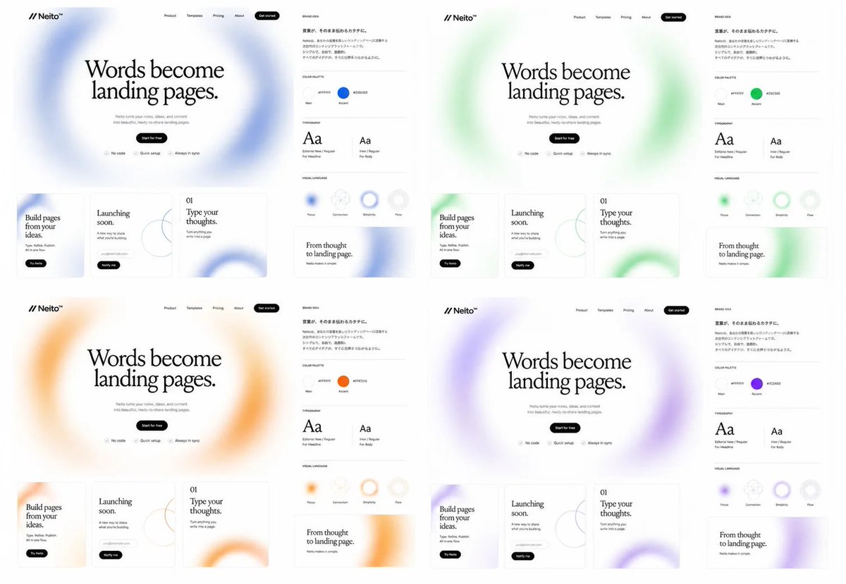
Neito 品牌色彩探索项目
一个结构化的提示词,用于生成 2×2 的 SaaS 品牌标识和落地页模型项目,包含四种强调色变体。
Goal: Create a clean brand exploration board for a fictional SaaS landing-page builder called {argument name="brand name" default="Neito"}, showing the same website and brand identity system repeated in exactly 4 color directions.

Canvas: Wide 16:9 white canvas, arranged as a 2×2 grid of four complete brand/website mockup panels with generous white space. Each panel is nearly identical except for the accent color and soft blurred gradient decorations.

Layout: Each of the 4 panels contains exactly 2 main areas: a large landing-page mockup on the left and a narrow brand-guide column on the right. The four accent themes are: 1 blue, 2 green, 3 orange, 4 purple.

Landing-page mockup details: At the top left place the logo mark as two forward slashes followed by “Neito” with a small star/spark symbol. Across the top navigation place exactly 5 items: Product, Templates, Pricing, About, and a black rounded “Get started” button. Center a large editorial serif headline: “Words become landing pages.” Below it add small gray supporting copy about turning ideas and content into beautiful ready-to-share landing pages, then a black pill button reading “Start for free”. Under the button place exactly 3 small feature chips with icons: “No code”, “Quick setup”, and “Always in sync”. Behind the hero headline use a huge airy blurred circular gradient ring in the panel’s accent color.

Bottom website cards: Under each hero section place exactly 3 rectangular content cards with thin borders and rounded corners. Card 1 reads “Build pages from your ideas.” with a small black pill button “Try Neito”. Card 2 reads “Launching soon.” and includes a small rounded email/input pill plus a black “Notify me” button and a thin abstract circle-line graphic. Card 3 is numbered “01” and reads “Type your thoughts.” with small descriptive text and a large cropped blurred accent-color ring in the lower right.

Brand-guide column: Add a small heading “BRAND IDEA” and a short Japanese-style paragraph block in small black text. Below it create exactly 4 labeled sections separated by thin gray horizontal rules: COLOR PALETTE, TYPOGRAPHY, VISUAL LANGUAGE, and a sample card. In COLOR PALETTE show exactly 2 circular swatches labeled Main and Accent; the Main swatch is near-white and the Accent swatch matches the panel color, with a small hex-code label beside each. In TYPOGRAPHY show exactly 2 type specimens: a large serif “Aa” labeled for headlines and a smaller sans-serif “Aa” labeled for body text. In VISUAL LANGUAGE show exactly 4 circular tokens labeled Flow, Connection, Simplicity, and Flex, with one or more using the accent color as a blurred ring. The final sample card reads “From thought to landing page.” with small subtext and a cropped blurred accent-color ring.

Visual style: Minimal premium web-design presentation, monochrome typography, lots of white space, thin light-gray dividers, subtle shadows, soft frosted gradients, editorial serif headline paired with tiny modern sans-serif UI labels. Keep everything crisp like a Figma brand exploration screenshot. Use {argument name="headline text" default="Words become landing pages."} as the main repeated hero headline, {argument name="accent palette" default="blue, green, orange, purple"} for the four color variants, and {argument name="canvas ratio" default="16:9"}.

Constraints: Show exactly 4 panels, exactly 3 bottom website cards per panel, exactly 2 brand areas per panel, exactly 2 color swatches per brand guide, exactly 2 typography specimens per brand guide, and exactly 4 visual-language tokens per brand guide. Do not add photos, people, device frames, dark backgrounds, or extra panels.
目标:为一个名为 {argument name="brand name" default="Neito"} 的虚构 SaaS 落地页构建器创建一个简洁的品牌探索项目,展示在 4 个完全相同的色彩方向下重复的网站和品牌标识系统。
画布:宽屏 16:9 白色画布,排列为 2×2 网格,包含四个完整的品牌/网站模型面板,并留有充足的留白。每个面板除强调色和柔和的模糊渐变装饰外,几乎完全相同。
布局:每个面板包含 2 个主要区域:左侧的大型落地页模型和右侧的窄版品牌指南栏。四个强调色主题分别为:1 蓝色,2 绿色,3 橙色,4 紫色。
落地页模型细节:在左上角放置 Logo 标识,即两个正斜杠后接“Neito”以及一个小星星/火花符号。在顶部导航栏放置 5 个项目:Product、Templates、Pricing、About 以及一个黑色的圆角“Get started”按钮。在中心放置一个大的衬线体标题:“Words become landing pages.”。下方添加简短的灰色辅助文案,描述如何将想法和内容转化为精美的落地页,然后是一个写有“Start for free”的黑色胶囊按钮。在按钮下方放置 3 个带有图标的小型功能标签:“No code”、“Quick setup”和“Always in sync”。在英雄区标题后方使用一个巨大的、带有面板强调色的空气感模糊圆形渐变环。
底部网站卡片:在每个英雄区下方放置 3 个带有细边框和圆角的矩形内容卡片。卡片 1 写着“Build pages from your ideas.”,并配有一个黑色小胶囊按钮“Try Neito”。卡片 2 写着“Launching soon.”,包含一个小型圆角电子邮件/输入框以及一个黑色“Notify me”按钮和细抽象圆线图形。卡片 3 编号为“01”,写着“Type your thoughts.”,配有简短描述性文字和右下角一个被裁剪的模糊强调色圆环。
品牌指南栏:添加一个小标题“BRAND IDEA”和一段小字号的黑色日式段落文本。下方创建 4 个由细灰色水平线分隔的标注部分:COLOR PALETTE、TYPOGRAPHY、VISUAL LANGUAGE 和一张示例卡片。在 COLOR PALETTE 中展示 2 个圆形色块,分别标注为 Main 和 Accent;Main 色块接近白色,Accent 色块与面板颜色匹配,每个色块旁附有十六进制颜色代码标签。在 TYPOGRAPHY 中展示 2 个字体样本:一个标注为标题的大号衬线体“Aa”和一个标注为正文的小号无衬线体“Aa”。在 VISUAL LANGUAGE 中展示 4 个圆形图标,分别标注为 Flow、Connection、Simplicity 和 Flex,其中一个或多个使用强调色作为模糊环。最后的示例卡片写着“From thought to landing page.”,配有简短副标题和被裁剪的模糊强调色圆环。
视觉风格:极简高级网页设计展示,单色排版,大量留白,细浅灰色分隔线,微妙阴影,柔和磨砂渐变,衬线标题搭配微小的现代无衬线 UI 标签。保持整体清晰,如同 Figma 品牌探索截图。使用 {argument name="headline text" default="Words become landing pages."} 作为重复的英雄区主标题,使用 {argument name="accent palette" default="blue, green, orange, purple"} 作为四种颜色变体,以及 {argument name="canvas ratio" default="16:9"}。
约束:展示 4 个面板,每个面板 3 个底部网站卡片,每个面板 2 个品牌区域,每个品牌指南 2 个色块,每个品牌指南 2 个字体样本,以及每个品牌指南 4 个视觉语言图标。不要添加照片、人物、设备边框、深色背景或额外的面板。