复古日式发行海报编辑
此提示词可将粗糙的宣传排版转化为精美的复古日式音乐海报,并升级为复古字体、装饰边框及做旧印刷风格。
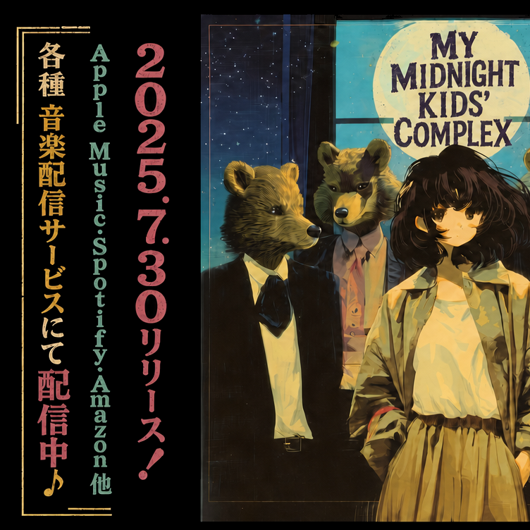
Using the provided reference image, redesign it as a polished retro Japanese music-release poster while preserving the same split layout, the same illustrated band artwork on the right, and the same overall composition. Upgrade the typography from plain placeholder text into authentic vintage poster styling: add distressed print texture, uneven ink, and a slightly worn screen-printed look. Keep the 3 vertical text columns on the left, but restyle them with stronger hierarchy and color separation: the Japanese service-announcement column in warm gold, the platform list in muted teal, and the date/release column in dusty pink. Change the bottom of the left Japanese column from the original release-start message to 「配信中♪」 and emphasize it in larger pink type with a musical note. Add thin gold decorative border lines and corner ornaments framing the left text block. On the right panel, keep the title text in the moon area but restyle it into bold distressed retro lettering that reads “MY MIDNIGHT KIDS’ COMPLEX.” Apply a cohesive nostalgic poster finish across the whole image: subtle paper grain, faded edges, light scratches, slightly darkened borders, and richer vintage teal/gold/pink color grading.
使用提供的参考图,将其重新设计为精致的复古日式音乐发行海报,同时保留相同的分割布局、右侧的乐队插画以及整体构图。将字体从简单的占位文本升级为地道的复古海报风格:添加做旧印刷纹理、不均匀的墨迹以及轻微磨损的丝网印刷外观。保留左侧的 3 列垂直文本,但通过更强的层级和色彩区分进行重构:日文服务公告列使用暖金色,平台列表使用柔和的青色,日期/发行列使用灰粉色。将左侧日文列底部原有的发行开始信息更改为「配信中♪」,并以较大的粉色字体突出显示,同时加上音符。在左侧文本块周围添加细金色的装饰边框线和边角装饰。在右侧面板中,保留月亮区域的标题文本,但将其重构为醒目的复古做旧字体,内容为“MY MIDNIGHT KIDS’ COMPLEX”。为整张图像应用统一的怀旧海报效果:细腻的纸张纹理、褪色的边缘、轻微的划痕、略微变暗的边框,以及更浓郁的复古青/金/粉色调。