Japanese Reading Lesson Infographic
将手写的日语教学笔记转换为结构化的信息图,以便与教育工作者分享课程设计理念。
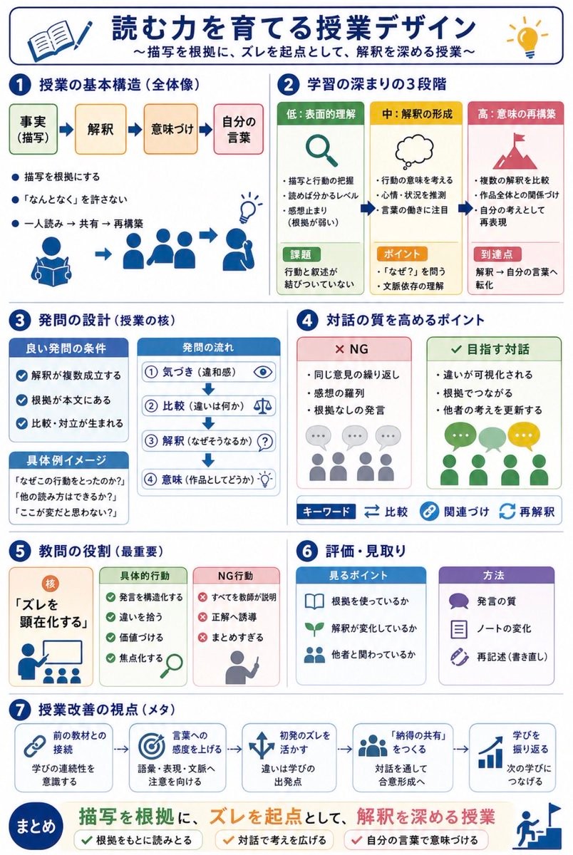
Using REFERENCE_0 and REFERENCE_1 as messy handwritten study-note sources, convert the content into a clean vertical Japanese educational infographic for quick sharing with teachers. Preserve the core topic about designing reading lessons for narrative texts, but organize it visually instead of reproducing the notebook pages. Create a polished white-background layout with navy section headers, rounded cards, simple flat icons, arrows, checkmarks, and color-coded boxes. Add the main title {argument name="headline text" default="読む力を育てる授業デザイン"} and subtitle {argument name="subtitle text" default="〜描写を根拠に、ズレを起点として、解釈を深める授業〜"}. Structure the infographic into exactly 7 numbered sections plus a final summary band: 1) lesson basic structure with four steps labeled 事実(描写)→ 解釈 → 意味づけ → 自分の言葉, 2) three stages of learning depth labeled 低:表面的理解, 中:解釈の形成, 高:意味の再構築, 3) question design with good-question conditions, question flow, and concrete example prompts, 4) points for improving dialogue quality with two comparison cards labeled NG and 目指す対話 plus keyword chips 比較, 関連づけ, 再解釈, 5) the teacher’s most important role centered on making “ズレ” visible with cards for concrete actions and NG actions, 6) assessment and observation with two cards labeled 見るポイント and 方法, and 7) meta viewpoints for lesson improvement shown as five connected cards: 前の教材との接続, 言葉への感度を上げる, 初発のズレを活かす, 「納得の共有」をつくる, 学びを振り返る. End with a prominent summary statement {argument name="summary statement" default="描写を根拠に、ズレを起点として、解釈を深める授業"} and three check items: 根拠をもとに読みとる, 対話で考えを広げる, 自分の言葉で意味づける. Make the result look like a professionally designed Japanese teaching handout, not a photo of notes. 以 REFERENCE_0 和 REFERENCE_1 作为杂乱的手写学习笔记来源,将其内容转换为简洁的垂直日语教学信息图,方便与教师快速分享。保留关于叙事文本阅读课程设计的核心主题,但以视觉化方式组织内容,而非简单复制笔记页面。创建一个精致的白色背景布局,搭配海军蓝章节标题、圆角卡片、简洁的扁平化图标、箭头、复选标记和颜色编码框。添加主标题 {argument name="headline text" default="読む力を育てる授業デザイン"} 和副标题 {argument name="subtitle text" default="〜描写を根拠に、ズレを起点として、解釈を深める授業〜"}。将信息图分为 7 个编号部分以及一个最终总结栏:1) 课程基本结构,分为四个步骤:事实(描写)→ 解釈 → 意味づけ → 自分の言葉;2) 学习深度的三个阶段,标注为:低:表面的理解,中:解释的形成,高:意义的重构;3) 问题设计,包含好问题的条件、问题流程及具体示例提示;4) 提升对话质量的要点,包含两张对比卡片:NG(不佳)和 目指す対話(目标对话),以及关键词标签:比较、关联、再解释;5) 教师最重要的角色,重点在于让“ズレ”(认知偏差/差异)可视化,包含具体行动和 NG 行动的卡片;6) 评估与观察,包含两张卡片:見るポイント(观察要点)和 方法;7) 课程改进的元视角,展示为五个相连的卡片:与前一教材的连接、提高对语言的敏感度、利用最初的“ズレ”、创造“共识的共享”、回顾学习。最后以醒目的总结陈述 {argument name="summary statement" default="描写を根拠に、ズレを起点として、解釈を深める授業"} 和三项检查清单结束:基于根据进行阅读、通过对话扩展思维、用自己的语言赋予意义。使最终结果看起来像专业设计的日语教学讲义,而非笔记照片。 REFERENCE_0 및 REFERENCE_1의 정돈되지 않은 자필 학습 노트를 활용하여, 교사들과 빠르게 공유할 수 있는 깔끔한 세로형 일본어 교육 인포그래픽으로 변환해 주세요. 서사 텍스트의 읽기 수업 설계라는 핵심 주제는 유지하되, 단순히 노트 페이지를 재현하는 대신 시각적으로 체계화해 주세요. 흰색 배경에 네이비색 섹션 헤더, 둥근 모서리의 카드, 단순한 플랫 아이콘, 화살표, 체크 표시, 색상별 박스를 사용하여 세련된 레이아웃을 구성하세요. 메인 타이틀 {argument name="headline text" default="読む力を育てる授業デザイン"}과 서브타이틀 {argument name="subtitle text" default="〜描写を根拠に、ズレを起点として、解釈を深める授業〜"}을 추가하세요. 인포그래픽은 총 7개의 번호가 매겨진 섹션과 마지막 요약 밴드로 구성하세요: 1) 事実(描写)→ 解釈 → 意味づけ → 自分の言葉의 4단계로 구성된 수업 기본 구조, 2) 低:表面的理解, 中:解釈の形成, 高:意味の再構築으로 라벨링된 학습 깊이의 3단계, 3) 좋은 질문의 조건, 질문 흐름, 구체적인 예시 프롬프트가 포함된 질문 설계, 4) NG와 目指す対話로 라벨링된 두 개의 비교 카드 및 比較, 関連づけ, 再解釈 키워드 칩을 포함한 대화 품질 향상을 위한 포인트, 5) 구체적인 행동과 NG 행동 카드를 통해 “ズレ(어긋남)”를 가시화하는 데 중점을 둔 교사의 가장 중요한 역할, 6) 見るポイント와 方法으로 라벨링된 두 개의 카드를 포함한 평가 및 관찰, 7) 前の教材との接続, 言葉への感度を上げる, 初発のズレを活かす, 「納得の共有」をつくる, 学びを振り返る의 5개 연결된 카드로 보여주는 수업 개선을 위한 메타 관점. 마지막으로 {argument name="summary statement" default="描写を根拠に、ズレを起点として、解釈を深める授業"}이라는 강조된 요약 문구와 根拠をもとに読みとる, 対話で考えを広げる, 自分の言葉で意味づける의 3가지 체크 항목으로 마무리하세요. 결과물은 노트 사진이 아닌, 전문적으로 디자인된 일본어 수업용 유인물처럼 보이게 제작해 주세요.