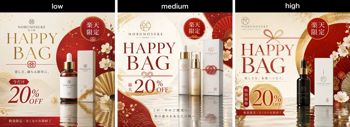
Rakuten Happy Bag 横幅对比图
为 Rakuten 独家促销活动生成三联式日本现代护肤品 Happy Bag 促销横幅质量对比图。
Goal: Create a wide comparison image showing three side-by-side Japanese beauty serum promotional banner variants for the modern Japanese skincare brand {argument name="brand name" default="NOBUNOSUKE"}, advertising a Rakuten Happy Bag sale.

Canvas: Horizontal 3-panel comparison layout, approximately 1200×500 px. Add a black header strip across the top with three white lowercase labels centered over each panel: exactly 3 labels, left to right: “low”, “medium”, “high”. Below the header, divide the image into exactly 3 equal vertical banner panels separated by thin dark gaps.

Overall visual style: Luxurious Japanese modern cosmetics advertising for women in their 30s–40s. Use an elegant palette of ivory, deep vermilion red, muted gold, warm beige, and subtle black accents. Backgrounds should feel like premium washi paper with gold flecks, wave patterns, red circular motifs, folding fans, plum blossoms, mizuhiki cord ornaments, and glossy water reflections at the bottom. Typography should mix large elegant serif English lettering with small refined Japanese copy.

Required repeated elements in every panel: exactly 1 brand logo near the top, exactly 1 large “HAPPY BAG” headline, exactly 1 red circular Rakuten-limited badge reading “楽天限定”, exactly 1 discount offer showing {argument name="discount text" default="20%OFF"}, and exactly 1 main product display with skincare serum packaging.

Panel 1, labeled low: Compose a cream-and-red banner with a large red sun circle behind the product on the right. Place the brand logo and small Japanese brand text at top center, a large gold “HAPPY BAG” headline on the left, a red “楽天限定” badge near the upper right, and a product set consisting of exactly 2 items: one amber glass dropper serum bottle with gold cap and white label, and one tall white product box beside it. Add white plum blossoms and a partially open gold folding fan around the product. Add Japanese copy under the headline, then a small red tag reading “今だけ” above a large red “20% OFF”. Put a red footer strip along the bottom with small white Japanese text indicating limited quantity and sale ending when sold out.

Panel 2, labeled medium: Compose a cleaner ivory banner with red curved paper shapes at the left bottom and right side, gold flecks, floral motifs, and a red folding fan in the upper right. Place the brand logo at top center, large dark red “HAPPY BAG” headline centered-left, and a red “楽天限定” badge at the upper right. Show exactly 4 product items centered-right: two tall cylindrical bottles with gold caps, one shorter serum bottle with pump/dropper styling, and one white rectangular box behind them with a red mizuhiki cord decoration. Add a discount block at lower left reading small vertical Japanese text “最大” and large “20% OFF”. Add two lines of small Japanese seasonal beauty copy near the bottom center.

Panel 3, labeled high: Compose a deeper luxury banner with cream background, red-and-gold arch brushstroke behind the product, red fan and plum blossoms on the right, and reflective water at the bottom. Place the brand logo at upper left, a small gold bow/mizuhiki motif above the headline, and a large red “HAPPY BAG” headline on the left. Add a red circular “楽天限定” badge at upper right. Show exactly 2 product items on the right-center: one black glass dropper serum bottle with gold cap and dark label, and one tall white product box beside it. Add small Japanese copy under the headline, a vertical red tag reading “特別価格” next to a large gold-red circular discount area showing “20% OFF”, and a dark red footer strip with small white Japanese text about limited quantity and sale ending when sold out.

Constraints: Keep all three panels visually similar but not identical, as if comparing low, medium, and high quality outputs of the same prompt. Maintain crisp premium product-ad composition, readable main English text, realistic cosmetic packaging, refined Japanese ornamentation, and no extra panels or watermarks.
目标:创建一张宽幅对比图,展示针对现代日本护肤品牌 {argument name="brand name" default="NOBUNOSUKE"} 的三款并排日本美容精华促销横幅变体,用于宣传 Rakuten Happy Bag 促销活动。
画布:水平三联式对比布局,尺寸约为 1200×500 像素。顶部添加一条黑色标题栏,在每个面板上方居中放置三个白色小写标签:共 3 个标签,从左到右依次为“low”、“medium”、“high”。标题栏下方,将图像精确划分为 3 个等宽的垂直横幅面板,面板间以细深色间隙隔开。
整体视觉风格:面向 30–40 岁女性的奢华日本现代化妆品广告。使用象牙白、深朱红、哑光金、暖米色和精致黑色点缀的优雅配色。背景应呈现出带有金箔、波浪纹、红色圆形图案、折扇、梅花、水引绳结装饰的高级和纸质感,底部带有光泽的水面反射效果。排版应将大型优雅的衬线英文字体与精致的小号日文文案相结合。
每个面板中必须重复的元素:顶部附近 1 个品牌 Logo,1 个醒目的“HAPPY BAG”大标题,1 个写有“楽天限定”的红色圆形 Rakuten 专属徽章,1 个显示 {argument name="discount text" default="20%OFF"} 的折扣优惠,以及 1 个展示护肤精华液包装的主产品。
面板 1(标记为 low):构图采用奶油色与红色调,产品右侧背景为一个巨大的红色圆日。品牌 Logo 和小号日文品牌文字置于顶部中央,左侧为金色大号“HAPPY BAG”标题,右上角附近为红色“楽天限定”徽章,产品组合包含 2 件物品:一个带金色瓶盖和白色标签的琥珀色玻璃滴管精华瓶,以及旁边的一个高款白色产品盒。在产品周围添加白色梅花和半开的金色折扇。标题下方添加日文文案,在巨大的红色“20% OFF”上方添加一个写有“今だけ”的小号红色标签。底部放置一条红色页脚栏,带有白色小号日文文字,说明数量有限,售完即止。
面板 2(标记为 medium):构图采用更简洁的象牙白横幅,左下角和右侧带有红色弧形纸张形状、金箔、花卉图案,右上角配有一把红色折扇。品牌 Logo 置于顶部中央,深红色大号“HAPPY BAG”标题居中偏左,右上角为红色“楽天限定”徽章。右侧居中展示 4 件产品:两个带金色瓶盖的高款圆柱形瓶子,一个带泵头/滴管造型的较短精华瓶,以及其后方一个带有红色水引绳结装饰的白色长方形盒子。左下角添加折扣区,包含小号垂直日文“最大”和巨大的“20% OFF”。底部中央附近添加两行小号日文季节性美容文案。
面板 3(标记为 high):构图采用更具奢华感的深色调,奶油色背景,产品后方为红金相间的笔触弧线,右侧配有红色折扇和梅花,底部为水面反射效果。品牌 Logo 置于左上角,标题上方有一个金色蝴蝶结/水引装饰,左侧为红色大号“HAPPY BAG”标题。右上角添加红色圆形“楽天限定”徽章。右侧居中展示 2 件产品:一个带金色瓶盖和深色标签的黑色玻璃滴管精华瓶,以及旁边的一个高款白色产品盒。标题下方添加日文文案,在巨大的金红色圆形折扣区旁添加一个写有“特別価格”的垂直红色标签,显示“20% OFF”,底部为深红色页脚栏,带有白色小号日文文字,说明数量有限,售完即止。
约束条件:保持三个面板视觉相似但不完全相同,如同对比同一提示词生成的低、中、高质量输出。保持清晰的高级产品广告构图、可读的主标题英文、逼真的化妆品包装、精致的日式装饰,且不要添加额外的面板或水印。