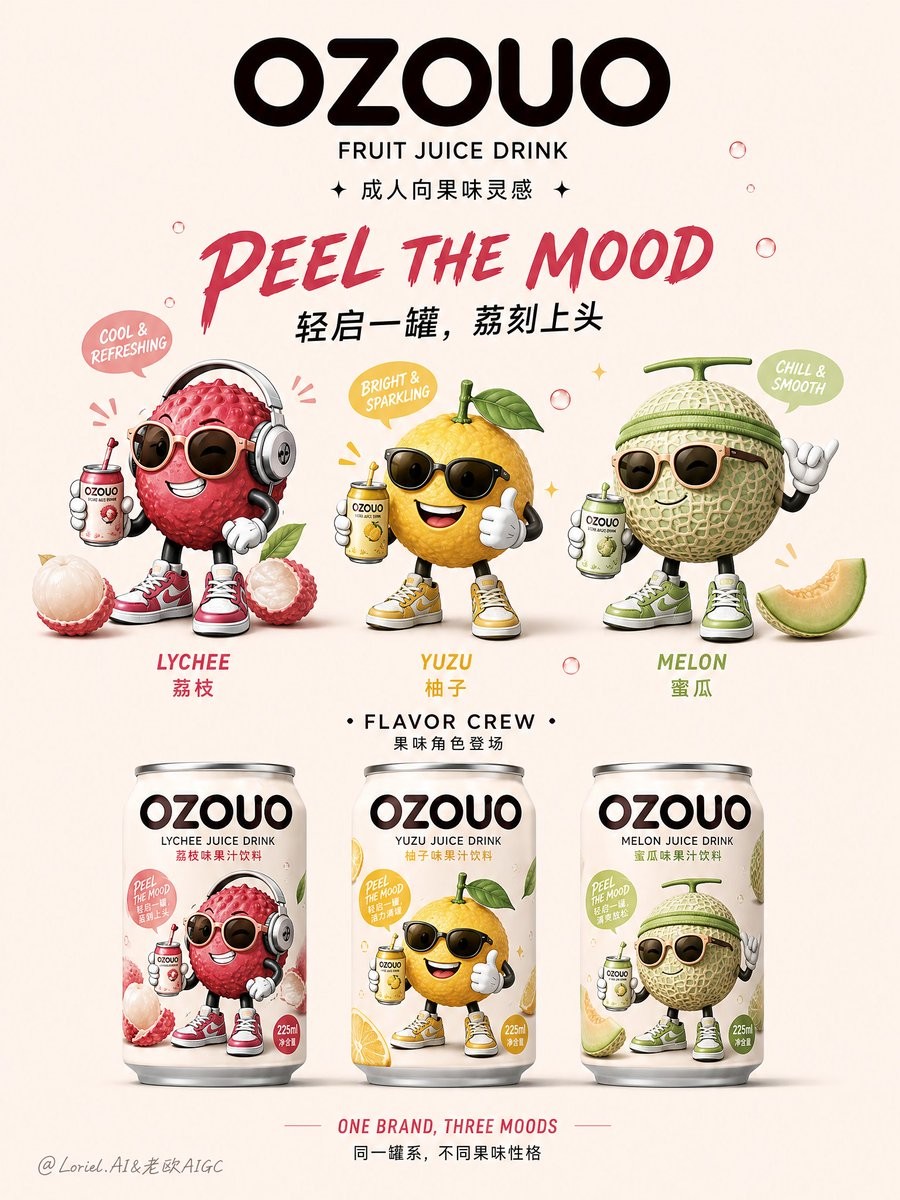
OZOUO Flavor Family
一份用于设计简洁、现代的快速消费品(FMCG)品牌识别海报的综合提示词,海报内容包含水果饮料、吉祥物及产品系列。
Create the second image of a unified brand visual system for “OZOUO” fruit drinks, keeping exactly the same brand identity, mascot illustration language, typography style, packaging tone, and color DNA as the existing OZOUO visual system, but giving this image a different responsibility: this is a brand family poster / flavor lineup identity board, not a packaging construction sheet. The image should feel like a clean, highly designed FMCG brand world overview for OZOUO, showing the logo, mascot family, flavor personality, and lineup structure in one coherent poster. It must clearly belong to the same OZOUO brand universe as the existing 225ml lychee can packaging design, but it should not repeat the front-side-back technical packaging layout. Core role: This image is a brand identity expansion poster that introduces OZOUO as a youthful but adult-oriented fruit drink brand with a playful mascot system and a clear multi-flavor product family. It should feel suitable for brand deck presentation, social media launch poster, product family overview, or showroom wall visual. Composition: Use a clean soft warm-beige or creamy neutral background with lots of breathing space. The layout should be vertically organized and extremely clean: top area: bold OZOUO logo and short brand statement middle area: mascot family or flavor character system, arranged with playful but balanced spacing bottom area: three 225ml compact cans lined up in a clean family presentation The poster should feel calm, graphic, friendly, modern, and shelf-brand ready. Brand consistency: Keep exactly the same OZOUO brand system as the existing reference: same “OZOUO” wordmark feeling, same adult-oriented cartoon mascot style, same compact 225ml can proportion, same premium FMCG realism, same lychee flavor world as a key anchor, same typography temperament, same overall balance between cute and grown-up. Do not switch to childish kids-drink aesthetics. Flavor family: Present OZOUO as a flavor lineup brand. Use three coordinated flavors under one system, such as: Lychee, Yuzu, Melon or Lychee, Peach, Grapefruit All three must feel like one family, with consistent layout logic and mascot illustration style, but each flavor should have its own accent color and fruit cues. Lychee should remain the lead or hero flavor to preserve continuity with the established brand system. Mascot direction: Create a family of stylish fruit-inspired adult cartoon mascots in the same OZOUO illustration language: cool, cheeky, lifestyle-driven, slightly ironic, fashionable, not childish. The lychee mascot should remain recognizable from the existing system, with sunglasses, headphones, sneakers, and confident pose. The other fruit mascots should be redesigned in matching style, each with subtle personality variation but clear consistency. They should appear above the cans in a loose playful arrangement, like the brand’s character cast. Packaging presence: At the bottom of the poster, show three realistic OZOUO 225ml cans arranged side by side, evenly spaced, front-facing or slightly varied in angle. The cans should feel like a real product family launch lineup, clean and commercially polished. The can proportions must remain compact and correctly adapted to the 225ml format. Typography: Typography should be a major brand asset in this poster, but kept concise and graphic. No cluttered copy. Use bold, stylish, rounded, art-directed lettering with clean hierarchy. Include text such as: “OZOUO” “FRUIT JUICE DRINK” “成人向果味灵感” “PEEL THE MOOD” “轻启一罐,荔刻上头” Optional family-line statement: “FLAVOR CREW” “果味角色登场” “ONE BRAND, THREE MOODS” “同一罐系,不同果味性格” If using flavor names, show them clearly and consistently: “LYCHEE” “YUZU” “MELON” or chosen flavor set. Visual style: The whole poster should feel clean, slightly playful, highly brandable, and very presentational, like a modern beverage startup identity sheet with better taste and more adult polish. Avoid technical clutter, ingredients tables, barcodes, or detailed legal zones unless used minimally. This image is more about brand character and family cohesion than technical packaging information. Color palette: Use the established OZOUO neutral creamy base, deep brown or espresso typography, and refined fruit accent colors. Let each flavor introduce a controlled accent: Lychee: blush pink / berry rose Yuzu: citrus yellow / warm lemon Melon or Peach: soft green or coral peach Keep all tones soft-but-saturated enough to feel shelf-ready and modern. Mood: clean, adult playful, brand-cohesive, graphic, friendly, stylish, FMCG-ready, lineup-focused, socially shareable, premium, memorable. Rendering: hyper-detailed 225ml can mockups, crisp mascot illustration, clean studio poster composition, premium branding presentation, soft shadows, polished aluminum texture, 8k, commercially believable. Negative prompt: technical packaging board, barcode-heavy layout, back-of-pack details dominating, childish kids drink style, inconsistent mascot family, mismatched can heights, messy composition, cluttered background, weak brand identity, random fruit mix, low detail, generic supermarket design
Create the second image of a unified brand visual system for “OZOUO” fruit drinks, keeping exactly the same brand identity, mascot illustration language, typography style, packaging tone, and color DNA as the existing OZOUO visual system, but giving this image a different responsibility: this is a brand family poster / flavor lineup identity board, not a packaging construction sheet. The image should feel like a clean, highly designed FMCG brand world overview for OZOUO, showing the logo, mascot family, flavor personality, and lineup structure in one coherent poster. It must clearly belong to the same OZOUO brand universe as the existing 225ml lychee can packaging design, but it should not repeat the front-side-back technical packaging layout. Core role: This image is a brand identity expansion poster that introduces OZOUO as a youthful but adult-oriented fruit drink brand with a playful mascot system and a clear multi-flavor product family. It should feel suitable for brand deck presentation, social media launch poster, product family overview, or showroom wall visual. Composition: Use a clean soft warm-beige or creamy neutral background with lots of breathing space. The layout should be vertically organized and extremely clean: top area: bold OZOUO logo and short brand statement middle area: mascot family or flavor character system, arranged with playful but balanced spacing bottom area: three 225ml compact cans lined up in a clean family presentation The poster should feel calm, graphic, friendly, modern, and shelf-brand ready. Brand consistency: Keep exactly the same OZOUO brand system as the existing reference: same “OZOUO” wordmark feeling, same adult-oriented cartoon mascot style, same compact 225ml can proportion, same premium FMCG realism, same lychee flavor world as a key anchor, same typography temperament, same overall balance between cute and grown-up. Do not switch to childish kids-drink aesthetics. Flavor family: Present OZOUO as a flavor lineup brand. Use three coordinated flavors under one system, such as: Lychee, Yuzu, Melon or Lychee, Peach, Grapefruit All three must feel like one family, with consistent layout logic and mascot illustration style, but each flavor should have its own accent color and fruit cues. Lychee should remain the lead or hero flavor to preserve continuity with the established brand system. Mascot direction: Create a family of stylish fruit-inspired adult cartoon mascots in the same OZOUO illustration language: cool, cheeky, lifestyle-driven, slightly ironic, fashionable, not childish. The lychee mascot should remain recognizable from the existing system, with sunglasses, headphones, sneakers, and confident pose. The other fruit mascots should be redesigned in matching style, each with subtle personality variation but clear consistency. They should appear above the cans in a loose playful arrangement, like the brand’s character cast. Packaging presence: At the bottom of the poster, show three realistic OZOUO 225ml cans arranged side by side, evenly spaced, front-facing or slightly varied in angle. The cans should feel like a real product family launch lineup, clean and commercially polished. The can proportions must remain compact and correctly adapted to the 225ml format. Typography: Typography should be a major brand asset in this poster, but kept concise and graphic. No cluttered copy. Use bold, stylish, rounded, art-directed lettering with clean hierarchy. Include text such as: “OZOUO”, “FRUIT JUICE DRINK”, “Adult-oriented fruit inspiration”, “PEEL THE MOOD”, “Pop a can, instant lychee rush”. Optional family-line statement: “FLAVOR CREW”, “Fruit flavor characters debut”, “ONE BRAND, THREE MOODS”, “Same series, different fruit personalities”. If using flavor names, show them clearly and consistently: “LYCHEE”, “YUZU”, “MELON” or chosen flavor set. Visual style: The whole poster should feel clean, slightly playful, highly brandable, and very presentational, like a modern beverage startup identity sheet with better taste and more adult polish. Avoid technical clutter, ingredients tables, barcodes, or detailed legal zones unless used minimally. This image is more about brand character and family cohesion than technical packaging information. Color palette: Use the established OZOUO neutral creamy base, deep brown or espresso typography, and refined fruit accent colors. Let each flavor introduce a controlled accent: Lychee: blush pink / berry rose Yuzu: citrus yellow / warm lemon Melon or Peach: soft green or coral peach Keep all tones soft-but-saturated enough to feel shelf-ready and modern. Mood: clean, adult playful, brand-cohesive, graphic, friendly, stylish, FMCG-ready, lineup-focused, socially shareable, premium, memorable. Rendering: hyper-detailed 225ml can mockups, crisp mascot illustration, clean studio poster composition, premium branding presentation, soft shadows, polished aluminum texture, 8k, commercially believable. Negative prompt: technical packaging board, barcode-heavy layout, back-of-pack details dominating, childish kids drink style, inconsistent mascot family, mismatched can heights, messy composition, cluttered background, weak brand identity, random fruit mix, low detail, generic supermarket design
为 OZOUO 果饮创建统一品牌视觉系统的第二张图,作为品牌家族海报和口味阵列 identity board,而不是包装施工图。保持既有 OZOUO 品牌身份、吉祥物插画语言、字体风格、包装调性和色彩 DNA,呈现一个年轻但成人化的果汁饮料品牌。暖米色或奶油中性背景,大量呼吸空间,竖向干净排版:顶部大胆 OZOUO logo 和短品牌语,中部是时髦果味成人卡通吉祥物家族,底部三罐 225ml 产品整齐排列。荔枝作为主口味,搭配柚子、蜜瓜或桃子等,同系列但各有强调色。高级 FMCG、友好、现代、可用于品牌 deck 与社媒发布。
OZOUO 과일 음료의 통합 브랜드 비주얼 시스템 두 번째 이미지를 만든다. 포장 제작 보드가 아니라 브랜드 패밀리 포스터이자 플레이버 라인업 아이덴티티 보드다. 기존 OZOUO의 브랜드 정체성, 마스코트 일러스트 언어, 타이포그래피, 패키징 톤, 색채 DNA를 유지한다. 따뜻한 크림색 중립 배경과 넓은 여백, 상단의 굵은 OZOUO 로고와 짧은 문구, 중간의 어른스럽고 장난스러운 과일 마스코트 가족, 하단의 225ml 캔 세 개를 정돈해서 배치한다. 리치를 주인공으로 유자, 멜론, 복숭아 등을 하나의 제품군처럼 보여준다.