Milo Cocoa Energy Poster
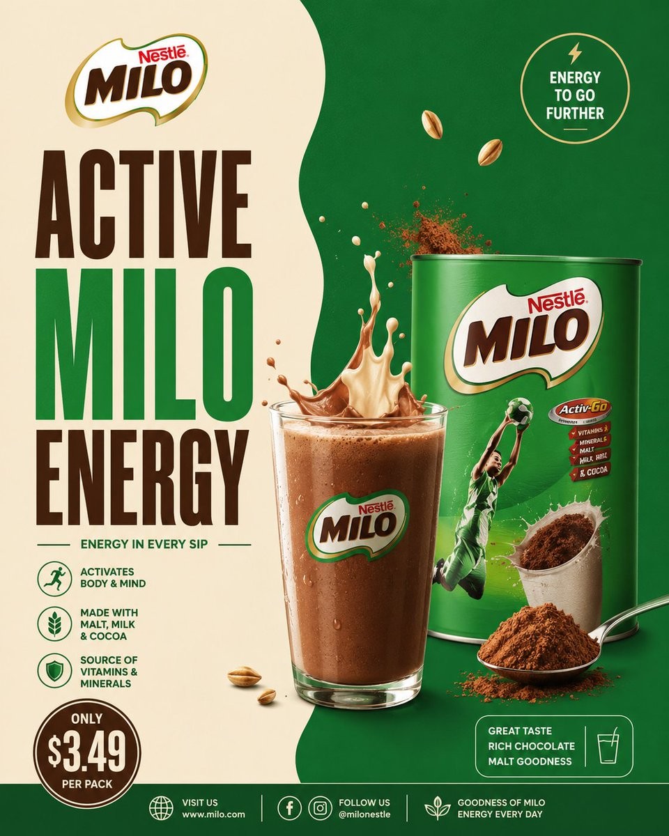
一张方形的商业可可麦芽饮品海报,采用绿色与奶油色拼接的品牌设计,搭配醒目的排版、逼真的产品包装以及充满活力的液体飞溅效果。
Goal: Create a premium square advertising poster for a cocoa malt drink brand, styled like a polished real-world grocery beverage campaign. Use {argument name="brand name" default="Nestlé MILO"} as the featured brand and make the poster feel energetic, sporty, nutritious, and chocolatey.

Canvas: Square 1:1 poster, high-resolution commercial print look. Split background with a warm cream panel on the left and a deep emerald green panel on the right, divided by a soft organic wavy vertical edge. Use studio lighting, glossy product rendering, crisp shadows, and realistic splashes.

Layout: Place the brand logo at the top left. Under it, create a huge stacked headline in bold condensed uppercase typography reading {argument name="headline text" default="ACTIVE MILO ENERGY"}; make “ACTIVE” dark chocolate brown, “MILO” bright green, and “ENERGY” dark chocolate brown. Center-right should feature a realistic glass of chocolate malt drink in front of a large green product tin. The drink splash erupts upward from the glass with both cream-colored milk and chocolate liquid, plus airborne cocoa powder particles. Put the product tin behind and slightly to the right of the glass. Add a spoonful of cocoa powder and loose cocoa powder at the lower right foreground.

Main product details: The product tin is a glossy green cylindrical can with a large MILO logo on the front, a dynamic athlete in a green sports uniform jumping with a ball, a cocoa cup image, and a small red nutrition badge. The glass is clear, filled with cold brown chocolate malt drink, condensation droplets, foam on top, and the MILO logo printed on the front.

Text content and badges: Include exactly 8 text areas: 1) top-left brand logo text “Nestlé MILO”; 2) main headline “ACTIVE MILO ENERGY”; 3) tagline below headline “ENERGY IN EVERY SIP”; 4) top-right circular badge “ENERGY TO GO FURTHER” with a small lightning icon; 5) three left-side benefit rows with icons and text: “ACTIVATES BODY & MIND”, “MADE WITH MALT, MILK & COCOA”, and “SOURCE OF VITAMINS & MINERALS”; 6) bottom-left price badge reading {argument name="price text" default="ONLY $3.49 PER PACK"}; 7) lower-right rounded rectangle reading “GREAT TASTE RICH CHOCOLATE MALT GOODNESS” with a simple glass icon; 8) bottom footer with website/social information: “VISIT US www.milo.com”, “FOLLOW US @milonestle”, and “GOODNESS OF MILO ENERGY EVERY DAY”.

Counted visual elements: Include exactly 1 glass of chocolate malt drink, exactly 1 large product tin, exactly 1 spoon filled with cocoa powder, exactly 1 cocoa powder mound, exactly 2 floating malt grains near the upper middle-right, exactly 3 small malt grains near the lower left of the glass, exactly 1 top-right circular energy badge, exactly 3 benefit icons on the left, exactly 1 bottom-left circular price badge, exactly 1 lower-right rounded taste badge, and exactly 3 footer icon groups.

Visual style: Bold FMCG advertising design inspired by Milo or Nesquik-style cocoa drink posters, with saturated green, cream, chocolate brown, gold accents, thick condensed type, clean iconography, glossy packaging, and photorealistic food splashes. Make the cocoa and milk splash look frozen in motion with powder burst details. Keep the poster clean, balanced, and highly legible.

Constraints: Do not add extra products, characters, text blocks, badges, or icons beyond the counted elements. Avoid clutter. No watermark. No spelling errors. Maintain strong brand hierarchy with the headline dominating the left half and the drink/tin dominating the right half.
目标:为一款可可麦芽饮品品牌创作一张高端方形广告海报,风格参考精美的现实商业饮料宣传。使用 {argument name="brand name" default="Nestlé MILO"} 作为主打品牌,营造出充满活力、运动感、营养丰富且浓郁巧克力口感的氛围。
画布:方形 1:1 海报,高分辨率商业印刷质感。背景采用左右拼接设计,左侧为暖奶油色面板,右侧为深祖母绿面板,中间由柔和的有机波浪形垂直边缘分隔。采用摄影棚灯光、光泽感产品渲染、清晰的阴影以及逼真的液体飞溅效果。
布局:品牌 Logo 置于左上角。下方放置巨大的堆叠式标题,采用粗体压缩大写字体,内容为 {argument name="headline text" default="ACTIVE MILO ENERGY"};将“ACTIVE”设为深巧克力棕色,“MILO”设为亮绿色,“ENERGY”设为深巧克力棕色。中右侧展示一杯逼真的巧克力麦芽饮品,前方放置一个大型绿色产品罐。饮品从杯中向上飞溅,包含奶油色牛奶和巧克力液体,并伴有空中漂浮的可可粉颗粒。产品罐放置在杯子后方略偏右的位置。右下角前景处放置一勺可可粉和散落的可可粉。
主要产品细节:产品罐为光泽感绿色圆柱形罐,正面印有巨大的 MILO Logo,以及一名身穿绿色运动服、正在运球跳跃的运动员形象、一杯可可饮品图案和一个红色小营养徽章。玻璃杯为透明材质,装满冰凉的棕色巧克力麦芽饮品,杯身带有冷凝水珠,顶部有泡沫,正面印有 MILO Logo。
文字内容与徽章:包含 8 个文本区域:1) 左上角品牌 Logo 文字“Nestlé MILO”;2) 主标题“ACTIVE MILO ENERGY”;3) 标题下方的标语“ENERGY IN EVERY SIP”;4) 右上角圆形徽章“ENERGY TO GO FURTHER”,配有一个小型闪电图标;5) 左侧三行益处说明,配有图标和文字:“ACTIVATES BODY & MIND”、“MADE WITH MALT, MILK & COCOA”以及“SOURCE OF VITAMINS & MINERALS”;6) 左下角价格徽章,内容为 {argument name="price text" default="ONLY $3.49 PER PACK"};7) 右下角圆角矩形框,内容为“GREAT TASTE RICH CHOCOLATE MALT GOODNESS”,配有一个简单的玻璃杯图标;8) 底部页脚,包含网站/社交媒体信息:“VISIT US www.milo.com”、“FOLLOW US @milonestle”以及“GOODNESS OF MILO ENERGY EVERY DAY”。
视觉元素计数:包含 1 杯巧克力麦芽饮品,1 个大型产品罐,1 勺可可粉,1 堆可可粉,2 颗漂浮在右上方的麦芽颗粒,3 颗靠近杯子左下方的麦芽颗粒,1 个右上角圆形能量徽章,3 个左侧益处图标,1 个左下角圆形价格徽章,1 个右下角圆角口味徽章,以及 3 组页脚图标。
视觉风格:大胆的快速消费品 (FMCG) 广告设计,灵感源自 Milo 或 Nesquik 风格的可可饮品海报,采用饱和的绿色、奶油色、巧克力棕色和金色点缀,使用粗体压缩字体、简洁的图标、光泽感包装以及照片级真实的食物飞溅效果。使可可和牛奶的飞溅看起来像是定格在运动中,并带有粉末爆裂的细节。保持海报简洁、平衡且高度易读。
约束:除上述计数的元素外,不得添加额外的产品、角色、文本块、徽章或图标。避免杂乱。无水印。无拼写错误。保持强有力的品牌层级,标题占据左半部分,饮品/罐占据右半部分。목표: 세련된 실제 식료품 음료 캠페인 스타일의 코코아 몰트 음료 브랜드용 프리미엄 정사각형 광고 포스터를 제작하세요. {argument name="brand name" default="Nestlé MILO"}를 주요 브랜드로 사용하고, 에너지 넘치고 스포티하며 영양가 있고 초콜릿 맛이 느껴지는 포스터로 만드세요.
캔버스: 정사각형 1:1 포스터, 고해상도 상업용 인쇄물 느낌. 왼쪽에는 따뜻한 크림색 패널, 오른쪽에는 짙은 에메랄드 그린 패널을 배치하고 부드럽고 유기적인 물결 모양의 수직 경계선으로 나누세요. 스튜디오 조명, 광택이 나는 제품 렌더링, 선명한 그림자, 사실적인 스플래시 효과를 사용하세요.
레이아웃: 브랜드 로고를 왼쪽 상단에 배치하세요. 그 아래에는 {argument name="headline text" default="ACTIVE MILO ENERGY"}라고 적힌 크고 굵은 응축형 대문자 타이포그래피 헤드라인을 쌓아서 만드세요. “ACTIVE”는 다크 초콜릿 브라운, “MILO”는 밝은 녹색, “ENERGY”는 다크 초콜릿 브라운 색상으로 설정하세요. 중앙 오른쪽에는 큰 녹색 제품 캔 앞에 놓인 사실적인 초콜릿 몰트 음료 잔을 배치하세요. 음료 스플래시는 잔에서 위쪽으로 솟구치며 크림색 우유와 초콜릿 액체, 그리고 공중에 흩날리는 코코아 파우더 입자를 포함해야 합니다. 제품 캔은 잔의 뒤쪽 약간 오른쪽에 배치하세요. 오른쪽 하단 전경에는 코코아 파우더가 담긴 숟가락과 흩어진 코코아 파우더를 추가하세요.
주요 제품 세부 정보: 제품 캔은 전면에 큰 MILO 로고, 공을 들고 점프하는 녹색 스포츠 유니폼을 입은 역동적인 운동선수, 코코아 컵 이미지, 작은 빨간색 영양 성분 배지가 있는 광택이 나는 녹색 원통형 캔입니다. 잔은 투명하며 차가운 갈색 초콜릿 몰트 음료가 담겨 있고, 표면에는 결로 방울과 거품이 있으며 전면에는 MILO 로고가 인쇄되어 있습니다.
텍스트 콘텐츠 및 배지: 총 8개의 텍스트 영역을 포함하세요: 1) 왼쪽 상단 브랜드 로고 텍스트 “Nestlé MILO”; 2) 메인 헤드라인 “ACTIVE MILO ENERGY”; 3) 헤드라인 아래 태그라인 “ENERGY IN EVERY SIP”; 4) 오른쪽 상단 원형 배지 “ENERGY TO GO FURTHER” (작은 번개 아이콘 포함); 5) 왼쪽 측면의 아이콘과 텍스트가 포함된 3개의 효능 행: “ACTIVATES BODY & MIND”, “MADE WITH MALT, MILK & COCOA”, “SOURCE OF VITAMINS & MINERALS”; 6) 왼쪽 하단 가격 배지 {argument name="price text" default="ONLY $3.49 PER PACK"}; 7) 오른쪽 하단 둥근 사각형 “GREAT TASTE RICH CHOCOLATE MALT GOODNESS” (간단한 잔 아이콘 포함); 8) 하단 푸터 웹사이트/소셜 정보: “VISIT US www.milo.com”, “FOLLOW US @milonestle”, “GOODNESS OF MILO ENERGY EVERY DAY”.
시각적 요소 개수: 초콜릿 몰트 음료 잔 1개, 대형 제품 캔 1개, 코코아 파우더가 담긴 숟가락 1개, 코코아 파우더 더미 1개, 오른쪽 상단 근처에 떠 있는 몰트 알갱이 2개, 잔 왼쪽 하단 근처에 작은 몰트 알갱이 3개, 오른쪽 상단 원형 에너지 배지 1개, 왼쪽 효능 아이콘 3개, 왼쪽 하단 원형 가격 배지 1개, 오른쪽 하단 둥근 맛 배지 1개, 하단 푸터 아이콘 그룹 3개를 포함하세요.
시각적 스타일: Milo 또는 Nesquik 스타일의 코코아 음료 포스터에서 영감을 받은 대담한 FMCG 광고 디자인으로, 채도가 높은 녹색, 크림색, 초콜릿 브라운, 금색 포인트, 두꺼운 응축형 서체, 깔끔한 아이콘, 광택이 나는 패키징, 사실적인 음식 스플래시를 사용하세요. 코코아와 우유 스플래시는 파우더가 터지는 디테일과 함께 움직임이 멈춘 듯한 모습으로 표현하세요. 포스터는 깔끔하고 균형 잡히며 가독성이 높아야 합니다.
제약 사항: 명시된 요소 외에 추가 제품, 캐릭터, 텍스트 블록, 배지 또는 아이콘을 추가하지 마세요. 복잡함을 피하세요. 워터마크를 넣지 마세요. 오타가 없어야 합니다. 왼쪽 절반은 헤드라인이, 오른쪽 절반은 음료와 캔이 지배하도록 강력한 브랜드 계층 구조를 유지하세요.