奢华个人色彩分析排版
一套用于个人色彩分析的复杂 10 面板编辑排版提示词,包含色卡和胶囊衣橱网格。
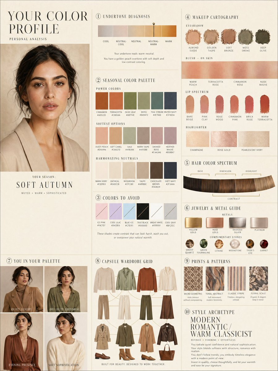
LUXURY PERSONAL COLOR PROFILE — EDITORIAL LAYOUT
Studio portrait of subject as anchor — skin retouched to luminous glass-like perfection, preserved natural structure, realistic pore texture, soft directional key lighting, no facial alteration. Background: warm ecru parchment with subtle linen grain texture. Layout reads like a Vogue Italia beauty supplement printed on heavyweight matte stock. Structured editorial grid, 3-column asymmetric, wide negative space, serif condensed display headers, all labels in spaced uppercase tracking, cohesive warm ivory/sand/ecru background system throughout all panels, ultra-photorealistic 8K, soft diffused studio lighting, flat elegant surfaces, no drop shadows.
PANELS:
① UNDERTONE DIAGNOSIS — Tonal spectrum bar from cool ash to warm amber, precision needle marker on subject's reading. Labels: Cool / Neutral-Cool / Neutral / Neutral-Warm / Warm. Fine annotation text.
② SEASONAL COLOR PALETTE — 10–12 fabric-textured swatches in subject's optimal season. Each labeled with poetic color name and HEX. Grouped: Power Colors / Softest Options / Harmonizing Neutrals.
③ COLORS TO AVOID — Desaturated row of clashing tones with fine editorial strikethrough. Clean, non-harsh presentation.
④ MAKEUP CARTOGRAPHY — Eyeshadow gradient dust swatches / blush tones fanned on skin strip / lip spectrum barely-there to bold / highlighter finishes labeled: champagne, rose gold, pearlescent ivory.
⑤ HAIR COLOR SPECTRUM — Curved gradient strip: base, dimension, highlight, contrast tones. Gold bracket indicators on best options.
⑥ JEWELRY & METAL GUIDE — Flat-lay editorial render: yellow gold, rose gold, oxidized silver, platinum finishes alongside complementary stone tones. Minimal styling.
⑦ YOU IN YOUR PALETTE — 3–4 editorial lookbook frames, subject in palette-correct outfits. Mood labels: Quiet Luxury / Off-Duty Editorial / Evening Presence.
⑧ CAPSULE WARDROBE GRID — Outfit flatlay: tops, bottoms, outerwear, shoes, bag — all palette-correct. Coordinating lines showing interchangeability. Net-a-Porter editorial aesthetic.
⑨ PRINTS & PATTERNS — 4 fabric print thumbnails: micro geometric, tonal abstract, classic stripe, floral scale. One-line styling note per print.
⑩ STYLE ARCHETYPE — Single typographic panel. Style identity title set large (e.g. "Modern Romantic / Warm Classicist"). Three defining aesthetic words. Four-line editorial wardrobe philosophy note.
RENDER SPECS: Ultra-photorealistic, 8K, editorial magazine print quality, warm neutral color grading, soft diffused studio lighting consistent across all panels, one serif display font + one fine sans-serif body font, no gradients, flat matte surfaces only.
奢华个人色彩分析 — 编辑排版
以主体摄影棚肖像为核心 — 皮肤修饰至如玻璃般透亮,保留自然结构与真实的毛孔纹理,采用柔和的定向主光,不对面部进行任何改动。背景:带有细腻亚麻纹理的暖色羊皮纸。排版风格如同印在厚重哑光纸张上的《Vogue Italia》美容增刊。结构化编辑网格,3 列非对称布局,宽阔的留白,衬线体压缩标题,所有标签采用宽字间距大写,所有面板采用统一的暖象牙白/沙色/羊皮纸背景系统,超写实 8K 画质,柔和漫射摄影棚光线,平整优雅的表面,无投影。
面板:
① 色调诊断 — 从冷灰到暖琥珀的色调光谱条,主体读数的精密指针标记。标签:冷色 / 中性偏冷 / 中性 / 中性偏暖 / 暖色。精细标注文字。
② 季节性色彩调色板 — 10–12 个主体最佳季节的织物纹理色卡。每个色卡标注诗意的色彩名称和 HEX 值。分组:能量色 / 最柔和选项 / 协调中性色。
③ 避雷色彩 — 一排去饱和的冲突色调,带有精细的编辑删除线。呈现方式简洁且不刺眼。
④ 美妆图谱 — 眼影渐变粉末色卡 / 皮肤上的腮红试色条 / 从若有似无到大胆的唇色光谱 / 高光质感标注:香槟金、玫瑰金、珠光象牙白。
⑤ 发色光谱 — 弧形渐变条:基色、维度色、高光色、对比色。最佳选项处有金色括号标记。
⑥ 珠宝与金属指南 — 平铺编辑渲染图:黄金、玫瑰金、氧化银、铂金饰面,以及互补的宝石色调。极简造型。
⑦ 你的色彩穿搭 — 3–4 个编辑风格的 Lookbook 框架,主体穿着符合调色板的服装。风格标签:静奢风 / 休闲编辑风 / 晚宴气场。
⑧ 胶囊衣橱网格 — 服装平铺图:上装、下装、外套、鞋履、包袋 — 全部符合调色板。展示互搭性的协调线条。Net-a-Porter 编辑审美。
⑨ 印花与图案 — 4 个织物印花缩略图:微几何、色调抽象、经典条纹、花卉比例。每种印花配有一行造型说明。
⑩ 风格原型 — 单一排版面板。风格标识标题字号放大(例如:“现代浪漫 / 温暖古典”)。三个定义美学的词汇。四行编辑风格的衣橱哲学笔记。
渲染规格:超写实,8K,杂志编辑印刷质量,暖中性色调,所有面板保持一致的柔和漫射摄影棚光线,一种衬线标题字体 + 一种精细无衬线正文字体,无渐变,仅平整哑光表面。