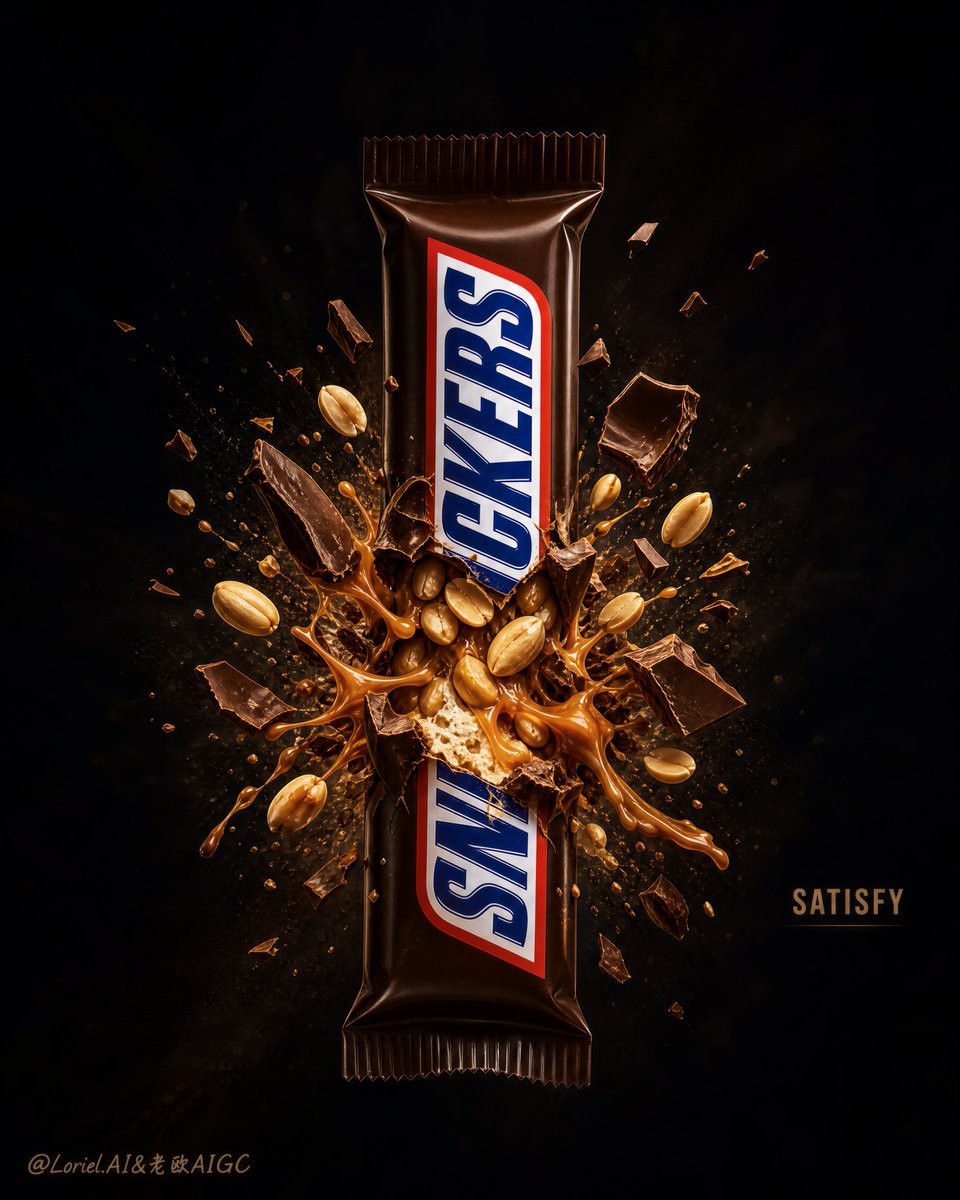
Luxury Candy Explosion Poster
一款超高端商业海报提示词,旨在为产品打造极具戏剧性和高张力的中心爆炸效果。
* compressed center rupture, sharp shell fractures 所有爆发集中在产品中段:外壳先出现清晰、厚薄可见的断裂面,再从裂口向外张开,中心才会有“压力瞬间释放”的力量。 * directional fragment hierarchy, large-to-small radial spread 大块巧克力、花生和内馅先围绕爆点做放射状主碎片;外围再接中碎屑和粉尘,不能所有物体等大小、均匀散开。 * elastic caramel bridges, sparse crumbs and glow dust 焦糖用拉丝把断裂面和飞出的碎片重新连接,少量可见的小颗粒延续运动方向;既有爆发力,又不会显得凌乱。 Create an ultra-premium commercial poster for BABY RUTH, pushing the Milk Cloud Orbit direction to the extreme while further enlarging the dark negative space, intensifying the red-and-gold contrast, and amplifying the central explosion tension. The image must feature one full-size Baby Ruth bar standing vertically in the exact center of the frame as the absolute hero, fully visible, front-facing, and brand-readable. The middle of the bar must burst open in a hyper-realistic explosive reveal, exposing roasted peanuts, dense caramel, nougat, and broken chocolate coating with maximum tactile richness. The final artwork must feel bold, craveable, jewel-like, cinematic, and collector-grade, with stronger center pressure, richer luxury color contrast, and a more dramatic dark-stage presentation. Use English-first branding only, with extremely minimal campaign text so the image remains effect-led. Core composition: Use a tall vertical composition with one Baby Ruth bar placed exactly on the center axis, standing upright and fully readable. Concentrate the explosion tightly around the middle section so all visual energy radiates from the center outward. Expand the surrounding dark empty space even further, letting the hero product and burst occupy a smaller, more concentrated central zone. The composition must feel like a precious object detonating inside luxury darkness, with the center under maximum pressure. Hero product logic: The Baby Ruth bar must read instantly and unmistakably as the hero product. Preserve the recognizable wrapper visibility and brand hierarchy, while allowing the center rupture to reveal the signature interior in extreme realism: thick caramel ribbons, dense roasted peanuts, rich nougat core, and sharply fractured chocolate shell. The product must feel heavy, tactile, indulgent, and physically believable, as if internal pressure has burst it open. Milk Cloud Orbit enhancement: Push all tactile qualities harder. The caramel must feel thicker, glossier, more elastic, and more physically weighted. The peanuts must feel more roasted, more natural, slightly oily, and more dimensional. The chocolate shell must show sharper break edges, denser coating thickness, and smoother premium finish. The nougat must feel denser and more indulgent. Fine crumbs, cocoa dust, and micro-particles must feel more luxurious, precise, and suspended in real space. Every surface should feel touchable and collector-grade. Center explosion tension: This is critical. Intensify the central burst so it feels tighter, more violent, and more visually compressed. The chocolate shell must crack outward with force, caramel must stretch between split surfaces like loaded tension, and peanuts must erupt from the core with believable directional energy. The center of the poster must feel like the single most dramatic millisecond of rupture, frozen in a premium campaign image. Dark negative space: Enlarge the dark surrounding area significantly. The outer frame should fall into rich, luxurious darkness so the eye is forced directly toward the center explosion. The empty space must feel intentional, cinematic, and expensive, making the hero product read more like a lit jewel object on a dark stage. Do not clutter the frame with extra props or large text. Red-and-gold color impact: Push the red-gold campaign atmosphere much harder. Keep the authentic Baby Ruth wrapper recognizable, but let the surrounding lighting, shadow atmosphere, and explosion field shift into a more intense burnt crimson, deep cherry red, antique gold, and dark cocoa palette. The contrast between deep red shadow and golden caramel highlights must feel richer, hotter, and more luxurious than before, while still staying premium and controlled. Typography and branding: Use English-first typography with an extremely short headline only, such as “BREAK THE CRAVE” or “GOLDEN IMPACT”. Keep the text minimal, discreet, and secondary to the product. The Baby Ruth logo on the wrapper remains the dominant readable brand element. The layout must feel like a polished global candy campaign, not a retail sale poster. Background: Use a clean abstract luxury background built from deep crimson-brown, black cherry, dark cocoa, and warm shadow gradients. The background must remain stage-like and uncluttered, with only soft atmospheric depth and subtle tonal movement if needed. Everything must support the central bar and its burst. Lighting: Use extremely delicate but high-impact commercial lighting. Let a warm controlled key light shape the wrapper, caramel gloss, chocolate fractures, peanut surfaces, and floating particles with premium highlight rolloff. Add subtle gold-toned separation light around the explosion zone to carve the fragments out from the dark red background. The lighting must feel cinematic, rich, and expensive. Material realism: Push realism to the maximum. The wrapper must feel tactile and physically real. The chocolate shell must show believable thickness, smooth coating, and sharp broken edges. Caramel must feel sticky, heavy, elastic, and glossy. Peanuts must show roasted surface texture, natural irregularity, and subtle oil sheen. Nougat must feel dense and rich. Dust and crumbs must feel physically suspended and weighty. Mood: explosive indulgence, red-gold luxury tension, premium candy drama, jewel-like center impact, cinematic craving, collector-grade snack campaign. Rendering style: ultra-premium candy advertising poster, Milk Cloud Orbit enhancement, centered vertical Baby Ruth bar, intensified middle explosion reveal, enlarged dark negative space, stronger red-and-gold campaign contrast, floating peanuts and caramel burst, broken chocolate shell, minimal campaign text, cinematic commercial lighting, world-class product realism, 8k. Negative prompt: cartoon explosion, fake caramel, weak brand visibility, blurry wrapper, cluttered composition, cheap supermarket flyer style, bright busy background, low-detail peanuts, plastic-looking chocolate, excessive text, cropped product, distorted logo, low-resolution texture, chaotic debris, weak center impact, insufficient negative space
创作一张超高级 BABY RUTH 商业海报,将 Milk Cloud Orbit 方向推向极致:扩大深色留白、强化红金对比与中央爆裂张力。竖版构图,恰好一根完整尺寸的 Baby Ruth 巧克力棒沿中轴竖直站立,正面朝向观众、包装完整可读,是绝对主角。爆发只集中在产品中段:先出现厚薄清楚、边缘锋利的巧克力外壳断面,再从裂口向外张开,中心呈现压力瞬间释放。主碎片由大块巧克力、烘烤花生和内馅组成,沿爆点放射;外围才出现中小碎屑、可可粉尘与微粒,大小和方向不可均匀。中段露出浓稠焦糖、烘烤花生、致密牛轧糖与破裂巧克力;焦糖厚重、油亮、富有弹性,以拉丝连接断面和飞出碎片。包装、巧克力厚度、焦糖黏性、花生油润纹理和牛轧糖密度都必须触感真实。让产品与爆发占据较小而高度集中的中央区域,外围大面积黑樱桃红、深可可和暗棕渐变留白,像昂贵珠宝在暗舞台中爆开。使用烧焦深红、深樱桃红、古金与可可黑;暖色主光塑造包装、焦糖、断面和花生,爆点周围加入克制金色分离光。文字极少,仅可用“BREAK THE CRAVE”或“GOLDEN IMPACT”之类短英文,且包装上的 Baby Ruth 标志是最主要品牌。整体大胆、诱人、珠宝感、电影级、收藏级、8K 商业写实。避免卡通爆炸、假焦糖、模糊包装、拥挤道具、廉价超市传单、明亮杂乱背景、低细节花生、塑料巧克力、过多文字、裁切产品、扭曲标志、混乱碎片、无力爆点或不足留白。
초고급 BABY RUTH 상업 포스터. Milk Cloud Orbit 방향을 극대화해 어두운 여백, 빨강과 금색의 대비, 중앙 폭발의 긴장감을 더 강하게 만든다. 세로 구도에서 풀사이즈 Baby Ruth 바 정확히 1개를 중앙축에 수직으로 세우고 정면을 향하게 하며, 전체와 포장이 선명하게 읽히는 절대적 주인공으로 둔다. 폭발은 제품 중간에만 집중한다. 먼저 두께가 보이는 날카로운 초콜릿 껍질 파단면이 생기고 균열에서 바깥으로 벌어지며 중앙 압력이 순간 해방된다. 큰 초콜릿 조각, 구운 땅콩, 속재료를 주 파편으로 방사하고 바깥쪽에만 중소 조각, 코코아 먼지, 미세 입자를 이어 간다. 모든 조각을 같은 크기나 균일한 간격으로 흩뿌리지 않는다. 중앙에서 진한 캐러멜, 구운 땅콩, 밀도 높은 누가, 깨진 초콜릿을 노출한다. 캐러멜은 두껍고 무겁고 광택과 탄성이 있으며 실처럼 늘어나 파단면과 날아가는 조각을 연결한다. 포장, 초콜릿 두께, 캐러멜의 점성, 땅콩의 기름진 표면, 누가의 밀도를 만질 수 있을 만큼 사실적으로 표현한다. 제품과 폭발은 작고 압축된 중앙 영역에 배치하고, 바깥은 블랙 체리, 다크 코코아, 짙은 갈색의 넓은 어둠으로 남겨 보석이 고급 무대에서 폭발하는 느낌을 준다. 번트 크림슨, 짙은 체리 레드, 앤티크 골드, 코코아 블랙 팔레트. 따뜻한 키라이트로 포장, 캐러멜, 파단면, 땅콩을 조형하고 폭발 주변에는 절제된 금빛 분리광을 더한다. 문구는 “BREAK THE CRAVE” 또는 “GOLDEN IMPACT” 같은 짧은 영어만 허용하며 포장의 Baby Ruth 로고가 가장 강한 브랜드 요소다. 대담하고 군침 도는 보석 같은 영화적 8K 상업 사실주의. 만화 폭발, 가짜 캐러멜, 흐린 포장, 복잡한 소품, 저가 전단, 밝고 산만한 배경, 저품질 땅콩, 플라스틱 같은 초콜릿, 과도한 문구, 잘린 제품, 왜곡된 로고, 혼란스러운 파편, 약한 폭발 중심, 부족한 여백을 피한다.