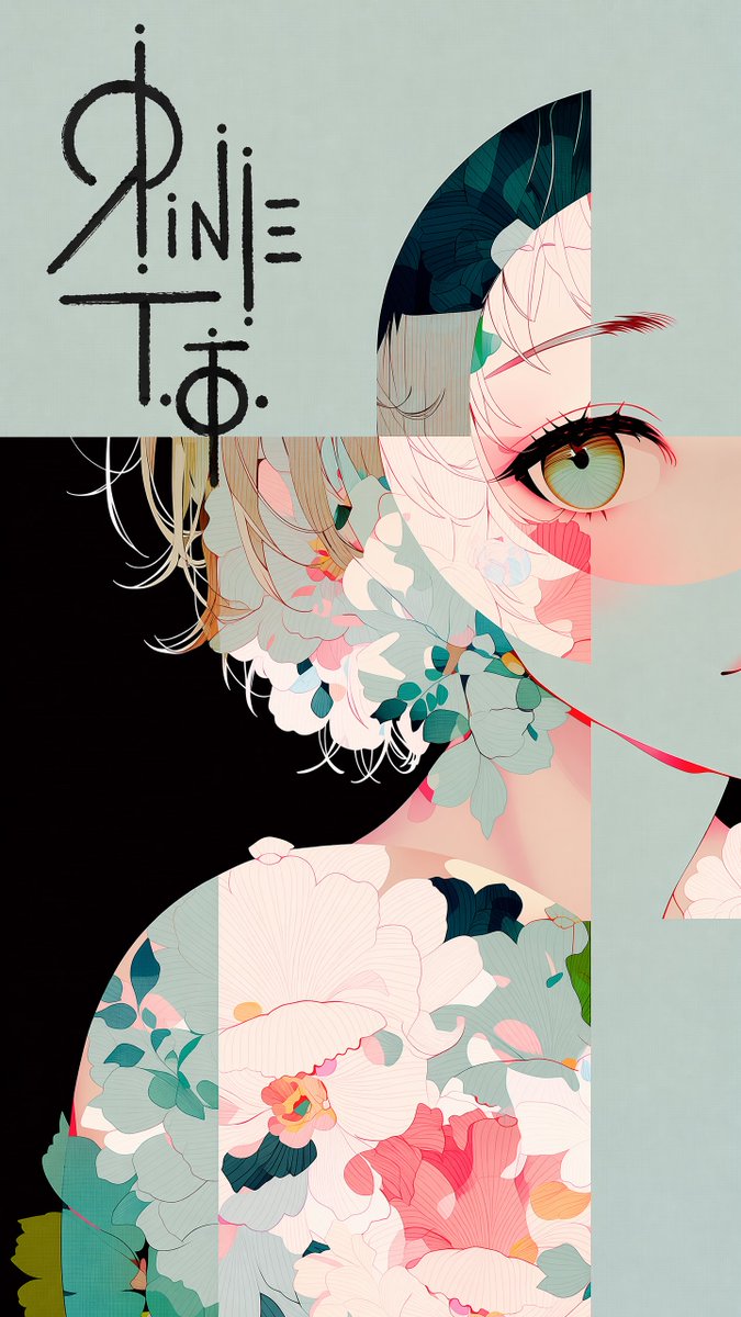
Logo 集成与马克笔叠加效果
这是一条用于 GPT Image 2 的技术提示词,旨在将 Logo 集成到现有插图中,并保持手绘马克笔风格及对比度。
The first image is an illustration. The second image contains a logo design on a black background.

Place the logo in the largest open, uncluttered area of the illustration — the zone with the fewest lines, shapes, and visual elements. {argument name="placement note" default="[※ここに配置場所を一言追記]"}

Reproduce the exact logo design from the second image. Render it bold and large, with rough hand-drawn strokes — as if signed directly onto the surface with a thick marker. Allow it to overflow slightly beyond the open area into adjacent illustrated content.

Color rule: The logo color must always contrast against the background directly beneath it. Use dark lines over light backgrounds, light lines over dark backgrounds. Shift color mid-stroke if the logo crosses multiple background tones. Never let the logo blend into the surrounding color.

Do not alter the illustration in any other way. Preserve all original colors, lines, and composition exactly.
第一张图片为插图。第二张图片包含黑色背景上的 Logo 设计。
将 Logo 放置在插图中最大、最整洁的空白区域——即线条、形状和视觉元素最少的区域。{argument name="placement note" default="[在此处添加关于放置位置的简要说明]"}
复刻第二张图片中的 Logo 原样。以粗犷的手绘笔触进行渲染,呈现出如同用粗马克笔直接在表面签名般的效果。允许 Logo 略微溢出空白区域,延伸至相邻的插图内容中。
颜色规则:Logo 颜色必须始终与下方的背景形成对比。在浅色背景上使用深色线条,在深色背景上使用浅色线条。如果 Logo 跨越多种背景色调,请在笔触中途切换颜色。切勿让 Logo 与周围颜色融合。
请勿以任何其他方式修改插图。请务必完整保留所有原始颜色、线条和构图。