平等合作商业信息图
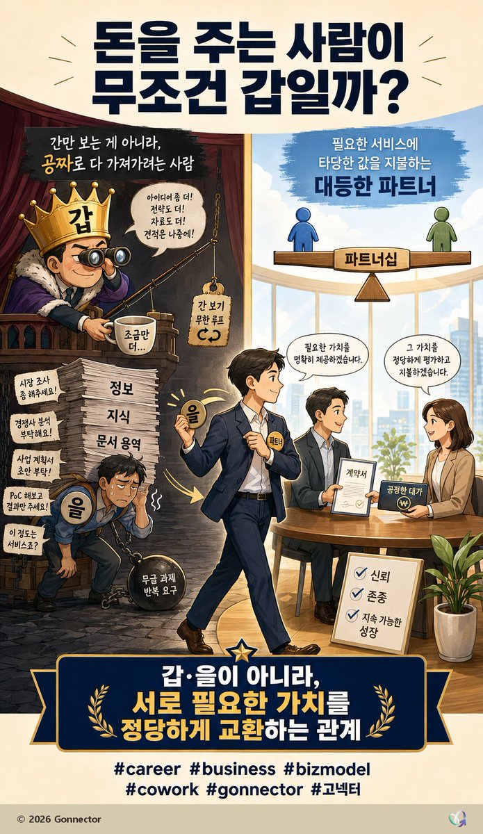
一张韩语垂直商业信息图,旨在阐述剥削性客户关系与公平价值导向型伙伴关系之间的区别。
Goal: Create a vertical Korean editorial infographic poster about business relationships, contrasting an exploitative “client as boss / vendor as subordinate” mindset with a fair partnership based on exchanging value. Use a polished GPT-image style digital illustration with clear Korean typography, warm lighting, and a split-scene narrative.

Canvas: Vertical 9:16 poster, cream paper background, high-resolution, suitable for a social media post. Main palette: navy, gold, cream, warm brown, sky blue, and business-office neutrals.

Top headline: Large bold dark navy Korean headline centered at the top: {argument name="headline text" default="돈을 주는 사람이\n무조건 갑일까?"}. Add small decorative radiating lines on both sides.

Layout: Divide the central image into two contrasting halves. Left half is dark, cramped, theatrical, and exploitative; right half is bright, airy, professional, and collaborative. A central walking businessman bridges the two worlds, moving from left to right. Bottom contains a large navy-and-gold banner statement and hashtags.

Left half, exploitative side: Show a smug king-like client on a balcony wearing a gold crown labeled “갑”, holding binoculars and fishing for free value. He sits in a dark red-brown booth with dramatic shadows. Include a speech bubble saying “아이디어 좀 더!\n전략도 더!\n자료도 더!\n견적은 나중에!” and a small hanging sign saying “간 보기\n무한 루프”. Near him, show a cup labeled “조금만 더...”. Below, depict an exhausted worker labeled “을”, hunched over and chained to a heavy black ball labeled “무급 과제\n반복 요구”. He carries the burden while standing beside a tall stack of papers labeled in three visible layers: “정보”, “지식”, “문서 용역”. Include exactly 5 small request notes on the left wall/stack area: 1) “시장 조사\n좀 해주세요!”, 2) “경쟁사 분석\n부탁해요!”, 3) “사업 계획서\n초안 부탁!”, 4) “PoC 해보고\n결과만 주세요!”, 5) “이 정도는\n서비스죠?” At the top of this left scene write: “간만 보는 게 아니라,\n공짜로 다 가져가려는 사람”, with “공짜로” emphasized in gold.

Right half, partnership side: Show a bright modern office with large windows, city skyline, blue sky, and a clean round meeting table. At the top, a balance scale diagram shows two simple human icons on a wooden seesaw: blue figure on the left and green figure on the right, balanced equally. The center support is labeled “파트너십”. Above it write: “필요한 서비스에\n타당한 값을 지불하는\n대등한 파트너”, emphasizing “대등한 파트너” in bold navy. At the meeting table, show exactly 3 professionals: one seated man holding a contract, one seated woman smiling and holding a payment card or payment symbol, and the central walking man approaching as the partner. Add speech bubbles: from the central/left professional, “필요한 가치를\n명확히 제공하겠습니다.” and from the woman, “그 가치를\n정당하게 평가하고\n지불하겠습니다.” Include a document labeled “계약서”, a payment object labeled “공정한 대가”, and a floor sign with exactly 3 checkmarked values: “신뢰”, “존중”, “지속 가능한\n성장”. Add a potted plant at lower right.

Central character: A confident Korean businessman in a navy suit walks from the dark left side into the bright right side, holding a glowing coin labeled “을” in one hand and wearing a small badge labeled “파트너”. He should look calm, empowered, and optimistic, symbolizing transition from subordinate vendor to equal partner.

Bottom banner: Large dark navy ribbon plaque with gold trim, a central star at the top, and two gold laurel branches. Main Korean statement in bold white and gold: {argument name="bottom statement" default="갑·을이 아니라,\n서로 필요한 가치를\n정당하게 교환하는 관계"}. Below the banner, include exactly 6 hashtags in dark navy: {argument name="hashtags" default="#career  #business  #bizmodel\n#cowork  #gonnector  #고넥터"}. Footer: small text at bottom left “© 2026 Gonnector” and a tiny abstract multicolor logo at bottom right.

Visual style: Semi-realistic editorial cartoon illustration, clean linework, Korean webtoon-infographic influence, cinematic lighting contrast between left and right, high readability, crisp typography, professional business storytelling. Make the text look intentionally designed and aligned, not random.

Constraints: Keep all Korean text legible and spelled as written. Use exactly the counted elements: 5 request notes, 3 paper-stack labels, 3 meeting professionals, 3 checklist values, 6 hashtags, and 2 contrasting halves. Avoid extra characters, extra hashtags, watermarks, distorted faces, or nonsensical text.
目标:创作一张垂直的韩语商业/职业信息图海报,对比“客户是老板,员工是下属”的剥削心态与平等合作心态。采用精致的编辑插画风格,结合半写实卡通人物、戏剧性的分屏叙事以及醒目的韩语排版。
画布:垂直 9:16 海报,暖色调奶油纸背景,高分辨率,清晰且适合打印的构图。顶部三分之一处包含醒目的深蓝色韩语标题:{argument name="headline text" default="돈을 주는 사람이\n무조건 갑일까?"}(意为:付钱的人就一定是“甲”吗?)。在标题周围添加细小的放射状强调线。
布局:将主插画分为左右两个垂直部分。左侧色调阴暗、拥挤、呈红褐色,充满压抑感;右侧明亮、通透、呈蓝色,展现专业感。一名处于中心位置的商务人士连接着两个世界,从左向右走,手中拿着一枚标有“을”(乙)的金币,佩戴着写有“파트너”(合作伙伴)的小徽章。
左侧部分,剥削性关系:展示 1 位傲慢的客户形象,如同国王般的“甲”:一个戴着标有“갑”(甲)字金冠、身穿毛皮镶边长袍的自负男子,在升高的阳台上用双筒望远镜钓鱼,象征着“试探底线”。在他上方添加韩语文字:“간만 보는 게 아니라, 공짜로 다 가져가려는 사람.”(不仅是试探,还想免费拿走一切的人)。他的对话气泡应写道:“아이디어 좀 더! 전략도 더! 자료도 더! 견적은 나중에!”(再多点创意!再多点策略!再多点资料!报价以后再说!)。在鱼钩附近添加 1 个悬挂标签,写着“간 보기 무한 루프”(无限试探循环)。在他下方展示 1 位过度劳累的下属员工,标注为“을”(乙),弯腰驼背、精疲力竭,被锁链锁在一个标有“무급 과제 반복 요구”(无偿任务重复要求)的沉重黑色球体上。在员工旁边放置一叠高高的文件,贴有三个大标签:“정보”(信息)、“지식”(知识)、“문서용역”(文档服务)。在文件堆周围,包含 5 张小需求便条:“시장 조사 좀 해주세요!”(请帮我做市场调查!)、“경쟁사 분석 부탁해요!”(拜托分析一下竞争对手!)、“사업 계획서 초안 부탁!”(请提供商业计划书草案!)、“PoC 해보고 결과만 주세요!”(做完 PoC 只把结果给我就行!)、“이 정도는 서비스죠?”(这点程度算服务吧?)。使用昏暗的灯光、破裂的石地板、阴影、压力标记,营造出一种被剥削的感觉。
右侧部分,合作关系:展示一个明亮的现代办公会议区,配有大窗户、天蓝色背景、城市天际线、室内植物和圆木桌。在右上角绘制一个蓝色笔触面板,内容为:“필요한 서비스에 타당한 값을 지불하는 대등한 파트너.”(为所需服务支付合理费用的平等伙伴)。在会议桌上方展示一个标有“파트너십”(伙伴关系)的平衡秤,秤的两端各有 2 个简单的图标人物,一个蓝色一个绿色,保持平衡。在桌旁展示 3 位商务人士:一位坐着的男性专业人士拿着标有“계약서”(合同)的文件,一位微笑的女性客户正在递交或展示一张标有“공정한 대가 ₩”(公平报酬 ₩)的支付卡/标识,以及作为平等伙伴到达的中心商务人士。添加 2 个对话气泡:“필요한 가치를 명확히 제공하겠습니다.”(我将明确提供所需的价值。)和“그 가치를 정당하게 평가하고 지불하겠습니다.”(我将公正地评估并支付该价值。)在桌子附近放置一个画架标志,上面有 3 个勾选的价值观:“신뢰”(信任)、“존중”(尊重)、“지속 가능한 성장”(可持续增长)。
底部横幅:添加一个带有金色饰边和月桂树装饰的深蓝色丝带牌匾。主要信息采用醒目的韩语大字体:{argument name="bottom slogan" default="갑·을이 아니라,\n서로 필요한 가치를\n정당하게 교환하는 관계"}(意为:不是“甲乙”关系,而是相互公平交换所需价值的关系)。在下方包含深蓝色标签:{argument name="hashtag line" default="#career #business #bizmodel\n#cowork #gonnector #고넥터"}。在左下角添加小字版权声明:“© 2026 Gonnector”,右下角添加一个微小的抽象彩色标志。
视觉风格:韩语编辑信息图,细腻的数字绘画,富有表现力的人物面部,干净的矢量风格排版与绘画质感相结合,深色剥削左侧与明亮协作右侧形成强烈对比,暖金色点缀,深蓝色排版,专业的 LinkedIn 风格商务插画。
约束条件:所有可见的韩语文字必须完全按照指定内容书写。确保标题醒目且易读。包含并统计以下指定元素:1 位傲慢的戴冠客户,1 位精疲力竭的下属员工,1 位中心行走的合作伙伴,右侧总共 3 位会议参与者,2 个平衡秤图标,5 张需求便条,3 个文件堆标签,右侧 2 个对话气泡,以及 3 个勾选的价值观。除标签和版权声明外,不得出现额外的英文替换文本。