日本护肤品广告对比
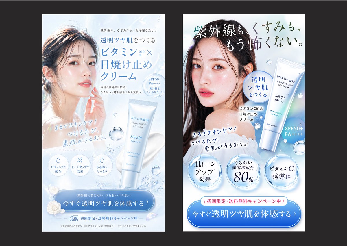
通过对比两款日本防晒霜美容广告,展示精致创意与侧重转化的广告设计之间的差异。
Create a side-by-side comparison image showing 2 vertical Japanese skincare advertisement banners on a dark charcoal background, each banner framed as a clean smartphone-style ad mockup with a white and icy blue beauty aesthetic. The left banner should look elegant and visually polished but less sales-driven: a soft backlit close-up of a woman with wet-looking dark hair and luminous bare skin, her face partially obscured by a centered rectangular blur block, pale blue water textures, floating droplets, a white-and-silver sunscreen tube labeled {argument name="product name" default="VITA LUMIÈRE"} near the lower right, refined Japanese serif and sans-serif typography, and a large blue rounded CTA button at the bottom. Include the headline in Japanese: 「透明ツヤ肌をつくる ビタミンC×日焼け止めクリーム」, small supporting copy above and below, 3 circular benefit icons near the lower middle, the handwritten-style subcopy 「まるでスキンケア!つけるたび、素肌がうるおう。」, and a bottom CTA button reading 「今すぐ透明ツヤ肌を体感する」. The right banner should be a stronger direct-response version of the same product and model, with clearer hierarchy, bolder copy, and more persuasive conversion elements: a larger dramatic Japanese headline across the top reading 「紫外線も、くすみも、もう怖くない。」, the same model again with a centered rectangular blur over the face, the product tube shown larger on the right, a blue speech-bubble badge reading 「透明ツヤ肌をつくる」, the same handwritten-style subcopy angled across the chest area, 3 large glossy circular claim badges along the lower middle reading 「肌トーンアップ効果」, 「うるおい美容液成分80%」, and 「ビタミンC誘導体」, plus a pink campaign strip above the CTA reading 「初回限定・送料無料キャンペーン中」. The right CTA button should be larger and more prominent, reading 「今すぐ透明ツヤ肌を体感する」. Use a bright cool palette of white, ice blue, silver, and faint holographic highlights, realistic cosmetic product rendering, soft water splash accents, translucent bubbles, premium Japanese beauty-ad styling, high contrast between headline and CTA, and a clear visual impression that the right ad is more persuasive and conversion-optimized than the left.创建一张并排对比图,在深炭灰色背景上展示 2 个竖版日本护肤品广告横幅,每个横幅均采用简洁的智能手机风格广告模型,并呈现白色与冰蓝色的美容美学。左侧横幅应看起来优雅且视觉精致,但销售导向较弱:采用柔和背光特写,展示一位湿发、皮肤透亮女性的半身像,其面部被居中的矩形模糊块遮挡,配以淡蓝色水纹理、漂浮的水滴,右下角放置一支标有 {argument name="product name" default="VITA LUMIÈRE"} 的白银色防晒霜管,采用精致的日文衬线体和无衬线字体,底部设有一个大的蓝色圆角 CTA 按钮。包含日文标题:「透明ツヤ肌をつくる ビタミンC×日焼け止めクリーム」,上方和下方附有简短的辅助文案,中下方有 3 个圆形功效图标,手写风格的副标题「まるでスキンケア!つけるたび、素肌がうるおう。」,以及底部显示「今すぐ透明ツヤ肌を体感する」的 CTA 按钮。右侧横幅应为同一产品和模特的强力直接响应版本,具有更清晰的层级、更醒目的文案和更具说服力的转化元素:顶部横跨更大的日文标题「紫外線も、くすみも、もう怖くない。」,同样的模特面部带有居中矩形模糊,产品管在右侧显示得更大,配有一个写着「透明ツヤ肌をつくる」的蓝色气泡徽章,胸部区域倾斜放置同样的手写风格副标题,中下方排列 3 个大型光泽圆形声明徽章,分别写着「肌トーンアップ効果」、「うるおい美容液成分80%」和「ビタミンC誘導体」,CTA 按钮上方增加一条粉色活动横幅,写着「初回限定・送料無料キャンペーン中」。右侧的 CTA 按钮应更大且更突出,文案为「今すぐ透明ツヤ肌を体感する」。使用白色、冰蓝色、银色和淡淡全息高光的明亮冷色调,结合逼真的化妆品渲染、柔和的水花装饰、半透明气泡、高级日本美容广告风格,确保标题与 CTA 之间具有高对比度,并清晰传达出右侧广告比左侧广告更具说服力和转化优化效果的视觉印象。