日系恋爱应用广告面板
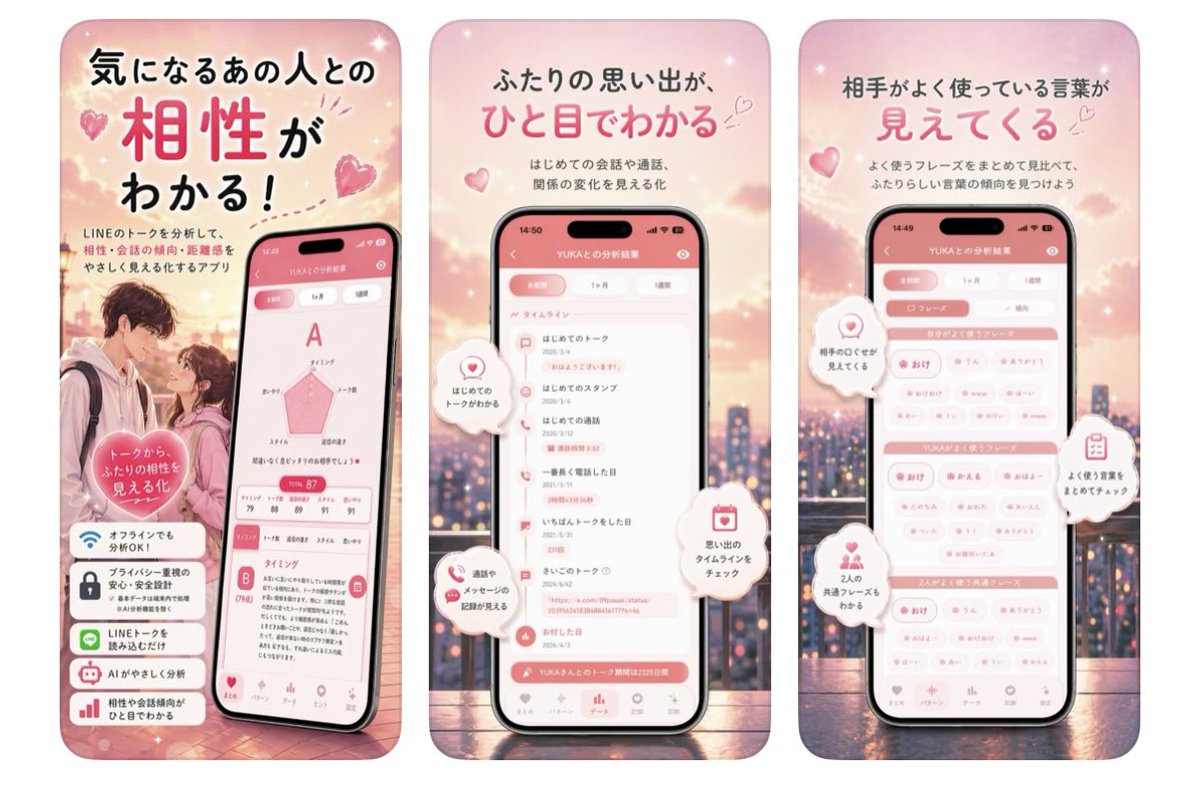
一组三联粉色系日本移动应用广告,展示了关系匹配度、时间线回忆以及常用词分析功能。
Goal: Create a three-panel vertical Japanese app promotion graphic for a romantic LINE-chat analysis app, using a soft pink dating aesthetic.

Canvas: Wide horizontal composition containing exactly 3 tall rounded-rectangle poster panels side by side, each like a smartphone ad card. Use a dreamy sunset cityscape background with pink clouds, bokeh lights, sparkles, floating hearts, and a warm romantic glow. Overall palette is blush pink, coral, white, and soft peach.

Panel 1: Left panel introduces compatibility analysis. Large Japanese headline at top: 「気になるあの人との 相性が わかる!」 with 「相性」 oversized in bright pink. Smaller copy below: 「LINEのトークを分析して、相性・会話の傾向・距離感をやさしく見える化するアプリ」. Show a blurred-face young couple standing close at lower left, and a tilted smartphone at lower right displaying a compatibility result screen with a large grade “A”, a pink radar chart, a score around 87, and detailed analysis cards. Add a pink heart badge over the couple reading 「トークから ふたりの相性を 見える化」. Add exactly 4 stacked feature cards at the bottom-left with icons and Japanese text: 1) Wi-Fi icon 「オフラインでも分析OK!」, 2) lock icon 「プライバシー重視の安心・安全設計」, 3) LINE chat icon 「LINEトークを読み込むだけ」, 4) robot icon 「AIがやさしく分析」.

Panel 2: Center panel focuses on relationship timeline. Large Japanese headline: 「ふたりの思い出が、ひと目でわかる」 with 「ひと目でわかる」 in bright pink. Smaller copy: 「はじめての会話や通話、関係の変化を見る化」. Center a front-facing smartphone showing an app screen titled like 「YUKAとの分析結果」 with a pink header and a vertical timeline list. Include exactly 4 floating white speech-bubble callouts with pink icons: 1) heart icon 「はじめてのトークがわかる」, 2) chat/phone icon 「通話やメッセージの記録が見える」, 3) calendar icon 「思い出のタイムラインをチェック」, 4) small heart/spark icon near the screen indicating memories. Keep the phone UI legible but stylized, with bottom navigation icons.

Panel 3: Right panel focuses on frequently used words. Large Japanese headline: 「相手がよく使っている言葉が 見えてくる」 with 「見えてくる」 in bright pink. Smaller copy: 「よく使うフレーズをまとめて見比べて、ふたりらしい言葉の傾向を見つけよう」. Center a front-facing smartphone showing a pink-and-white keyword dashboard with grouped pill tags and section bars for the user and partner. Add exactly 4 floating white callout bubbles with pink icons: 1) heart icon 「相手のことが見えてくる」, 2) clipboard icon 「よく使う言葉をまとめてチェック」, 3) two-person icon 「2人の共通フレーズもわかる」, 4) small heart bubble as decorative accent.

Visual style: Polished Japanese mobile app advertisement, cute romantic UI design, glossy smartphone mockups, rounded corners, soft shadows, subtle sparkles, hearts, and bokeh. Use a clean rounded Japanese sans-serif font; emphasize key headline words in hot pink while other text is dark charcoal. Faces in the couple photo should be intentionally blurred for privacy.

Constraints: Use exactly 3 poster panels, exactly 3 smartphones, exactly 4 feature cards in the first panel, and exactly 4 floating callouts in each of the second and third panels. Do not add extra panels, watermarks, QR codes, or brand logos beyond the LINE mention in the Japanese copy.
目标:为一款浪漫的 LINE 聊天分析应用制作三联式竖版日本应用推广图,采用柔和的粉色约会美学。

画布:宽幅横向构图,包含 3 个并排的圆角长方形海报面板,每个面板呈现为智能手机广告卡片样式。背景使用梦幻般的日落城市景观,配以粉色云朵、虚化光斑、闪光点、漂浮的心形图案以及温暖的浪漫光晕。整体色调为淡粉色、珊瑚色、白色和柔桃色。

面板 1:左侧面板介绍匹配度分析。顶部大号日文标题:「気になるあの人との 相性が わかる!」(了解与心仪之人的匹配度!),其中「相性」二字放大并使用亮粉色。下方小字说明:「LINEのトークを分析して、相性・会話の傾向・距離感をやさしく見える化するアプリ」(通过分析 LINE 对话,轻松可视化匹配度、对话倾向及距离感的应用)。左下方展示一对面部模糊的年轻情侣,右下方展示一台倾斜的智能手机,屏幕显示匹配度结果界面,包含大号“A”级评分、粉色雷达图、约 87 分的得分以及详细的分析卡片。在情侣上方添加一个粉色心形徽章,文字为「トークから ふたりの相性を 見える化」(从对话中可视化两人的匹配度)。左下方添加 4 张堆叠的功能卡片,配有图标和日文说明:1) Wi-Fi 图标「オフラインでも分析OK!」(离线也能分析!),2) 锁图标「プライバシー重視の安心・安全設計」(注重隐私的安心安全设计),3) LINE 聊天图标「LINEトークを読み込むだけ」(只需导入 LINE 对话),4) 机器人图标「AIがやさしく分析」(AI 贴心分析)。

面板 2:中间面板聚焦于关系时间线。大号日文标题:「ふたりの思い出が、ひと目でわかる」(两人的回忆,一目了然),其中「ひと目でわかる」使用亮粉色。小字说明:「はじめての会話や通話、関係の変化を見る化」(将初次对话、通话及关系变化可视化)。居中放置一台正面的智能手机,显示应用界面,标题为「YUKAとの分析結果」(与 YUKA 的分析结果),配有粉色页眉和垂直时间线列表。包含 4 个漂浮的白色气泡标注,配有粉色图标:1) 心形图标「はじめてのトークがわかる」(了解初次对话),2) 聊天/电话图标「通話やメッセージの記録が見える」(查看通话及消息记录),3) 日历图标「思い出のタイムラインをチェック」(查看回忆时间线),4) 屏幕附近的小心形/闪光图标作为装饰。保持手机 UI 清晰且风格化,底部带有导航图标。

面板 3:右侧面板聚焦于常用词汇。大号日文标题:「相手がよく使っている言葉が 見えてくる」(对方常用的词汇,清晰可见),其中「見えてくる」使用亮粉色。小字说明:「よく使うフレーズをまとめて見比べて、ふたりらしい言葉の傾向を見つけよう」(汇总并对比常用短语,发现属于两人的语言倾向)。居中放置一台正面的智能手机,显示粉白配色的关键词仪表盘,包含分组的胶囊标签以及用户与对方的对比栏。添加 4 个漂浮的白色气泡标注,配有粉色图标:1) 心形图标「相手のことが見えてくる」(更了解对方),2) 剪贴板图标「よく使う言葉をまとめてチェック」(汇总查看常用词),3) 双人图标「2人の共通フレーズもわかる」(了解两人的共同短语),4) 小心形气泡作为装饰点缀。

视觉风格:精致的日系移动应用广告,可爱的浪漫 UI 设计,光泽感手机样机,圆角设计,柔和阴影,细微的闪光、心形和虚化效果。使用简洁的圆体日文字体;标题关键词使用亮粉色强调,其余文字为深炭灰色。情侣照片中的面部应进行模糊处理以保护隐私。

限制:必须使用 3 个海报面板,3 台智能手机,第一个面板包含 4 张功能卡片,第二和第三个面板各包含 4 个漂浮标注。除日文文案中提及的 LINE 外,不得添加额外的面板、水印、二维码或品牌 Logo。