日语提示词技巧 Slides
创建一张日语教学演示 Slides,展示夏季促销横幅提示词的“反面教材”与“正面教材”,并呈现最终的极简海军蓝横幅效果。
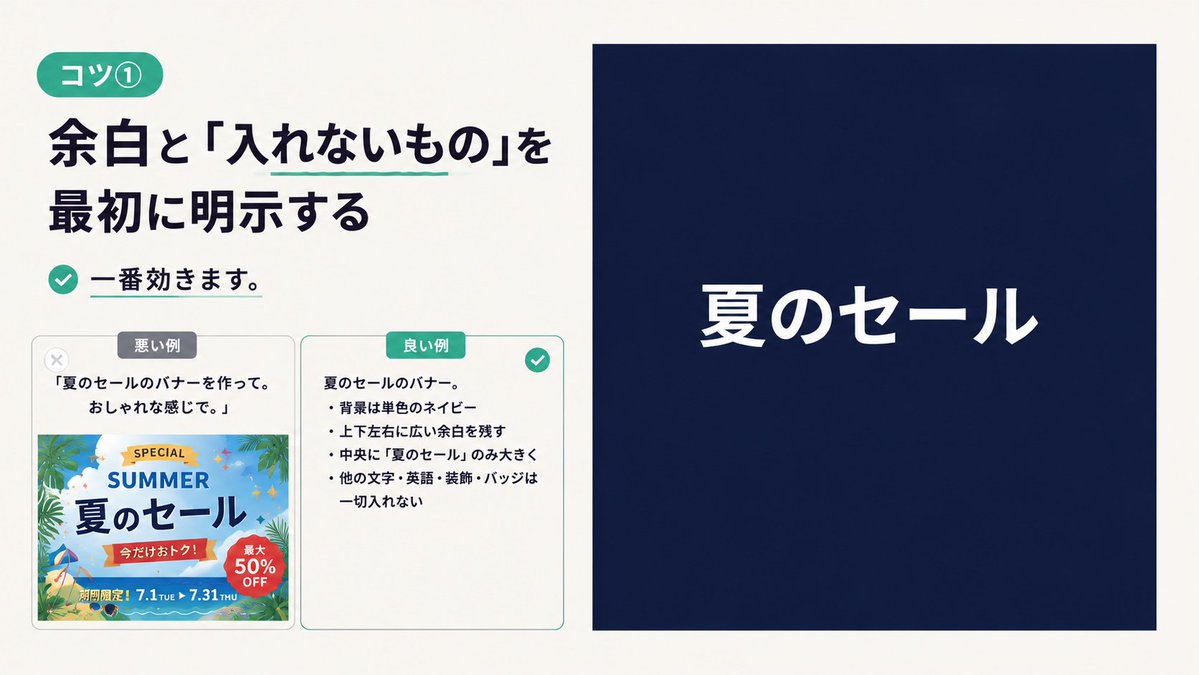
Goal: Create a clean Japanese instructional slide about prompt-writing tip {argument name="tip number" default="コツ①"}, explaining that whitespace and excluded elements should be stated first.

Canvas: 16:9 horizontal presentation slide, warm off-white background, generous margins, modern minimalist editorial layout. Use dark navy text and teal accents.

Layout: Split the slide into two main columns. The left column takes about 48% width and contains the lesson text plus two comparison cards. The right column takes about 47% width and shows a large example banner: a solid navy rectangle with only one centered white headline.

Left column details: At top left, place a rounded teal pill label reading {argument name="badge text" default="コツ①"}. Below it, use a large bold Japanese headline in dark navy: {argument name="main headline" default="余白と「入れないもの」を最初に明示する"}. Add a thin teal underline only under the phrase 「入れないもの」. Under the headline, place a teal circular check icon followed by bold text: 「一番効きます。」 with a short teal underline beneath the sentence.

Comparison section: Below the lesson text, place exactly 2 rounded rectangular cards side by side with light gray borders. Card 1 is the bad example, labeled with a small gray pill 「悪い例」 at the top and a pale gray X icon near the upper-left corner. It contains the quote 「夏のセールのバナーを作って。おしゃれな感じで。」 and below it a busy colorful summer-sale banner thumbnail with palm leaves, beach colors, decorative badges, English words, discount circles, dates, and many small ornaments; visible text includes “SPECIAL”, “SUMMER”, 「夏のセール」, 「今だけおトク!」, 「最大50% OFF」, and 「期間限定!7.1 TUE ▶ 7.31 THU」. Card 2 is the good example, labeled with a teal pill 「良い例」 at the top and a teal check icon at the upper-right corner. It contains a short bullet list in Japanese describing the constraints: 「夏のセールのバナー。」, 「背景は単色のネイビー」, 「上下左右に広い余白を残す」, 「中央に『夏のセール』のみ大きく」, 「他の文字・英語・装飾・バッジは一切入れない」.

Right column example: Create one large solid dark navy rectangle with no border, no decoration, and wide empty space. Center a single white Japanese headline reading {argument name="banner headline" default="夏のセール"}. The text should be large, bold, clean sans-serif, horizontally and vertically centered. Do not add any other text, icons, badges, images, patterns, gradients, or decorative elements inside this right banner.

Visual style: Japanese tech/business education design, crisp typography, high contrast, precise spacing, subtle rounded corners, teal accent color, no watermark. Keep the composition close to a screenshot-like presentation slide.
目标:创建一张简洁的日语教学 Slides,介绍提示词编写技巧 {argument name="tip number" default="コツ①"},说明应优先明确留白和排除元素。
画布:16:9 横向演示 Slides,暖米白色背景,宽裕的页边距,现代极简编辑排版。使用深海军蓝文字和青色点缀。
布局:将 Slides 分为左右两栏。左栏占据约 48% 的宽度,包含课程文本和两张对比卡片。右栏占据约 47% 的宽度,展示一个大型示例横幅:一个纯海军蓝矩形,仅在中心放置一行白色标题。
左栏细节:左上角放置一个圆角青色胶囊标签,文字为 {argument name="badge text" default="コツ①"}。下方使用深海军蓝的大号加粗日语标题:{argument name="main headline" default="余白と「入れないもの」を最初に明示する"}。仅在「入れないもの」短语下方添加一条细青色下划线。标题下方放置一个青色圆形勾选图标,后接加粗文字:「一番効きます。」,并在该句下方添加一条短青色下划线。
对比部分:在课程文本下方,并排放置 2 张带有浅灰色边框的圆角矩形卡片。卡片 1 为反面教材,顶部贴有小型灰色胶囊标签「悪い例」,左上角附近有一个浅灰色 X 图标。内容包含引语「夏のセールのバナーを作って。おしゃれな感じで。」,下方是一个杂乱且色彩丰富的夏季促销横幅缩略图,包含棕榈叶、沙滩色调、装饰性徽章、英文单词、折扣圆圈、日期以及许多小装饰;可见文字包括“SPECIAL”、“SUMMER”、“夏のセール”、“今だけおトク!”、“最大50% OFF”以及“期間限定!7.1 TUE ▶ 7.31 THU”。卡片 2 为正面教材,顶部贴有青色胶囊标签「良い例」,右上角有一个青色勾选图标。内容包含一个日语短列表,描述约束条件:「夏のセールのバナー。」、「背景は単色のネイビー」、「上下左右に広い余白を残す」、「中央に『夏のセール』のみ大きく」、「他の文字・英語・装飾・バッジは一切入れない」。
右栏示例:创建一个大型纯深海军蓝矩形,无边框、无装饰、留有大面积空白。在中心放置一个白色日语标题 {argument name="banner headline" default="夏のセール"}。文字应为大号、加粗、简洁的无衬线字体,水平和垂直居中。右侧横幅内不得添加任何其他文字、图标、徽章、图像、图案、渐变或装饰元素。
视觉风格:日本科技/商业教育设计,排版清晰,高对比度,间距精准,圆角柔和,青色点缀,无水印。构图应接近截图式的演示 Slides。