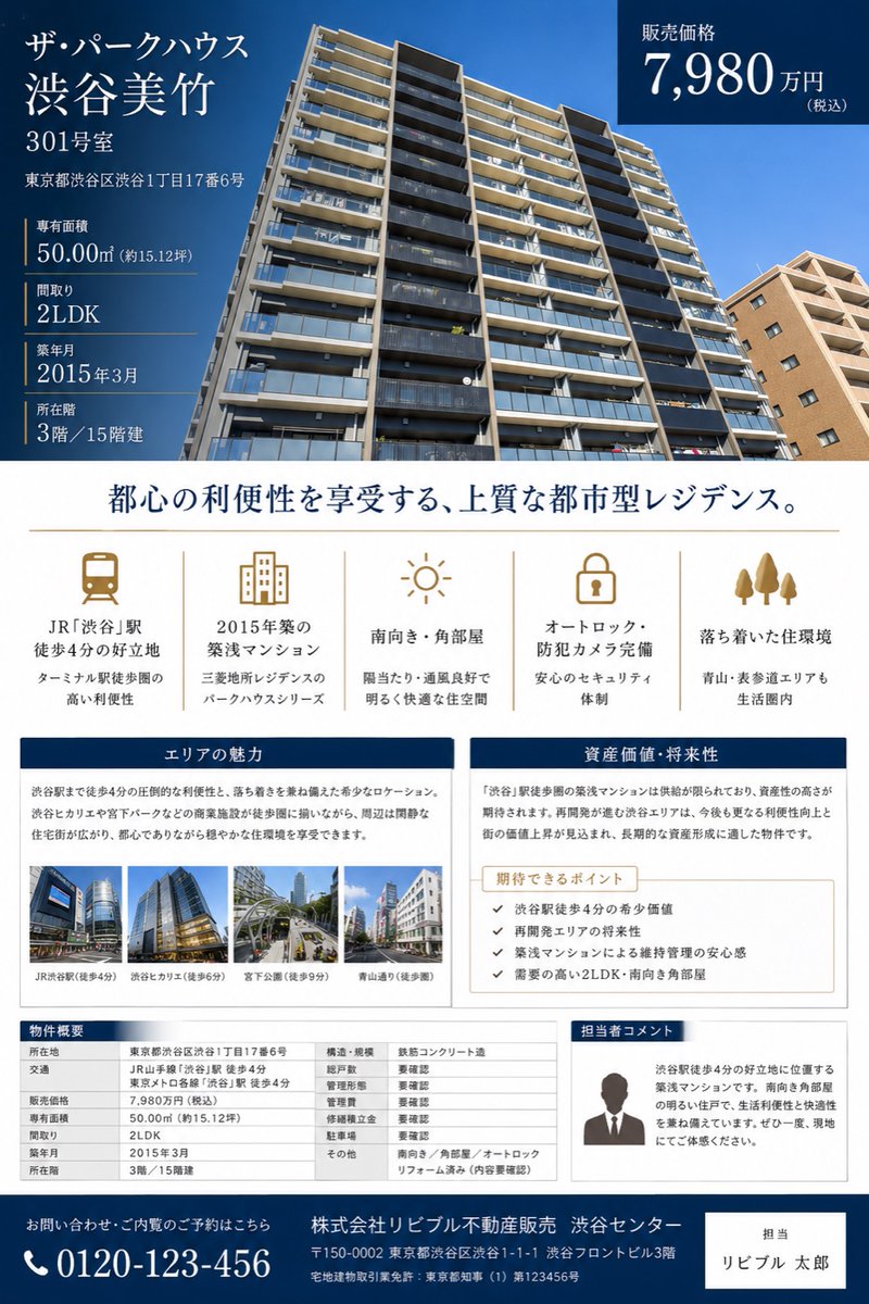
日本豪华公寓销售宣传单
生成一份精美的日本房地产宣传册,用于展示公寓房源,包含价格、特色、区域优势、规格及联系方式。
Goal: Create a polished Japanese real estate sales brochure flyer for a condominium listing, suitable for a property appraisal or sales proposal.

Canvas: Portrait A4 flyer, clean luxury real-estate design, white background with deep navy and muted gold accents. Use elegant Japanese Mincho-style serif typography for headings and readable sans-serif for tables and body copy.

Top hero section: Fill the upper half with a wide low-angle exterior photo of a modern high-rise condominium under a clear blue sky. Overlay a dark navy translucent information block on the left and a dark navy price box on the top right.

Main listing text in the left overlay: Show the building name and unit prominently: 「{argument name="property name" default="ザ・パークハウス 渋谷美竹"}」, 「{argument name="unit number" default="301号室"}」. Beneath it show the address: 「東京都渋谷区渋谷1丁目17番6号」. Then list exactly 5 property specs separated by thin gold rules: dedicated area 「50.00㎡(約15.12坪)」, floor plan 「2LDK」, construction date 「2015年3月」, floor 「3階/15階建」, and other listing details as compact real-estate facts.

Top-right price box: Dark navy rectangle with white text reading 「販売価格」 and the large price 「{argument name="sale price" default="7,980万円"}」 with small 「(税込)」.

Center headline: Large centered Japanese headline in navy: 「都心の利便性を享受する、上質な都市型レジデンス。」 with a thin gold horizontal divider below.

Feature icon row: Create exactly 5 evenly spaced feature columns with muted-gold line icons and Japanese labels. The 5 icons are: 1) train icon, label 「JR『渋谷』駅 徒歩4分の好立地」 with subtext about Terminal station convenience; 2) apartment building icon, label 「2015年築の築浅マンション」 with subtext about Mitsubishi Estate Residence Park House series; 3) sun icon, label 「南向き・角部屋」 with subtext about sunlight and ventilation; 4) lock icon, label 「オートロック・防犯カメラ完備」 with subtext about security; 5) three trees icon, label 「落ち着いた住環境」 with subtext mentioning Aoyama and Omotesando within living range.

Middle content panels: Use two side-by-side bordered cards with navy title bars. Left card title 「エリアの魅力」 with a paragraph describing the convenience of being 4 minutes from Shibuya Station and a calm residential environment. Include exactly 4 small landscape thumbnail photos along the bottom, each with captions: 「JR渋谷駅(徒歩4分)」, 「渋谷ヒカリエ(徒歩5分)」, 「宮下公園(徒歩9分)」, 「青山通り(徒歩8分)」. Right card title 「資産価値・将来性」 with a paragraph about scarcity and asset value near Shibuya Station. Inside it place a beige sub-box titled 「期待できるポイント」 containing exactly 4 checkmark bullet points: 1) 「渋谷駅徒歩4分の希少価値」, 2) 「再開発エリアの将来性」, 3) 「築浅マンションによる維持管理の安心感」, 4) 「需要の高い2LDK・南向き角部屋」.

Bottom section: Create exactly 3 bottom blocks. Left: a property overview table titled 「物件概要」 with multiple rows for location, access, sale price, dedicated area, floor plan, construction date, floor, structure, total units, management type, management company, parking, and other notes. Middle/right: a bordered staff comment card titled 「担当者コメント」 with a simple gray silhouette portrait and Japanese sales comment explaining the 4-minute Shibuya location, southern corner room brightness, and recommendation to visit. Far bottom: a full-width dark navy contact footer with a phone icon and large number 「{argument name="phone number" default="0120-123-456"}」, company name 「株式会社リビブル不動産販売 渋谷センター」, address and license text in small white type, plus a white contact-person box on the right reading 「担当」 and 「{argument name="agent name" default="リビブル 太郎"}」.

Visual style and constraints: Make it look like a finished premium Japanese real-estate brochure, not a wireframe. Keep all text crisp and aligned, use navy #003057, white, light gray, and gold accent lines. Maintain a professional editorial grid, balanced margins, realistic building photography, small realistic urban thumbnails, no extra logos, no watermark, no QR code, and no unrelated decorative elements.
目标:制作一份精美的日本房地产销售宣传单,适用于房产评估或销售提案。
画布:A4 竖版宣传单,采用简洁的豪华房地产设计风格,白色背景搭配深海军蓝和柔和的金色点缀。标题使用优雅的日式明朝体(Mincho),表格和正文使用易读的无衬线字体(Sans-serif)。
顶部主视觉区:上半部分填充一张现代高层公寓在晴空下的广角低角度外观照片。左侧叠加深海军蓝半透明信息块,右上角叠加深海军蓝价格框。
左侧叠加层的主要房源文本:醒目地显示建筑名称和单元号:「{argument name="property name" default="The Parkhouse 涩谷美竹"}」、「{argument name="unit number" default="301 室"}」。下方显示地址:「東京都渋谷区渋谷1丁目17番6号」。随后用细金线分隔列出 5 项房产规格:专有面积「50.00㎡(约 15.12 坪)」、户型「2LDK」、建筑日期「2015 年 3 月」、楼层「3 楼/共 15 层」,以及其他紧凑的房地产事实信息。
右上角价格框:深海军蓝矩形,白色文字显示「销售价格」,大号字体显示「{argument name="sale price" default="7,980 万日元"}」,并附带小号「(含税)」。
中心标题:居中对齐的深海军蓝大号日文标题:「都心便利尽享,高品质都市住宅。」下方配有一条细金线横向分隔符。
特色图标行:创建 5 个间距均匀的特色栏,配以柔和的金色线条图标和日文标签。5 个图标分别为:1) 火车图标,标签「JR『涩谷』站步行 4 分钟的优越地段」,副标题说明枢纽站的便利性;2) 公寓楼图标,标签「2015 年建成的次新公寓」,副标题说明三菱地所 Residence Park House 系列;3) 太阳图标,标签「南向・角房」,副标题说明采光与通风;4) 锁图标,标签「配备自动锁・监控摄像头」,副标题说明安全性;5) 三棵树图标,标签「宁静的居住环境」,副标题提到青山和表参道均在生活圈内。
中部内容板块:使用两个并排的带边框卡片,配有海军蓝标题栏。左侧卡片标题「区域魅力」,段落描述距离涩谷站 4 分钟路程的便利性及宁静的居住环境。底部包含 4 张小型景观缩略图,每张配有说明:「JR 涩谷站(步行 4 分钟)」、「涩谷 Hikarie(步行 5 分钟)」、「宫下公园(步行 9 分钟)」、「青山通(步行 8 分钟)」。右侧卡片标题「资产价值・未来潜力」,段落描述涩谷站周边的稀缺性和资产价值。内部放置一个米色子框,标题为「期待点」,包含 4 个勾选清单:1) 「涩谷站步行 4 分钟的稀缺价值」、2) 「再开发区域的未来潜力」、3) 「次新公寓带来的维护安心感」、4) 「需求旺盛的 2LDK・南向角房」。
底部区域:创建 3 个底部区块。左侧:名为「物件概要」的房产概况表,包含位置、交通、销售价格、专有面积、户型、建筑日期、楼层、结构、总户数、管理类型、管理公司、停车位及其他备注等行。中/右侧:名为「负责人寄语」的带边框员工评论卡,配有简单的灰色剪影头像和日文销售评论,解释 4 分钟到达涩谷的地理优势、南向角房的采光,并建议实地参观。最底部:全宽深海军蓝联系页脚,配有电话图标和醒目号码「{argument name="phone number" default="0120-123-456"}」,公司名称「株式会社 Livible 房地产销售 涩谷中心」,右侧以小号白字标注地址和执照信息,并配有一个白色联系人方框,显示「负责人」及「{argument name="agent name" default="Livible 太郎"}」。
视觉风格与约束:使其看起来像一份成品高端日本房地产宣传册,而非线框图。保持所有文本清晰且对齐,使用海军蓝 #003057、白色、浅灰色和金色装饰线。保持专业的编辑网格、均衡的页边距、真实的建筑摄影、小型写实城市缩略图,不添加额外 Logo、水印、二维码及无关的装饰元素。