Product Marketing - Japanese Chore Quest App Ad
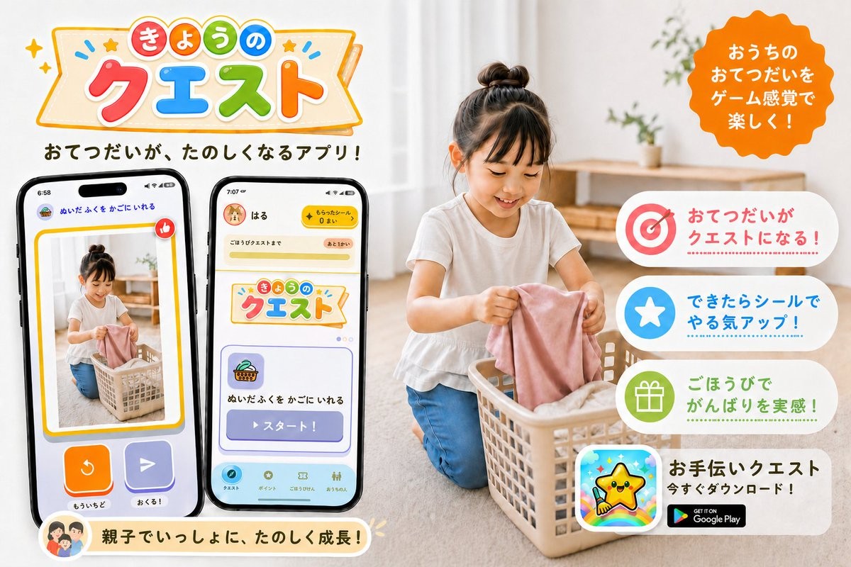
一张明亮的日文宣传横幅,用于游戏化家庭家务 App,适用于社交媒体或 App 发布营销。
Goal: Create a cheerful Japanese promotional app banner for a family chore-help app called {argument name="app name" default="きょうのクエスト"}, showing household chores turned into fun game-like quests.

Canvas: Horizontal 3:2 social media ad, bright white and warm beige home interior, clean commercial design, high-resolution photorealistic lifestyle photo combined with colorful app UI mockups and playful vector graphics.

Layout: Left half contains the large app logo at the top, a short Japanese tagline below it, and exactly 2 large smartphone mockups angled slightly toward each other. Right half contains a photorealistic child doing laundry in a basket, with a bright orange scalloped speech-badge near the top right and exactly 4 rounded white feature cards stacked vertically along the right side. Bottom left has one cream-colored rounded message ribbon with a small family avatar icon.

Main subject: A young child with a top bun hairstyle, wearing a white short-sleeve shirt and blue pants, kneeling on a light wood floor and putting a pink cloth into a beige laundry basket. The home background is softly blurred, with sheer curtains, natural daylight, a simple wooden shelf, and small green plants. Keep the child face softly obscured or neutral, not the focus.

Logo and headline text: At the top left, create a playful banner logo with colorful rounded Japanese characters. Use a cream ribbon sign with orange outline, tiny stars, sparkles, and blue accent marks. The logo text reads 「きょうの クエスト」, with 「きょうの」 in small colored circles and 「クエスト」 in large red, blue, green, and orange letters. Under the logo, add the tagline 「おてつだいが、たのしくなるアプリ!」 in bold dark brown rounded Japanese type.

Phone mockups: Include exactly 2 black-framed smartphones. Phone 1 on the far left shows a reward/confirmation-style screen with a photo of the child doing laundry inside a yellow border, a red thumbs-up icon, two large bottom buttons in orange and purple, and small Japanese labels including 「ぬいたふくを かごにいれる」, 「もういちど」, and 「おくる!」. Phone 2 to its right shows the app home/quest screen with a yellow top bar, a user name 「はる」, a coin counter, the same app logo card, a quest card with basket icon, and a large purple button labeled 「スタート!」; include a bottom navigation bar with small rounded icons.

Right-side callouts: Add an orange scalloped circular badge at the top right with white Japanese text: 「おうちのおてつだいをゲーム感覚で楽しく!」. Stack exactly 4 rounded feature cards on the right, each with a large icon on the left and Japanese copy on the right: 1) target icon in red/pink with text 「おてつだいがクエストになる!」, 2) white star in blue circle with text 「できたらシールでやる気アップ!」, 3) gift icon in green circle with text 「ごほうびでがんばりを実感!」, 4) app icon showing a smiling yellow star mascot over a rainbow background, with bold text 「お手伝いクエスト」, smaller text 「今すぐダウンロード!」, and a black Google Play badge.

Bottom ribbon: Add one rounded cream ribbon near the bottom left under the phones with a small circular family illustration icon and the Japanese message 「親子でいっしょに、たのしく成長!」.

Visual style: Friendly, family-oriented, colorful, polished Japanese app PR graphic. Use rounded fonts, soft shadows, sticker-like icons, pastel accents, clean spacing, and a warm natural photo background. Make all UI elements crisp and readable, with no extra feature cards, no extra phones, no watermark, and no unrelated English text except the Google Play badge.
目标:为一款名为 {argument name="app name" default="きょうのクエスト"} 的家庭家务辅助 App 创建一张欢快的日文宣传横幅,展示将家务转化为趣味游戏任务的过程。
画布:横向 3:2 社交媒体广告,明亮的白色与暖米色家居内饰,简洁的商业设计,高分辨率写实生活照片,结合多彩的 App UI 模型和趣味矢量图形。
布局:左半部分顶部包含大型 App Logo,下方为简短的日文标语,以及 2 个稍微向彼此倾斜的大型智能手机模型。右半部分包含一张写实风格的孩子在篮子里整理衣物的照片,右上角附近有一个明亮的橙色扇形对话徽章,右侧垂直堆叠 4 张圆角白色功能卡片。左下角有一个奶油色圆角消息丝带,带有一个小型家庭头像图标。
主体:一个扎着丸子头的幼童,身穿白色短袖衬衫和蓝色裤子,跪在浅色木地板上,将一块粉色布料放入米色洗衣篮中。家居背景经过柔焦处理,配有透明窗帘、自然光、简单的木质搁板和小盆栽。保持孩子面部柔和模糊或中性,不要作为焦点。
Logo 和标题文字:在左上角,创建一个带有多彩圆润日文字符的趣味横幅 Logo。使用带有橙色轮廓、小星星、闪光和蓝色强调标记的奶油色丝带标志。Logo 文字为「きょうの クエスト」,其中「きょうの」位于彩色小圆圈中,「クエスト」为红色、蓝色、绿色和橙色的大字母。在 Logo 下方,添加粗体深棕色圆润日文字体标语「おてつだいが、たのしくなるアプリ!」。
手机模型:包含 2 部黑色边框智能手机。最左侧的手机 1 显示奖励/确认界面,内含孩子整理衣物的照片(黄色边框内)、红色点赞图标、底部两个橙色和紫色的大按钮,以及包括「ぬいたふくを かごにいれる」、「もういちど」和「おくる!」在内的小型日文标签。右侧的手机 2 显示 App 主页/任务界面,带有黄色顶部栏、用户名「はる」、金币计数器、相同的 App Logo 卡片、带有篮子图标的任务卡片,以及一个标有「スタート!」的大型紫色按钮;包含一个带有小型圆角图标的底部导航栏。
右侧标注:在右上角添加一个橙色扇形圆形徽章,配有白色日文文字:「おうちのおてつだいをゲーム感覚で楽しく!」。在右侧堆叠 4 张圆角功能卡片,每张卡片左侧带有大图标,右侧为日文文案:1) 红色/粉色目标图标,文字为「おてつだいがクエストになる!」;2) 蓝色圆圈中的白色星星,文字为「できたらシールでやる気アップ!」;3) 绿色圆圈中的礼物图标,文字为「ごほうびでがんばりを実感!」;4) 显示彩虹背景上微笑黄色星星吉祥物的 App 图标,配有粗体文字「お手伝いクエスト」、较小文字「今すぐダウンロード!」以及一个黑色 Google Play 徽章。
底部丝带:在手机下方的左下角附近添加一个圆角奶油色丝带,带有一个小型圆形家庭插画图标和日文信息「親子でいっしょに、たのしく成長!」。
视觉风格:友好、以家庭为导向、多彩、精致的日文 App 公关图形。使用圆润字体、柔和阴影、贴纸风格图标、柔和色调强调、整洁的间距和温暖的自然照片背景。确保所有 UI 元素清晰易读,不包含额外的功能卡片、额外的手机、水印,且除了 Google Play 徽章外不包含任何无关的英文文本。