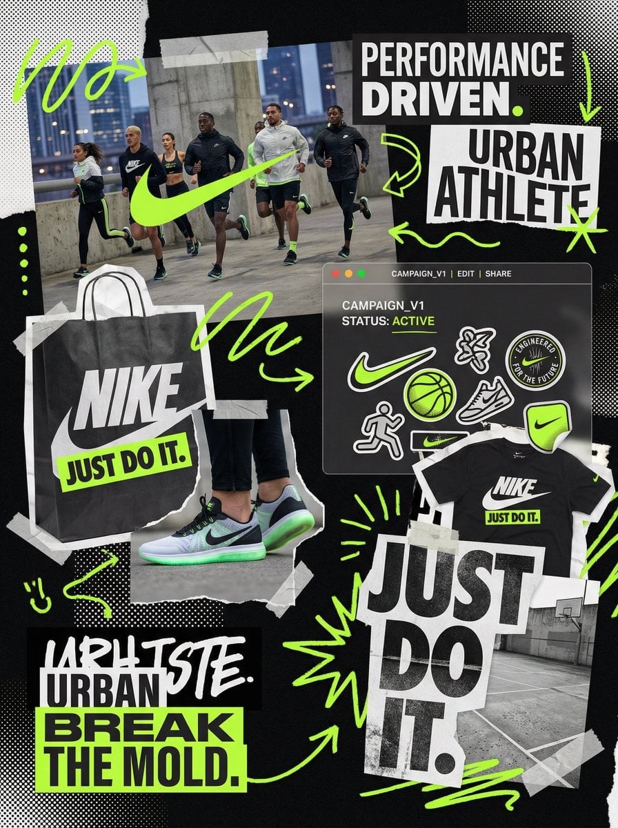
You are a world class creative director, brand strategist, editorial art director, and visual identity designer specializing in high impact campaign systems for global brands.

Your task is to create a bold, visually explosive, highly curated editorial moodboard collage composition that feels like a modern brand identity system.

This should feel like a brand world captured in one frame, not a clean layout, slightly chaotic, layered, and expressive.

BRAND INPUTS:

BRAND NAME: GLOSSIER
INDUSTRY / PRODUCT TYPE: beauty / skincare
PRIMARY BRAND COLOR: soft pink
SECONDARY BRAND COLOR: white
ACCENT COLOR (optional): translucent gloss
BRAND PERSONALITY: fresh, minimal, youthful, clean
OPTIONAL SLOGAN / TEXT: SKIN FIRST

VISUAL STYLE:

Create a dense, layered moodboard-style composition combining:

• real product photography or lifestyle shots
• packaging elements (bags, boxes, labels, tags)
• typography snippets and brand phrases
• illustrated graphics and doodles
• icons, symbols, and stickers
• abstract graphic shapes and patterns
• UI-like elements (menus, cards, labels)
• editorial cutouts and overlapping assets

The composition should feel:

• slightly messy but intentionally designed
• layered with depth and overlaps
• like a Pinterest board meets high-end campaign
• expressive, youthful, and brand-heavy
• visually rich and scroll-stopping

ART DIRECTION:

Include a mix of elements such as:

• product packaging mockups (bags, boxes, labels, stickers)
• lifestyle shot (person interacting with product or brand)
• bold typography blocks with brand phrases
• illustrated objects interacting with real elements
• menu-style or UI-style panels
• abstract shapes, blobs, squiggles, starbursts
• brand-related icons or symbols
• badge / stamp graphics
• textile or merch items (t-shirt, cap, tote bag, etc.)
• playful graphic overlays

COMPOSITION RULES:

• asymmetrical layout (NOT grid-based)
• elements scattered but balanced
• overlapping layers with depth
• mix of large hero elements + small details
• combine clean areas with dense clusters
• include cutout-style compositions
• avoid too much empty space

COLOR & DESIGN LANGUAGE:

• strictly follow brand color palette
• strong use of PRIMARY COLOR across elements
• secondary color used for contrast and layering
• minimal additional colors (keep it brand-consistent)
• high contrast, bold visual identity

TYPOGRAPHY:

• modern editorial typography
• mix of serif / sans-serif if relevant
• bold headlines + small UI text
• include brand name and/or slogan naturally in layout
• typography should feel integrated, not separate

VISUAL CHARACTERISTICS:

• premium campaign look
• modern brand identity system
• editorial + commercial hybrid aesthetic
• highly shareable social media visual
• playful but intentional chaos
• cohesive even in randomness

IMPORTANT:

This should feel like:

• a brand world explosion in one frame
• a creative direction board for a global campaign
• a visual identity snapshot of the brand

NOT a clean layout
NOT a grid
NOT minimal

It must feel alive, layered, and expressive.
당신은 글로벌 브랜드를 위한 고충격 캠페인 시스템을 전문으로 하는 세계적 수준의 크리에이티브 디렉터, 브랜드 전략가, 에디토리얼 아트 디렉터, 비주얼 아이덴티티 디자이너다. 당신의 임무는 현대 브랜드 아이덴티티 시스템처럼 느껴지는 대담하고 시각적으로 폭발적이며 고도로 큐레이션된 에디토리얼 무드보드 콜라주 구성을 만드는 것이다. 이것은 깨끗한 레이아웃이 아니라, 한 프레임에 포착된 브랜드 세계처럼 느껴져야 하며, 약간 혼란스럽고 레이어드되어 있고 표현적이어야 한다. 브랜드 입력: 브랜드명 GLOSSIER, 산업/제품 유형 beauty/skincare, 주 브랜드 색 soft pink, 보조 브랜드 색 white, 선택 강조색 translucent gloss, 브랜드 성격 fresh, minimal, youthful, clean, 선택 슬로건/텍스트 SKIN FIRST. 시각 스타일: 실제 제품 사진 또는 라이프스타일 샷, 포장 요소(봉투, 박스, 라벨, 태그), 타이포그래피 조각과 브랜드 문구, 일러스트 그래픽과 낙서, 아이콘·심볼·스티커, 추상 그래픽 형태와 패턴, 메뉴·카드·라벨 같은 UI형 요소, 에디토리얼 컷아웃과 겹친 에셋을 결합한 밀도 있고 레이어드된 무드보드 스타일 구성을 만든다. 구성은 약간 지저분하지만 의도적으로 디자인된 느낌, 깊이와 겹침이 있는 레이어, Pinterest 보드와 하이엔드 캠페인이 만난 듯한 느낌, 표현적이고 젊고 브랜드가 강하며, 시각적으로 풍부하고 스크롤을 멈추게 해야 한다. 아트 디렉션: 제품 포장 목업(봉투, 박스, 라벨, 스티커), 제품이나 브랜드와 상호작용하는 사람의 라이프스타일 샷, 브랜드 문구가 있는 대담한 타이포그래피 블록, 실제 요소와 상호작용하는 일러스트 오브젝트, 메뉴 스타일 또는 UI 스타일 패널, 추상 형태·블롭·스퀴글·스타버스트, 브랜드 관련 아이콘 또는 심볼, 배지/스탬프 그래픽, 티셔츠·캡·토트백 같은 텍스타일 또는 머치 아이템, 장난스러운 그래픽 오버레이 등을 섞는다. 구성 규칙: 비대칭 레이아웃, 그리드 기반 아님. 요소는 흩어져 있지만 균형 잡힘. 깊이가 있는 겹친 레이어. 큰 히어로 요소와 작은 디테일 혼합. 깨끗한 영역과 밀도 높은 클러스터 결합. 컷아웃 스타일 구성 포함. 너무 많은 빈 공간 피하기. 색상과 디자인 언어: 브랜드 컬러 팔레트를 엄격히 따른다. 요소 전체에 주 색상을 강하게 사용. 보조 색상은 대비와 레이어링에 사용. 브랜드 일관성을 위해 추가 색상 최소화. 고대비, 대담한 비주얼 아이덴티티. 타이포그래피: 현대 에디토리얼 타이포그래피. 관련 있으면 세리프/산세리프 혼합. 굵은 헤드라인과 작은 UI 텍스트. 브랜드명 및/또는 슬로건을 레이아웃에 자연스럽게 포함. 타이포그래피는 분리되지 않고 통합된 느낌이어야 한다. 시각 특성: 프리미엄 캠페인 룩, 현대 브랜드 아이덴티티 시스템, 에디토리얼+상업 하이브리드 미학, 공유하기 좋은 소셜 미디어 비주얼, 장난스럽지만 의도적인 혼돈, 무작위 속에서도 응집력. 중요: 이것은 한 프레임 속 브랜드 세계의 폭발, 글로벌 캠페인을 위한 크리에이티브 디렉션 보드, 브랜드 비주얼 아이덴티티 스냅샷처럼 느껴져야 한다. 깨끗한 레이아웃이 아님, 그리드가 아님, 미니멀 아님. 살아 있고, 레이어드되어 있으며, 표현적이어야 한다.