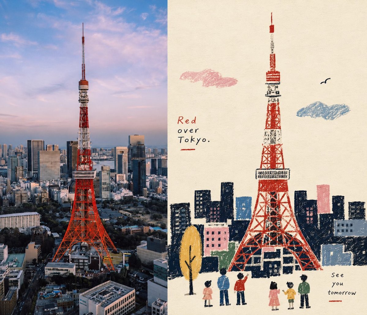
Please transform each photo I upload into an individual high-end design poster, rather than a collage, outputting each photo separately. The overall composition should be a 7:6 side-by-side layout, with two vertical sections of equal width. The left section preserves the original photo, maintaining the subject's identity, structure, pose, realistic texture, natural lighting, and original color atmosphere, with only slight professional color grading for an art magazine or exhibition quality. The environment can be naturally extended to fit the frame without stretching the subject. The right section extracts the most recognizable subject, silhouette, pose, and narrative from the photo, reconstructing it as a Naïve folk-inspired narrative illustration. Do not trace the photo exactly; actively simplify details using silhouettes, primitive forms, and minimal color blocks to retell the original scene with visual cues that make the subject instantly recognizable while maintaining a rustic, humorous, and slice-of-life feel. Use simplified silhouettes and large primitive forms for the subject, compressing proportions and exaggerating features without strict perspective or anatomy. The space should use a flattened perspective, building narratives through size and color relationships, with secondary objects distributed like rhythmic visual symbols. The visuals should feature granular textures similar to crayons, oil pastels, thick pencils, and dry materials, with visible rubbing and paper textures in dark areas. Outlines should have a handcrafted, slightly awkward feel. Use a limited color palette derived from the most vibrant and representative colors in the original photo, set against a warm white paper base with dark silhouette anchors. Include spot-color accents for specific focal points, avoiding dull or neon colors. The composition should value the visual center, negative space, and rhythmic relationships, avoiding a centered look. Minimalist typography should be naturally integrated, using simple, slightly irregular folk-art fonts that act as signs or annotations within the scene rather than structured commercial titles. The overall aesthetic should be intimate, clever, and sophisticated, avoiding childish cartoons, 3D rendering, or smooth vector styles.
创作“民俗叙事双栏海报”图像。忠实保留以下完整创作说明中的主体身份、构图、光线、材质、风格、画幅、画面文字与负面约束。

Please transform each photo I upload into an individual high-end design poster, rather than a collage, outputting each photo separately. The overall composition should be a 7:6 side-by-side layout, with two vertical sections of equal width. The left section preserves the original photo, maintaining the subject's identity, structure, pose, realistic texture, natural lighting, and original color atmosphere, with only slight professional color grading for an art magazine or exhibition quality. The environment can be naturally extended to fit the frame without stretching the subject. The right section extracts the most recognizable subject, silhouette, pose, and narrative from the photo, reconstructing it as a Naïve folk-inspired narrative illustration. Do not trace the photo exactly; actively simplify details using silhouettes, primitive forms, and minimal color blocks to retell the original scene with visual cues that make the subject instantly recognizable while maintaining a rustic, humorous, and slice-of-life feel. Use simplified silhouettes and large primitive forms for the subject, compressing proportions and exaggerating features without strict perspective or anatomy. The space should use a flattened perspective, building narratives through size and color relationships, with secondary objects distributed like rhythmic visual symbols. The visuals should feature granular textures similar to crayons, oil pastels, thick pencils, and dry materials, with visible rubbing and paper textures in dark areas. Outlines should have a handcrafted, slightly awkward feel. Use a limited color palette derived from the most vibrant and representative colors in the original photo, set against a warm white paper base with dark silhouette anchors. Include spot-color accents for specific focal points, avoiding dull or neon colors. The composition should value the visual center, negative space, and rhythmic relationships, avoiding a centered look. Minimalist typography should be naturally integrated, using simple, slightly irregular folk-art fonts that act as signs or annotations within the scene rather than structured commercial titles. The overall aesthetic should be intimate, clever, and sophisticated, avoiding childish cartoons, 3D rendering, or smooth vector styles.
“민속 서사 양면 포스터” 이미지를 제작한다. 아래의 전체 제작 사양에 있는 인물 정체성, 구도, 조명, 재질, 화풍, 화면비, 화면 속 문자와 금지 조건을 충실히 유지한다.

Please transform each photo I upload into an individual high-end design poster, rather than a collage, outputting each photo separately. The overall composition should be a 7:6 side-by-side layout, with two vertical sections of equal width. The left section preserves the original photo, maintaining the subject's identity, structure, pose, realistic texture, natural lighting, and original color atmosphere, with only slight professional color grading for an art magazine or exhibition quality. The environment can be naturally extended to fit the frame without stretching the subject. The right section extracts the most recognizable subject, silhouette, pose, and narrative from the photo, reconstructing it as a Naïve folk-inspired narrative illustration. Do not trace the photo exactly; actively simplify details using silhouettes, primitive forms, and minimal color blocks to retell the original scene with visual cues that make the subject instantly recognizable while maintaining a rustic, humorous, and slice-of-life feel. Use simplified silhouettes and large primitive forms for the subject, compressing proportions and exaggerating features without strict perspective or anatomy. The space should use a flattened perspective, building narratives through size and color relationships, with secondary objects distributed like rhythmic visual symbols. The visuals should feature granular textures similar to crayons, oil pastels, thick pencils, and dry materials, with visible rubbing and paper textures in dark areas. Outlines should have a handcrafted, slightly awkward feel. Use a limited color palette derived from the most vibrant and representative colors in the original photo, set against a warm white paper base with dark silhouette anchors. Include spot-color accents for specific focal points, avoiding dull or neon colors. The composition should value the visual center, negative space, and rhythmic relationships, avoiding a centered look. Minimalist typography should be naturally integrated, using simple, slightly irregular folk-art fonts that act as signs or annotations within the scene rather than structured commercial titles. The overall aesthetic should be intimate, clever, and sophisticated, avoiding childish cartoons, 3D rendering, or smooth vector styles.