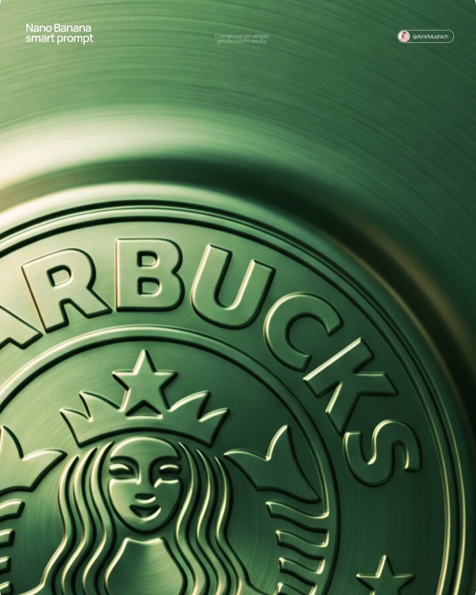
[BRAND NAME] + [METAL COLOR]

Act as a Senior CGI Artist and Brand Identity Director specializing in premium logo materializations. Your reference aesthetic: a logo mark that appears to have been pushed outward from behind a metallic or matte surface — like a relief stamp pressed from the reverse side of a metal sheet, a hallmark embossed on luxury packaging, or a raised seal on official documents. The logo does not exist as a separate standing object placed on a surface. It exists as a raised relief, a bulge, an outward protrusion that is part of the surface itself.

BRAND INTELLIGENCE SYSTEM

Before executing any phase, resolve these parameters: (1) LOGO GEOMETRY — identify [BRAND NAME]'s primary icon mark in its simplest most reduced form — the mark that works at any scale, (2) COLOR PALETTE — based on [COLOR], build the full tonal system from the lightest specular highlight to the deepest shadow tone, determine if the overall mood reads warm, cool, or neutral, (3) SURFACE MATERIAL — based on [COLOR] determine the surface character: silver or grey becomes brushed or circular-grain steel, gold or champagne becomes warm brushed metal with radial grain, black becomes anodized aluminum or matte carbon fiber, white becomes matte ceramic or chalk plaster, any saturated hue becomes anodized colored metal holding the hue in lit areas and desaturating toward black in deepest shadows, (4) LIGHT DIRECTION — determine the most flattering single light angle to reveal the emboss topography — where highlights land on the raised ridge peaks and where shadows fall on the descending walls.

PHASE 1: SURFACE & ATMOSPHERE

The entire image is one single continuous material surface — not a background with an object placed on it, but one unified physical plane filling the entire canvas. This surface is made of the SURFACE MATERIAL resolved above. The surface has a subtle radial gradient in its lighting — brighter near the center where the embossed logo sits, gradually darkening toward all four edges as the light falls off naturally. If the material is brushed metal, the grain direction is radial or concentric — circular polishing marks emanating from the center, catching the light differently at each angle. Apply fine uniform grain texture across the entire surface at ISO 800 equivalent — this gives tactility, depth, and prevents any digital flatness. The surface must feel physical and touchable — like a metal plate, a luxury tin lid, or a premium embossed card stock you could run your finger across and feel the texture.

PHASE 2: THE EMBOSS — CRITICAL

The [BRAND NAME] logo mark is rendered as a full bas-relief — think of a coin, a commemorative medal, or a luxury brand stamp where the ENTIRE logo shape rises as one unified solid mass from the surface. Not just the outline. Not just the stroke path. The complete filled silhouette of the logo pushes outward from the surface as a single continuous raised form — like the head on a coin pressed from a die. The interior of the logo is NOT hollow or open. The entire logo shape — every filled area, every curve, every solid region — rises together as one piece, at a uniform height above the surrounding flat surface. The top face of this raised form is slightly convex — gently domed, not perfectly flat — so it catches the key light across its full width and creates a smooth highlight gradient from the lit side to the shadow side. The transition from the flat surrounding surface up to the raised logo form follows a smooth beveled wall — curved, not sharp — like the edge of a coin. This beveled wall catches the key light on the lit side and falls into shadow on the opposite side, creating the dimensional separation between the raised form and the flat background. Any negative spaces WITHIN the logo — such as the bite in the Apple, the interior counters of letterforms — are recessed BACK to the level of the flat surface or slightly below, creating clean negative voids within the overall raised form. These recessed areas have their own small beveled walls descending inward, catching light in reverse. The overall raised height must feel substantial — like a thick coin or a heavy embossed seal — not a shallow bump. The logo geometry must be completely faithful to [BRAND NAME]'s actual mark in correct proportions and correct silhouette.

PHASE 3: LIGHTING

One primary soft area light from upper-left at approximately 10 to 11 o'clock position — broad and diffused, wrapping around the curved walls of the raised ridge to create the characteristic highlight peak at the top and gradual shadow descent on the far wall. Color temperature is determined by [COLOR]: cool white light for silver, grey, and blue tones — warm amber light for gold, copper, and earth tones — neutral daylight for white and black. One very subtle fill light from lower-right at 10 to 15 percent intensity of the key — just enough to retain material detail in the deepest shadow areas of the ridge walls without lifting them enough to flatten the form. No hard shadows anywhere on the surface. No spotlight pools. No rim light. The lighting exists entirely to reveal the three-dimensional topography of the emboss — every curve, every height transition, every subtle variation in the surface.

PHASE 4: TYPOGRAPHY

In the lower portion of the canvas, below the embossed logo, on the same continuous surface — a minimal typographic lockup. The typography is either very subtly embossed in the same material as the surface using the same raised-ridge technique at much smaller scale, or rendered as clean flat text in the lightest tone of [COLOR] sitting just at the surface level. Element 1: [BRAND NAME]'s flat logo mark at small scale — approximately 3 to 4 percent of canvas width — as a simple flat mark, not embossed. Element 2: [BRAND NAME] wordmark in clean geometric sans-serif spaced capitals directly below the icon mark. Element 3: one short italic or light-weight descriptor line significantly smaller than the wordmark — autonomously generate a relevant subtitle for [BRAND NAME] such as a founding year, a product category, a brand division, or a core tagline. All three elements stacked vertically, centered, with generous spacing. No decorative elements. No lines or rules. Pure typographic restraint.

TECH SPECS

The single most important instruction in this entire prompt: the logo must read as PUSHED OUTWARD FROM the surface, rising toward the viewer, proud and raised. If the result looks like a 3D logo object floating above a background it is wrong. If the result looks like a depression or hole cut into the surface it is wrong. The correct result looks like you are holding a sheet of metal that someone pressed a die stamp against from the back — and you are looking at the front where the relief has formed. Ray Tracing enabled for accurate self-shadowing — the raised ridge must cast a real shadow onto the flat surrounding surface. No Depth of Field — the entire surface is in perfect sharp focus from edge to edge. Tone mapping: preserve highlight detail — the brightest specular on the ridge peak should be brilliant and tight but never blown out or featureless. Film grain applied uniformly across the full final render. No chromatic aberration. No lens distortion. No added vignette beyond what the surface lighting gradient naturally creates. Anti-aliasing maximum — the ridge edges must be perfectly clean. Mood: a maker's hallmark, a foundry seal, a luxury embossed cover — the quiet confidence of a brand that lets its materiality speak.
[BRAND NAME] + [METAL COLOR]. 프리미엄 로고 물질화를 전문으로 하는 시니어 CGI 아티스트이자 브랜드 아이덴티티 디렉터처럼 행동한다. 참조 미학: 로고 마크가 금속 또는 매트 표면 뒤에서 바깥쪽으로 밀려 나온 것처럼 보인다. 금속판 뒷면에서 눌러 만든 부조 스탬프, 럭셔리 패키징에 양각된 홀마크, 공식 문서의 올라온 실처럼. 로고는 표면 위에 놓인 별도 물체가 아니라 표면 자체의 일부인 융기 부조, 불룩함, 바깥쪽 돌출이다. 브랜드 인텔리전스 시스템: 실행 전에 로고 지오메트리를 해결해 [BRAND NAME]의 가장 단순한 기본 아이콘 마크를 식별한다. [COLOR]를 바탕으로 가장 밝은 스페큘러 하이라이트부터 가장 깊은 그림자까지 전체 톤 시스템과 따뜻함/차가움/중립 무드를 정한다. 표면 재질은 [COLOR]에 따라 결정한다. 은/회색은 브러시드 또는 원형 그레인 스틸, 금/샴페인은 방사형 그레인의 따뜻한 브러시드 메탈, 검정은 아노다이즈드 알루미늄 또는 매트 카본 파이버, 흰색은 매트 세라믹 또는 분필 플라스터, 포화 색상은 밝은 영역에서 색상을 유지하고 깊은 그림자에서 검정으로 저채도화되는 아노다이즈드 컬러 메탈. 양각 지형을 가장 잘 드러내는 빛 방향을 결정한다. 1단계 표면과 분위기: 전체 이미지는 캔버스를 가득 채우는 하나의 연속된 물리적 재질 평면이다. 배경 위에 물체를 놓은 것이 아니다. 표면에는 양각 로고가 있는 중심이 더 밝고 네 가장자리로 자연스럽게 어두워지는 은은한 방사형 조명 그라데이션이 있다. 브러시드 메탈이라면 중심에서 퍼지는 원형 연마 자국의 방사형 또는 동심원 그레인. ISO 800 상당의 미세하고 균일한 그레인을 표면 전체에 적용해 촉감, 깊이, 디지털 평면감을 방지한다. 표면은 금속판, 럭셔리 틴 뚜껑, 프리미엄 양각 카드지처럼 물리적이고 만지고 싶어야 한다. 2단계 양각 핵심: [BRAND NAME] 로고 마크를 동전, 기념 메달, 럭셔리 브랜드 스탬프처럼 완전한 저부조로 렌더링한다. 로고 전체의 채워진 실루엣이 윤곽이나 스트로크가 아니라 하나의 통합된 고체 덩어리로 표면에서 올라온다. 내부는 비어 있지 않다. 융기 형태는 균일한 높이이며, 윗면은 약간 볼록한 돔 형태로 전체 폭에 걸쳐 키라이트를 받아 부드러운 하이라이트 그라데이션을 만든다. 주변 평면에서 올라온 로고까지의 전환은 날카롭지 않은 부드러운 곡선 베벨 벽이다. 로고 내부의 네거티브 스페이스는 평평한 표면 레벨 또는 약간 아래로 recessed되고, 안쪽으로 내려가는 작은 베벨 벽을 가진다. 전체 융기 높이는 두꺼운 동전이나 무거운 양각 실처럼 실질적으로 느껴져야 한다. 로고 기하학은 [BRAND NAME]의 실제 마크에 충실해야 한다. 3단계 조명: 왼쪽 위 10~11시 방향에서 오는 하나의 넓고 확산된 소프트 에어리어 라이트. 곡선 능선을 감싸며 상단 하이라이트 피크와 반대 벽의 점진적 그림자를 만든다. 색온도는 [COLOR]로 결정한다. 오른쪽 아래에서 키라이트의 10–15% 강도의 매우 은은한 필라이트. 딱딱한 그림자, 스포트라이트 풀, 림 라이트 없음. 조명은 양각의 3차원 지형을 드러내기 위해서만 존재한다. 4단계 타이포그래피: 캔버스 아래쪽, 같은 연속 표면 위에 미니멀 타이포그래픽 락업. 같은 재질로 매우 은은하게 작은 스케일로 양각하거나, [COLOR]의 가장 밝은 톤을 사용한 깨끗한 평면 텍스트를 표면 레벨에 둔다. 세 요소를 세로 중앙 정렬: 작은 평면 로고 마크는 캔버스 너비 3–4%, [BRAND NAME] 워드마크는 자간 넓은 기하학 산세리프 대문자, 그 아래 훨씬 작은 이탤릭 또는 라이트웨이트 설명 라인을 자율 생성한다. 창립 연도, 제품 카테고리, 브랜드 디비전, 핵심 태그라인 등. 장식 요소, 선, 룰 없음. 기술 사양: 가장 중요한 지시는 로고가 표면에서 바깥쪽으로 밀려 올라와 관객 쪽으로 융기된 것처럼 읽혀야 한다는 것. 결과가 배경 위에 떠 있는 3D 로고 물체처럼 보이면 틀렸고, 표면에 파인 홈이나 구멍처럼 보이면 틀렸다. 올바른 결과는 금속 시트 뒤에서 다이 스탬프를 눌러 앞면에 부조가 생긴 것을 보는 것과 같다. 레이 트레이싱 활성화, 올라온 능선은 주변 평평한 표면에 실제 그림자를 드리워야 한다. 심도 없음, 전체 표면이 가장자리부터 가장자리까지 완벽히 선명. 톤 매핑은 하이라이트 디테일 보존. 전체 최종 렌더에 균일한 필름 그레인. 색수차 없음, 렌즈 왜곡 없음, 자연스러운 표면 조명 그라데이션 외 추가 비네트 없음. 최대 안티앨리어싱, 능선 가장자리는 완벽히 깨끗해야 한다. 무드: 제작자의 홀마크, 주조소의 실, 럭셔리 양각 커버, 물질성으로 말하는 브랜드의 조용한 자신감.