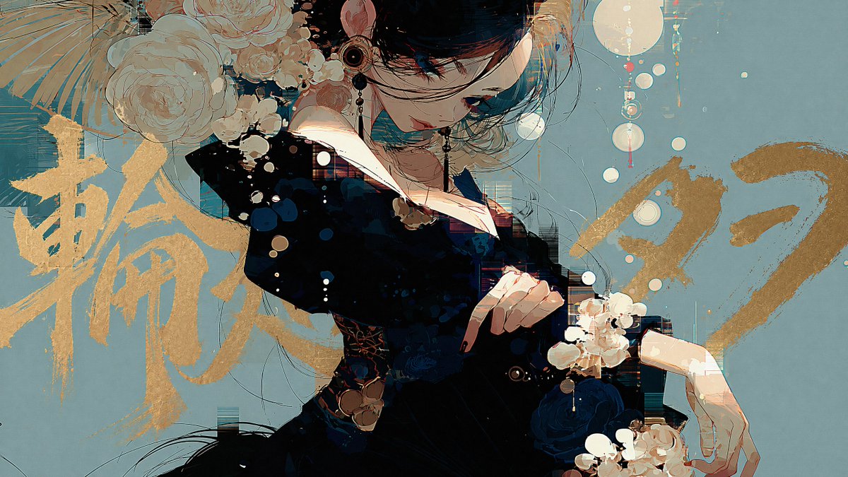
Cinematic Brush Title Overlay
一个精妙的提示词,旨在为图像中的主体后方添加大型毛笔书法风格文字,营造出深度感和电影海报效果。
Add a title text to this image with intentional layer depth.

[Text to Add]
- The phrase to add: "{argument name="タイトル" default="ここにタイトルを入力]"}"

[Typography]
- If the text is in English or romaji: handwritten brush script style — loose, expressive, confident strokes, imperfect and alive
- If the text is in Japanese: calligraphic brushwork by a master — rough, bold, spontaneous ink strokes with natural variation in pressure and thickness
- Scale: large and dominant — the text is a visual element, not a label
- Color: choose a color that does not clash with or duplicate the background — prioritize visual harmony over legibility

[Layer Depth — Critical Rule]
- The text must appear BEHIND the main subject (person, figure, or foreground object)
- The main subject occludes the text naturally — as if the subject is standing in front of the text
- The background remains behind both the text and the subject
- If any other text elements exist in the image (watermarks, captions, body copy, small text), the title must appear in front of all of them
- Layer order from back to front: background → existing text elements → title text → subject

[Legibility — Important]
- Do not force the text to be readable
- It is acceptable — even desirable — for portions of the text to be hidden behind the subject
- The text exists as a design element and compositional layer, not as information to be read
- Layout and aesthetic integration take priority over legibility at all times

[Placement]
- The text spans large across the image, partially hidden behind the subject
- Placement feels cinematic and intentional — like a movie poster or editorial cover
- Allow the text to bleed beyond the frame edges naturally
- Do not generate random text blocks, body copy, or filler text anywhere in the image
- Only the specified title text should appear as a new addition

[Style Preservation]
- Do not alter the subject, colors, or composition of the original image
- Add only the text layer — nothing else
Add a title text to this image with intentional layer depth. [Text to Add] - The phrase to add: "[ここにタイトルを入力]" [Typography] - If the text is in English or romaji: handwritten brush script style — loose, expressive, confident strokes, imperfect and alive - If the text is in Japanese: calligraphic brushwork by a master — rough, bold, spontaneous ink strokes with natural variation in pressure and thickness - Scale: large and dominant — the text is a visual element, not a label - Color: choose a color that does not clash with or duplicate the background — prioritize visual harmony over legibility [Layer Depth — Critical Rule] - The text must appear BEHIND the main subject (person, figure, or foreground object) - The main subject occludes the text naturally — as if the subject is standing in front of the text - The background remains behind both the text and the subject - If any other text elements exist in the image (watermarks, captions, body copy, small text), the title must appear in front of all of them - Layer order from back to front: background -> existing text elements -> title text -> subject [Legibility — Important] - Do not force the text to be readable - It is acceptable — even desirable — for portions of the text to be hidden behind the subject - The text exists as a design element and compositional layer, not as information to be read - Layout and aesthetic integration take priority over legibility at all times [Placement] - The text spans large across the image, partially hidden behind the subject - Placement feels cinematic and intentional — like a movie poster or editorial cover - Allow the text to bleed beyond the frame edges naturally - Do not generate random text blocks, body copy, or filler text anywhere in the image - Only the specified title text should appear as a new addition [Style Preservation] - Do not alter the subject, colors, or composition of the original image - Add only the text layer — nothing else
为该图像添加具有空间深度感的标题文本。

[要添加的文本]
- 要添加的短语:"{argument name="title" default="在此输入标题"}"

[排版]
- 若文本为英文或罗马字:手写毛笔书法风格 —— 笔触随性、富有表现力、自信,呈现出不完美且生动的质感
- 若文本为日文:大师级书法笔触 —— 粗犷、大胆、即兴的墨迹,笔压和粗细具有自然的起伏变化
- 比例:大型且占据主导地位 —— 文本是视觉元素,而非标签
- 颜色:选择与背景不冲突或不重复的颜色 —— 优先考虑视觉和谐,而非可读性

[图层深度 —— 关键规则]
- 文本必须出现在主体(人物、形象或前景物体)的后方
- 主体自然地遮挡文本 —— 就像主体站在文本前方一样
- 背景保持在文本和主体的后方
- 如果图像中存在其他文本元素(水印、标题、正文、小字),标题必须出现在它们的前方
- 从后到前的图层顺序:背景 → 现有文本元素 → 标题文本 → 主体

[可读性 —— 重要]
- 不要强求文本的可读性
- 文本部分被主体遮挡是可以接受的,甚至是理想的效果
- 文本作为设计元素和构图层存在,而非供阅读的信息
- 布局和美学融合始终优先于可读性

[位置]
- 文本横跨图像,部分被主体遮挡
- 位置感应具有电影感和刻意为之的效果 —— 如同电影海报或杂志封面
- 允许文本自然地延伸至画面边缘之外
- 不要在图像的任何位置生成随机文本块、正文或填充文本
- 仅应添加指定的标题文本作为新增内容

[风格保持]
- 不要改变原始图像的主体、颜色或构图
- 仅添加文本图层 —— 不添加其他任何内容