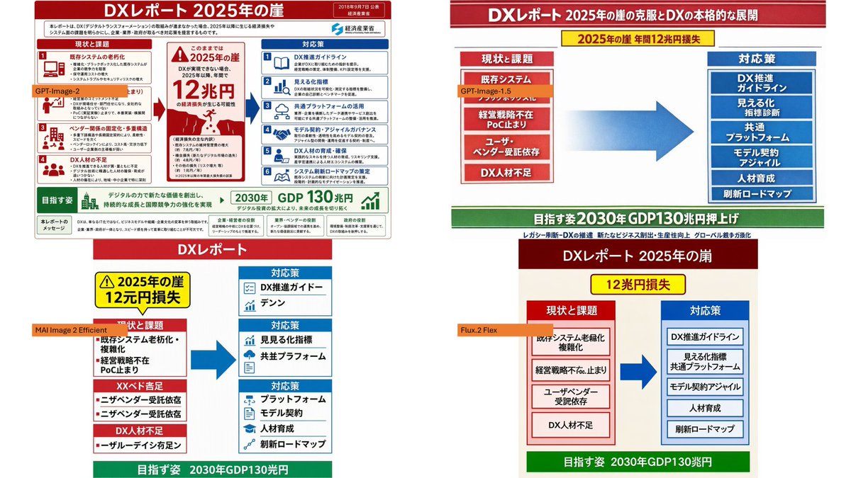
四格 DX 报告模型对比
基于参考图像,创建一张 PowerPoint 风格的对比 Slides,展示四种由 AI 生成的日本 DX 报告信息图版本。
Using the provided reference image as the source slide, create a 16:9 white comparison canvas showing four different regenerated versions of the same Japanese government-style DX report slide.

Layout: Arrange exactly 4 panels in a 2×2 grid with generous white margins. The top-left panel should keep the provided reference slide nearly unchanged and scaled down. The other three panels should be simplified reinterpretations of the same content, each with the same overall logic: red header, red “current issues” block on the left, blue “countermeasures” block on the right, a large blue arrow pointing from left to right, and a green goal band at the bottom.

Panel labels: Add exactly 4 small orange model labels over the panels: {argument name="top left model label" default="GPT-Image-2"}, {argument name="top right model label" default="GPT-Image-1.5"}, {argument name="bottom left model label" default="MAI Image 2 Efficient"}, and {argument name="bottom right model label" default="Flux.2 Flex"}.

Text and content to preserve from the reference: Keep the main theme as {argument name="main headline" default="DXレポート 2025年の崖"}. Preserve readable Japanese key phrases such as “2025年の崖”, “12兆円損失”, “現状と課題”, “対応策”, “既存システム”, “経営戦略不在”, “DX人材不足”, “DX推進ガイドライン”, “見える化指標”, “共通プラットフォーム”, “モデル契約・アジャイル”, “人材育成”, “刷新ロードマップ”, and the green goal message about “2030年 GDP130兆円”.

Panel differences: The top-right version should look like a clean, simplified PowerPoint infographic with a long red title bar, a yellow warning banner near the top, stacked red issue boxes on the left, stacked blue solution boxes on the right, and a large gradient blue arrow in the center. The bottom-left version should look more compact and slightly imperfect, with multiple red issue sections on the left and three blue response sections on the right. The bottom-right version should look like a neat minimal slide with a dark red title bar, a yellow loss badge, two bordered columns, and a green bottom goal bar.

Style constraints: Make the overall image look like a screenshot of a PowerPoint slide comparing output quality across image models. Keep all four panels legible, flat, and infographic-like. Do not add photo-realistic elements, people, watermarks, or extra panels.
以提供的参考图像作为源 Slides,创建一个 16:9 的白色对比画布,展示同一份日本政府风格 DX 报告 Slides 的四种不同重构版本。
布局:将 4 个面板精确排列为 2×2 网格,并留出充足的白色边距。左上角面板应保持提供的参考 Slides 基本不变并进行缩放。其余三个面板应是对相同内容的简化重构,每个面板遵循相同的整体逻辑:红色标题栏、左侧红色“现状与课题”区块、右侧蓝色“应对策略”区块、中间从左向右指向的大型蓝色箭头,以及底部的绿色目标栏。
面板标签:在面板上方添加 4 个小型橙色模型标签:{argument name="top left model label" default="GPT-Image-2"}、{argument name="top right model label" default="GPT-Image-1.5"}、{argument name="bottom left model label" default="MAI Image 2 Efficient"} 以及 {argument name="bottom right model label" default="Flux.2 Flex"}。
需保留的文本与内容:保持主标题为 {argument name="main headline" default="DXレポート 2025年の崖"}。保留可读的日语关键短语,例如“2025年の崖”、“12兆円損失”、“現状と課題”、“対応策”、“既存システム”、“経営戦略不在”、“DX人材不足”、“DX推進ガイドライン”、“見える化指標”、“共通プラットフォーム”、“モデル契約・アジャイル”、“人材育成”、“刷新ロードマップ”,以及关于“2030年 GDP130兆円”的绿色目标信息。
面板差异:右上角版本应呈现为简洁的 PowerPoint 信息图,带有长红色标题栏、顶部附近的黄色警告横幅、左侧堆叠的红色问题框、右侧堆叠的蓝色解决方案框以及中心的大型渐变蓝色箭头。左下角版本应看起来更紧凑且略显不完美,左侧有多个红色问题部分,右侧有三个蓝色响应部分。右下角版本应呈现为整洁的极简 Slides,带有深红色标题栏、黄色损失徽章、两个带边框的列以及底部的绿色目标栏。
风格约束:使整体图像看起来像是对比不同图像模型输出质量的 PowerPoint Slides 截图。保持所有四个面板清晰、扁平且具有信息图特征。请勿添加照片级真实元素、人物、水印或额外面板。