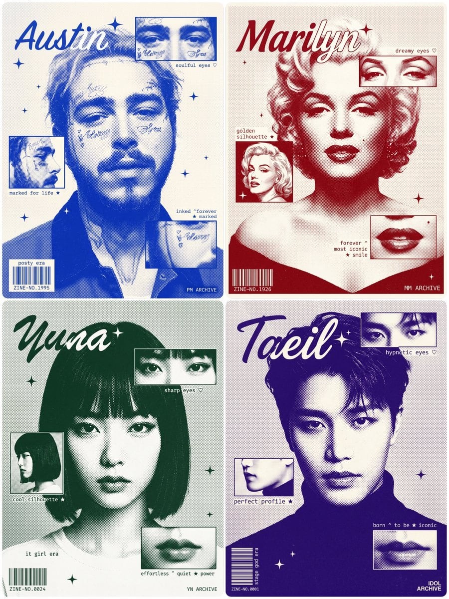
Duotone Risograph Fan Zine Poster
AuthorΛRMINDate2026-07-29Modelbanana-proViews1
A fan zine editorial poster of [Character Name], [Describe Key Physical Features], tight shoulder-up crop — head and face fill 70-75% of the frame height, only the very top edge of shoulders and shirt collar barely visible at the bottom of the frame, the bottom of the poster cuts off exactly at the shoulder line, NO chest, NO torso visible, wearing [Describe Collar/Neckline Edge Only], facing forward, [Describe Expression].

Rendered in halftone dot photographic style, duotone — [Describe Ink Color] bright and saturated but not neon, like classic risograph screen-print ink, NOT dark, NOT muted, NOT pale — a bold alive mid-tone [Color/Hex Code], on off-white/cream paper texture. Subtle film grain and analog noise texture layered over the entire image, the grain is light and organic like a physically printed risograph zine, NOT heavy, NOT overwhelming — just enough to remove the digital cleanness and add tactile printed paper feel throughout.

CRITICAL — background extends fully to all four edges and corners of the image with zero white border or margin, no padding, no frame, no white edge — the halftone dot texture fills the entire canvas edge-to-edge. Background has a uniform fine halftone dot pattern at very low density and small uniform dot size, spread evenly across the entire background to all four corners, creating a subtle grainy newspaper/risograph texture. The main portrait also rendered in halftone dot style but with higher dot density creating tonal depth.

Three rectangular inset panels in fine-line photographic style, each panel has a clean thin border line:
- top-right panel: [Describe Panel 1 Detail], positioned at upper-right, partially overlapping the portrait
- middle-left panel: [Describe Panel 2 Detail], positioned at mid-left, overlapping the portrait edge
- bottom-right panel: [Describe Panel 3 Detail], positioned at lower-right area

Character name "[Name]" in medium-sized expressive italic script font, positioned top-left corner only — CRITICAL SIZE AND PLACEMENT: the name is modest in size, NOT large, NOT dominating the composition, the LEFT half of the word sits outside the portrait over the background area rendered in [Same Ink Color], the RIGHT half overlaps the character's hair/face rendered in pure white, this split naturally happens because the word starts at the left edge and drifts into the portrait. Small four-pointed sparkle star decorative element next to the name, small four-pointed sparkle stars scattered across composition.

Small monospace typewriter annotation texts placed DIRECTLY on the background dot-pattern texture, NO white highlight, NO text box, NO background fill behind any text — raw text only over the existing surface:
- near eyes panel right side: "[Annotation 1]"
- near profile panel left side: "[Annotation 2]"
- lower-right area: "[Annotation 3]"

Barcode rendered as WHITE vertical lines only, printed directly onto the dot-pattern background, bottom-left corner, NO box, NO background fill, NO outline behind it — just bare white barcode stripes over the existing background texture, tiny zine number "ZINE-NO.[Xxxx]" in small white monospace text below it, "[Tagline]" on top of the white barcode stripes. Brand label text "[Brand Name]" bottom-right corner.

Strict duotone — [Same Ink Color] and off-white/cream ONLY, full bleed edge-to-edge composition, no white margins anywhere, vintage risograph silkscreen fan zine aesthetic. CRITICAL — zero white rectangles or fills behind any annotation text anywhere, all text floats transparently over the composition with no background.
[Character Name] 的粉丝志编辑海报,[Describe Key Physical Features],紧密肩部以上裁切——头部和脸部占画面高度的 70-75%,画面底部仅勉强可见肩膀最上缘和衬衫领口,海报底部正好在肩线处切断,没有胸部,没有躯干可见,穿着 [Describe Collar/Neckline Edge Only],正面朝前,[Describe Expression]。

以 halftone dot 摄影风格渲染,双色调——[Describe Ink Color] 明亮且饱和但不是霓虹,像经典 risograph 丝网印刷油墨,不暗、不灰、不淡——一种大胆鲜活的中间调 [Color/Hex Code],印在米白/奶油纸张纹理上。整张图像叠加细微胶片颗粒和模拟噪点纹理,颗粒轻盈有机,像实体印刷的 risograph zine,不厚重、不压倒——只需足够去除数字洁净感,并在整体加入可触摸的印刷纸质感。

关键——背景完全延伸到图像四个边缘和角落,零白边或边距,无 padding、无框、无白色边缘——halftone 点状纹理从边到边填满整张画布。背景具有均匀细小的 halftone 点图案,密度很低且点大小小而统一,均匀铺展到整个背景四角,形成微妙的颗粒新闻纸/risograph 质感。主肖像也以 halftone 点风格渲染,但点密度更高以形成色调深度。

三个细线摄影风格矩形嵌入面板,每个面板都有干净细边线:
- 右上面板:[Describe Panel 1 Detail],位于右上方,部分重叠肖像
- 中左面板:[Describe Panel 2 Detail],位于中左,重叠肖像边缘
- 右下面板:[Describe Panel 3 Detail],位于右下区域

角色名 "[Name]" 使用中等大小、富有表现力的斜体手写字体,只放在左上角——关键尺寸与位置:名字大小适中,不大,不主导构图;单词左半部分位于肖像外的背景区域,并以 [Same Ink Color] 渲染,右半部分重叠角色头发/脸部,并以纯白渲染;这种分割自然发生,因为单词从左边缘开始并漂入肖像。名字旁边有小四角闪星装饰元素,构图中散布小四角闪星。

小型等宽打字机注释文字直接放在背景点状纹理上,没有白色高亮,没有文本框,任何文字后方都没有背景填充——只有原始文字浮在现有表面上:
- 眼睛面板右侧附近:"[Annotation 1]"
- 侧脸面板左侧附近:"[Annotation 2]"
- 右下区域:"[Annotation 3]"

条形码仅渲染为白色竖线,直接印在点状纹理背景上,位于左下角,没有盒子,没有背景填充,没有轮廓底板——只是裸露白色条形码线条覆盖在现有背景纹理上;其下方用小号白色等宽文字写极小 zine 编号 "ZINE-NO.[Xxxx]","[Tagline]" 位于白色条形码线条上方。品牌标签文字 "[Brand Name]" 位于右下角。

严格双色调——只使用 [Same Ink Color] 和米白/奶油色,full bleed 边到边构图,任何地方都没有白色边距,复古 risograph 丝网印刷粉丝志美学。关键——任何注释文字后方绝对没有白色矩形或填充,所有文字都透明地漂浮在构图表面,没有背景。
[Character Name]의 팬진 에디토리얼 포스터, [Describe Key Physical Features], 타이트한 어깨 위 크롭 — 머리와 얼굴이 프레임 높이의 70-75%를 채우고, 프레임 맨 아래에는 어깨와 셔츠 칼라의 아주 위쪽 가장자리만 겨우 보인다. 포스터 아래쪽은 정확히 어깨선에서 잘리며, 가슴 없음, 몸통 보이지 않음, [Describe Collar/Neckline Edge Only] 착용, 정면을 향함, [Describe Expression].

하프톤 도트 사진 스타일, 듀오톤으로 렌더링 — [Describe Ink Color]는 밝고 포화되어 있지만 네온은 아니며, 클래식 리소그래프 스크린 인쇄 잉크처럼 보인다. 어둡지 않고, 탁하지 않고, 창백하지 않다 — 대담하고 살아 있는 중간 톤 [Color/Hex Code], 오프화이트/크림 종이 질감 위. 전체 이미지 위에 미묘한 필름 그레인과 아날로그 노이즈 질감을 레이어링한다. 그레인은 실제 인쇄된 리소그래프 진처럼 가볍고 유기적이며, 무겁지 않고 압도적이지 않다 — 디지털의 깨끗함을 제거하고 전체에 촉각적인 인쇄 종이 느낌을 더할 정도만.

중요 — 배경은 이미지의 네 가장자리와 네 모서리까지 완전히 확장되고, 흰 테두리나 여백은 0, 패딩 없음, 프레임 없음, 흰 가장자리 없음 — 하프톤 도트 질감이 캔버스 전체를 가장자리부터 가장자리까지 채운다. 배경에는 매우 낮은 밀도와 작고 균일한 점 크기의 균일한 미세 하프톤 도트 패턴이 있으며, 배경 전체와 네 모서리까지 고르게 퍼져 미묘한 거친 신문지/리소그래프 질감을 만든다. 메인 초상도 하프톤 도트 스타일로 렌더링하지만, 더 높은 도트 밀도로 톤 깊이를 만든다.

세 개의 직사각형 인셋 패널은 세밀한 선의 사진 스타일이며, 각 패널에는 깨끗하고 얇은 테두리 선이 있다:
- 오른쪽 위 패널: [Describe Panel 1 Detail], 오른쪽 위에 배치, 초상과 부분적으로 겹침
- 가운데 왼쪽 패널: [Describe Panel 2 Detail], 중간 왼쪽에 배치, 초상 가장자리와 겹침
- 오른쪽 아래 패널: [Describe Panel 3 Detail], 오른쪽 아래 영역에 배치

캐릭터 이름 "[Name]"은 중간 크기의 표현적인 이탤릭 스크립트 폰트로, 왼쪽 위 모서리에만 배치 — 중요 크기와 위치: 이름은 적당한 크기이며, 크지 않고, 구도를 지배하지 않는다. 단어의 왼쪽 절반은 초상 밖 배경 영역에 위치하고 [Same Ink Color]로 렌더링되며, 오른쪽 절반은 캐릭터의 머리/얼굴과 겹쳐 순백색으로 렌더링된다. 이 분할은 단어가 왼쪽 가장자리에서 시작해 초상 쪽으로 흘러들기 때문에 자연스럽게 발생한다. 이름 옆에 작은 네 꼭지 반짝이 별 장식 요소, 구도 전체에 작은 네 꼭지 반짝이 별을 흩뿌린다.

작은 모노스페이스 타자기 주석 텍스트를 배경 도트 패턴 질감 위에 직접 배치한다. 흰색 하이라이트 없음, 텍스트 박스 없음, 어떤 텍스트 뒤에도 배경 채움 없음 — 기존 표면 위의 생 텍스트만:
- 눈 패널 오른쪽 근처: "[Annotation 1]"
- 프로필 패널 왼쪽 근처: "[Annotation 2]"
- 오른쪽 아래 영역: "[Annotation 3]"

바코드는 흰색 세로선만으로 렌더링하여 왼쪽 아래 모서리의 도트 패턴 배경 위에 직접 인쇄한다. 박스 없음, 배경 채움 없음, 뒤쪽 윤곽 없음 — 기존 배경 질감 위의 맨 흰색 바코드 줄무늬만. 그 아래에는 작은 흰색 모노스페이스 텍스트로 작은 진 번호 "ZINE-NO.[Xxxx]", 흰색 바코드 줄무늬 위에는 "[Tagline]". 브랜드 라벨 텍스트 "[Brand Name]"은 오른쪽 아래 모서리.

엄격한 듀오톤 — [Same Ink Color]와 오프화이트/크림만, 가장자리부터 가장자리까지 풀블리드 구도, 어디에도 흰 여백 없음, 빈티지 리소그래프 실크스크린 팬진 미학. 중요 — 어떤 주석 텍스트 뒤에도 흰색 사각형이나 채움은 0, 모든 텍스트는 배경 없이 투명하게 구도 위에 떠 있다.