深色模式 AI 查看器及课程网站预览
此内容生成一张逼真的深色主题 AI 图像查看器截图,展示了一个高端日本在线课程落地页概念,适用于产品样机、社交媒体帖子及设计工作流演示。
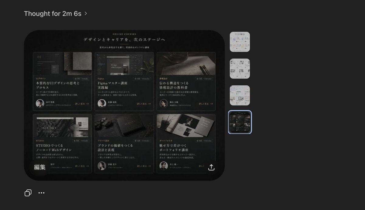
A dark-mode desktop screenshot of an AI image viewer interface showing a generated website design preview. The overall canvas is charcoal gray with a minimal modern app UI. At the top left, place the heading “Thought for 2m 6s” in small white sans-serif text with a subtle chevron. Center-left, show one large rounded-rectangle preview image with a glossy black luxury editorial web landing page for online courses in Japanese. Inside that preview, the website hero area has a black background, elegant serif and sans-serif typography, and the small English heading “ONLINE COURSES” above a large Japanese headline that reads “デザインとキャリアを、次のステージへ”. Beneath it is a smaller Japanese subheading. The main content area of the website contains exactly 6 course cards arranged in a 3-column by 2-row grid. Each card is dark, cinematic, and premium, with a moody photo, category label, Japanese title, short description, a small circular instructor portrait, and a “詳しく見る →” style link. Card 1 shows UI design imagery and the large title “本質的なUIデザインの思考とプロセス”. Card 2 shows a Figma-related screen image and the title “Figmaマスター講座 実践編”. Card 3 shows writing tools on paper and the title “伝わる構造をつくる 情報設計の技術”. Card 4 shows a STUDIO-themed visual and the title “STUDIOでつくる ノーコードWebデザイン”. Card 5 shows a branding or book-like object and the title “ブランドの価値をつくる 設計と表現”. Card 6 shows a portfolio booklet spread and the title “魅せ方で差がつく ポートフォリオ講座”. Add subtle gold-gray highlights, thin borders, soft reflections, and a refined high-end Japanese design aesthetic. At the lower left inside the preview image, include the white Japanese label “編集”. At the lower right inside the preview image, add a small white share/export icon. On the far right side of the app interface, place exactly 4 vertically stacked rounded-square thumbnails representing alternate generated images; the top 3 thumbnails are pale light-theme page designs, and the 4th thumbnail matches the dark course-grid design. Highlight the 4th thumbnail with a glowing blue selection outline. At the bottom left of the overall screenshot, add exactly 2 small white interface icons: a copy icon and a horizontal three-dots menu. The composition should feel like a real product screenshot from a creative AI tool, with crisp UI spacing, subtle shadows, and accurate screen-capture realism.
一张深色模式的桌面端 AI 图像查看器界面截图,展示了生成的网站设计预览。整体画布为炭灰色,采用极简现代应用 UI。左上角放置小号白色无衬线文本标题“Thought for 2m 6s”,并配有细微的折角图标。中左侧展示一张大型圆角矩形预览图,内容为一个日文在线课程的黑色奢华风格网页落地页。在预览图内部,网站首屏区域为黑色背景,采用优雅的衬线与无衬线字体,上方有小型英文标题“ONLINE COURSES”,下方为大型日文主标题“デザインとキャリアを、次のステージへ”,其下配有较小的日文副标题。网站主要内容区域包含 6 张课程卡片,以 3 列 2 行的网格排列。每张卡片风格深邃、具有电影质感且高端,包含氛围感图片、类别标签、日文标题、简短描述、小型圆形讲师头像以及“詳しく見る →”样式的链接。卡片 1 展示 UI 设计图像,大标题为“本質的なUIデザインの思考とプロセス”。卡片 2 展示 Figma 相关屏幕图像,标题为“Figmaマスター講座 実践編”。卡片 3 展示纸面书写工具,标题为“伝わる構造をつくる 情報設計の技術”。卡片 4 展示 STUDIO 主题视觉,标题为“STUDIOでつくる ノーコードWebデザイン”。卡片 5 展示品牌或书籍类物体,标题为“ブランドの価値をつくる 設計と表現”。卡片 6 展示作品集画册,标题为“魅せ方で差がつく ポートフォリオ講座”。添加细微的金灰色高光、细边框、柔和的反射效果,呈现精致的高端日式设计美学。在预览图左下角,包含白色日文标签“編集”。在预览图右下角,添加一个小型白色分享/导出图标。在应用界面的最右侧,垂直堆叠放置 4 个圆角方形缩略图,代表其他生成的图像;前 3 个缩略图为浅色主题页面设计,第 4 个缩略图与深色课程网格设计相匹配。用发光的蓝色选中边框高亮显示第 4 个缩略图。在整体截图的左下角,添加 2 个小型白色界面图标:复制图标和水平三点菜单。整体构图应呈现出真实创意 AI 工具的产品截图质感,具备清晰的 UI 间距、细腻的阴影以及精准的屏幕捕捉真实感。