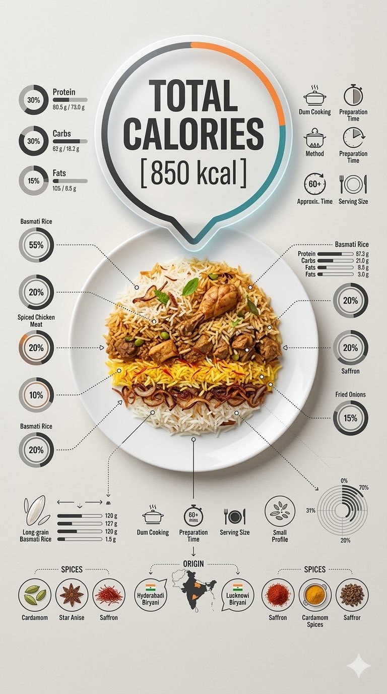
Ultra-clean top-down (90° flat lay) infographic composition. A perfectly centered white ceramic plate sits on a seamless light background. On the plate: [Dish Name] shown in a precise cross-section or layered cutaway, revealing internal ingredients, textures, and structure with extreme clarity. PRIMARY FOCAL POINT (HERO ELEMENT): Above the plate, occupying a large portion of the upper canvas, place an oversized floating infographic bubble displaying: TOTAL CALORIES [XXXX kcal] The calorie bubble is significantly larger than any other element, instantly readable at thumbnail size. Design it with strong visual contrast: bold sans-serif typography, thick outline or semi-transparent glassmorphism, subtle glow or drop shadow, and clean UI styling. This is the first thing the eye sees. SECONDARY ELEMENTS: Surrounding the plate, fill the remaining space with a dense, high-information infographic system: – Nutritional breakdown charts (protein, carbs, fats) – Ingredient percentage bars and rings – Cooking or preparation temperatures and times – Origin, aging, or production icons – Measurement scales, micro-diagrams, data badges Use thin vector connectors, dotted lines, arrows, pictograms, and radial charts clearly linking data to specific food components. Visual hierarchy rules: Calorie bubble = dominant Plate + food = secondary anchor Surrounding data = tertiary but dense and readable Design language: premium editorial infographic, Apple UI × National Geographic food science, extremely clean, structured, and modern. Color palette: natural food colors, monochrome infographic UI, one accent color reserved exclusively for the calorie bubble. Lighting: soft studio lighting, zero clutter, flat background for maximum contrast. Output: 9:16 Vertical portrait, 8K, highly detailed, 1080×192, ultra-crisp, social-feed optimized, no watermark.
超干净的 top-down(90° flat lay)infographic 构图。
一个完美居中的白色陶瓷盘子放置在无缝的浅色背景上。
在盘子上:[Dish Name] 以精确的横截面或分层剖面展示,极为清晰地揭示内部配料、质地和结构。

主要焦点(HERO ELEMENT):在盘子上方,占据上部画布的大部分,放置一个超大浮动的 infographic 气泡,显示:总热量 [XXXX kcal]
热量气泡明显大于任何其他元素,在缩略图大小时也能立即读取。将其设计为具有强烈的视觉对比:粗体 sans-serif 排版、粗轮廓或半透明 glassmorphism、细微光晕或 drop shadow,以及干净的 UI 风格。这是视觉首先看到的元素。

次要元素:在盘子周围,用密集、高信息量的 infographic 系统填充剩余空间:
– 营养成分分解图(蛋白质、碳水、脂肪)
– 配料百分比条和环形图
– 烹饪或准备的温度和时间
– 来源、陈化或生产图标
– 测量刻度、微型图解、数据徽章
使用细线矢量连接线、点线、箭头、象形图标和径向图,清晰地将数据链接到特定食物成分。

视觉层级规则:
热量气泡 = 主导
盘子 + 食物 = 次要锚点
周边数据 = 第三层,但密集且可读

设计语言:高端编辑式 infographic,Apple UI × National Geographic food science,极其干净、有结构且现代。

色彩调色板:自然食物色、单色 infographic UI,唯一强调色专用于热量气泡。

照明:柔和的 studio lighting,零杂乱,平坦背景以获得最大对比度。

输出:9:16 垂直纵向,8K,高度细节化,1080×192,超清晰,针对 social-feed 优化,无水印。
초청결한 탑다운(90° 평면 배치) 인포그래픽 구성. 완벽하게 중앙에 위치한 흰색 세라믹 접시가 매끄러운 밝은 배경 위에 놓여 있다. 접시 위에는: [Dish Name]이 정밀한 단면 또는 층별 컷어웨이로 보여져 내부 재료, 질감, 구조를 극도로 선명하게 드러낸다. 주요 초점(히어로 요소): 접시 위에, 상단 캔버스의 큰 부분을 차지하는 오버사이즈 플로팅 인포그래픽 버블을 배치하여: 총 칼로리 [XXXX kcal] 칼로리 버블은 다른 어떤 요소보다 훨씬 크며, 썸네일 크기에서도 즉시 읽을 수 있다. 강한 시각적 대비로 디자인하라: 굵은 산세리프 타이포그래피, 두꺼운 윤곽선 또는 반투명 글라스모피즘, 미세한 발광 또는 드롭 섀도우, 그리고 깔끔한 UI 스타일링. 이것이 눈에 가장 먼저 들어오는 요소이다. 보조 요소: 접시를 둘러싸고 남은 공간을 밀집된 고정보 인포그래픽 시스템으로 채운다: – 영양 성분 차트 (단백질, 탄수화물, 지방) – 재료 비율 바와 링 – 조리 또는 준비 온도 및 시간 – 원산지, 숙성 또는 생산 아이콘 – 측정 스케일, 마이크로 다이어그램, 데이터 배지 얇은 벡터 커넥터, 점선, 화살표, 픽토그램, 그리고 특정 음식 구성 요소와 데이터를 명확하게 연결하는 방사형 차트를 사용하라. 시각적 계층 규칙: 칼로리 버블 = 지배적 요소 접시 + 음식 = 보조 앵커 주변 데이터 = 3차적이지만 밀집되고 읽기 쉬움 디자인 언어: 프리미엄 편집 인포그래픽, Apple UI × National Geographic 식품 과학, 극도로 깔끔하고 구조적이며 현대적. 색상 팔레트: 자연 식품 색상, 단색 인포그래픽 UI, 칼로리 버블에만 독점적으로 예약된 하나의 강조 색상. 조명: 부드러운 스튜디오 조명, 혼잡함 없는, 최대 대비를 위한 평면 배경. 출력: 9:16 세로 초상화, 8K, 매우 상세, 1080×192, 초선명, 소셜 피드 최적화, 워터마크 없음.