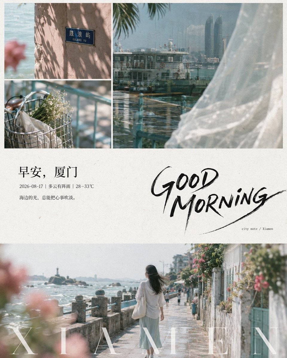
From future theme provide character, environment, object, date, and short sentence content, and distribute them into a narrative of "local perception - white space pause - full entry": the first look must be two sets of soft images at the top and bottom sandwiching a large block of paper white, with a small amount of black text in the middle forming a quiet but distinct editorial pause. The upper part uses an asymmetrical three-grid collage, with two close-up fragments stacked on one side and a larger immersive local view on the other; bold cropping allows the subject to be obscured by edges, foreground silhouettes, or repeated small shapes, establishing atmosphere through scattered tactile sensations. The lower part uses a wide main scene to carry the theme, with the character or core object facing away, sideways, or in transit, not posed, retaining sufficient environment and foreground bokeh, making the viewing feel like an accidental record. The central paper white maintains relaxed breathing: two levels of short sentences are placed at the top left, the main sentence being restrained book body text, and the second sentence smaller, lighter, and tightly spaced; a huge free-hand writing title is placed at the bottom right, creating a sense of gesture with thick and thin jumps, slightly dry-brush edges, open counters, loose connections, long tail strokes, and diagonal extensions, accompanied by a small number of small-sized notes and quotation marks or emphasis symbols compatible with the target text orthography. Regardless of the target writing system, maintain recognizable glyphs along its natural reading direction; cursive text must not be forcibly disconnected, and spaced text can establish rhythm using density variations. A line of formal high-contrast display characters is superimposed on the edge of the bottom image, transparent or swallowed by highlights; text that allows letter spacing uses wide spacing, while text that cannot be split uses word spacing, line length, and weight to gain equivalent airiness. Images are unified in a light film tone of natural daylight, yellow-green, and low-saturation cyan, with milky white highlights, low contrast, and fine grain; foreground soft focus and light mist come from real depth of field; the white background retains extremely light paper fibers, printing gray marks, and a sense of incomplete cleanliness. Use narrow white dividers to connect the photo collage and paper surface, allowing the softness of photography and the decisiveness of black handwriting to elevate each other. Avoid commercial sharpening, vivid filters, perfect centering, average columns, excessive decoration, fake aging, strong gradients, or plastic skin smoothing.
创作“晨间叙事拼贴”主题图像,精准呈现主体、构图、光线、材质、画面文字与整体情绪,并严格执行下方英文细节。

From future theme provide character, environment, object, date, and short sentence content, and distribute them into a narrative of "local perception - white space pause - full entry": the first look must be two sets of soft images at the top and bottom sandwiching a large block of paper white, with a small amount of black text in the middle forming a quiet but distinct editorial pause. The upper part uses an asymmetrical three-grid collage, with two close-up fragments stacked on one side and a larger immersive local view on the other; bold cropping allows the subject to be obscured by edges, foreground silhouettes, or repeated small shapes, establishing atmosphere through scattered tactile sensations. The lower part uses a wide main scene to carry the theme, with the character or core object facing away, sideways, or in transit, not posed, retaining sufficient environment and foreground bokeh, making the viewing feel like an accidental record. The central paper white maintains relaxed breathing: two levels of short sentences are placed at the top left, the main sentence being restrained book body text, and the second sentence smaller, lighter, and tightly spaced; a huge free-hand writing title is placed at the bottom right, creating a sense of gesture with thick and thin jumps, slightly dry-brush edges, open counters, loose connections, long tail strokes, and diagonal extensions, accompanied by a small number of small-sized notes and quotation marks or emphasis symbols compatible with the target text orthography. Regardless of the target writing system, maintain recognizable glyphs along its natural reading direction; cursive text must not be forcibly disconnected, and spaced text can establish rhythm using density variations. A line of formal high-contrast display characters is superimposed on the edge of the bottom image, transparent or swallowed by highlights; text that allows letter spacing uses wide spacing, while text that cannot be split uses word spacing, line length, and weight to gain equivalent airiness. Images are unified in a light film tone of natural daylight, yellow-green, and low-saturation cyan, with milky white highlights, low contrast, and fine grain; foreground soft focus and light mist come from real depth of field; the white background retains extremely light paper fibers, printing gray marks, and a sense of incomplete cleanliness. Use narrow white dividers to connect the photo collage and paper surface, allowing the softness of photography and the decisiveness of black handwriting to elevate each other. Avoid commercial sharpening, vivid filters, perfect centering, average columns, excessive decoration, fake aging, strong gradients, or plastic skin smoothing.
“아침 서사 콜라주”을 주제로 피사체, 구도, 조명, 질감, 화면 속 문구와 분위기를 정확히 표현하고 아래 영어 세부 조건을 엄격히 따른다.

From future theme provide character, environment, object, date, and short sentence content, and distribute them into a narrative of "local perception - white space pause - full entry": the first look must be two sets of soft images at the top and bottom sandwiching a large block of paper white, with a small amount of black text in the middle forming a quiet but distinct editorial pause. The upper part uses an asymmetrical three-grid collage, with two close-up fragments stacked on one side and a larger immersive local view on the other; bold cropping allows the subject to be obscured by edges, foreground silhouettes, or repeated small shapes, establishing atmosphere through scattered tactile sensations. The lower part uses a wide main scene to carry the theme, with the character or core object facing away, sideways, or in transit, not posed, retaining sufficient environment and foreground bokeh, making the viewing feel like an accidental record. The central paper white maintains relaxed breathing: two levels of short sentences are placed at the top left, the main sentence being restrained book body text, and the second sentence smaller, lighter, and tightly spaced; a huge free-hand writing title is placed at the bottom right, creating a sense of gesture with thick and thin jumps, slightly dry-brush edges, open counters, loose connections, long tail strokes, and diagonal extensions, accompanied by a small number of small-sized notes and quotation marks or emphasis symbols compatible with the target text orthography. Regardless of the target writing system, maintain recognizable glyphs along its natural reading direction; cursive text must not be forcibly disconnected, and spaced text can establish rhythm using density variations. A line of formal high-contrast display characters is superimposed on the edge of the bottom image, transparent or swallowed by highlights; text that allows letter spacing uses wide spacing, while text that cannot be split uses word spacing, line length, and weight to gain equivalent airiness. Images are unified in a light film tone of natural daylight, yellow-green, and low-saturation cyan, with milky white highlights, low contrast, and fine grain; foreground soft focus and light mist come from real depth of field; the white background retains extremely light paper fibers, printing gray marks, and a sense of incomplete cleanliness. Use narrow white dividers to connect the photo collage and paper surface, allowing the softness of photography and the decisiveness of black handwriting to elevate each other. Avoid commercial sharpening, vivid filters, perfect centering, average columns, excessive decoration, fake aging, strong gradients, or plastic skin smoothing.