粘土玩具落地页 UI 设计
一款为儿童玩具品牌打造的手工粘土风格日本电商落地页模型,非常适合概念设计、趣味 UI 探索及广告风格的产品展示。
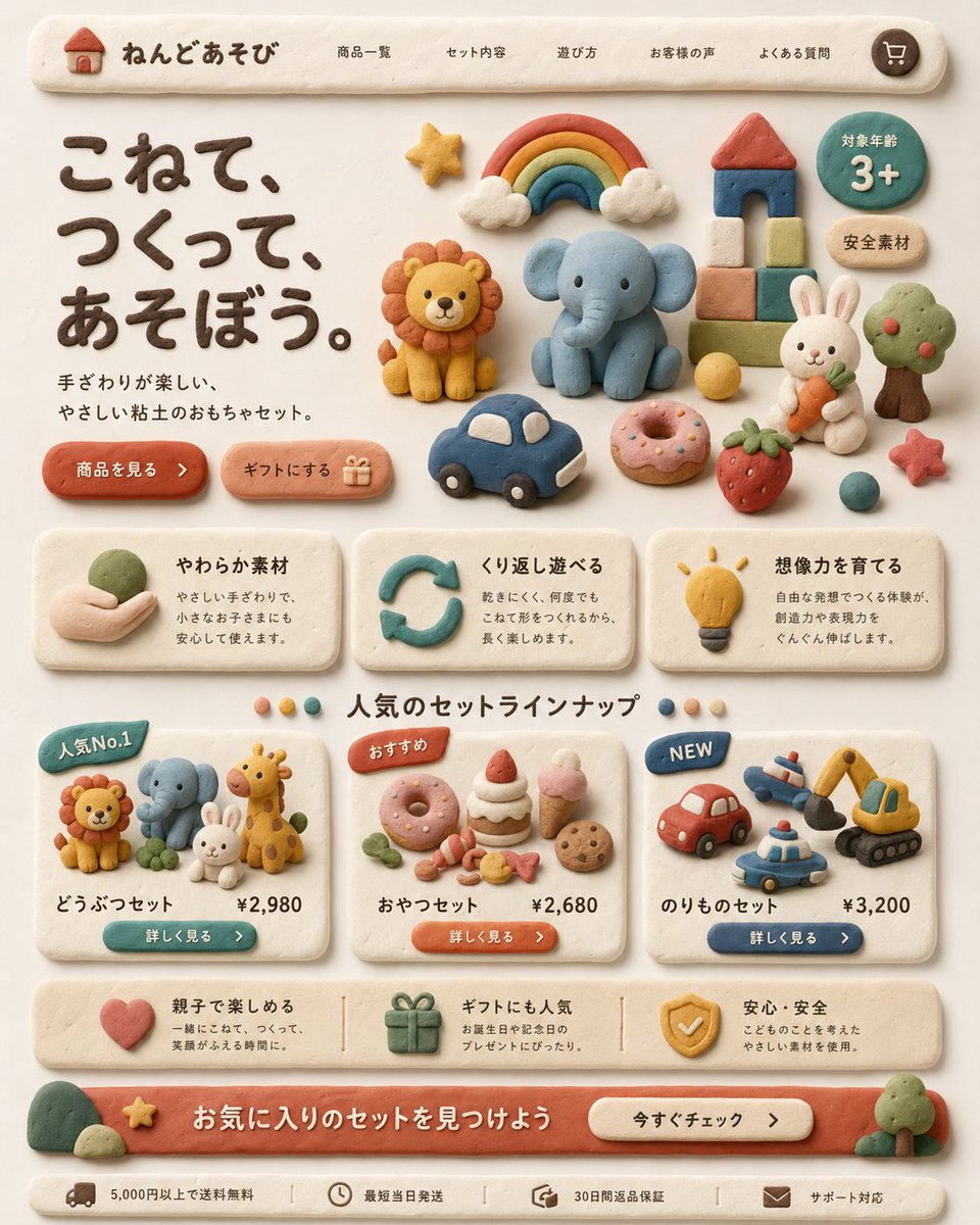
Create a warm, playful Japanese landing page for a children's clay toy brand, designed entirely in a handmade soft clay diorama style. The whole interface should look sculpted from pastel modeling clay with rounded edges, slight finger-pressed imperfections, matte texture, soft shadows, and a cozy cream background. At the top, show a pill-shaped navigation bar with a small clay house logo and the brand name "ねんどあそび", followed by 5 navigation items: "商品一覧", "セット内容", "遊び方", "お客様の声", "よくある質問", plus a round cart icon on the far right. In the hero section, place a large dark-brown clay headline on the left reading "こねて、つくって、あそぼう。" and a smaller supporting sentence beneath it reading "手ざわりが楽しい、やさしい粘土のおもちゃセット。" Add 2 rounded clay call-to-action buttons below: "商品を見る" and "ギフトにする" with a small gift icon. On the right side of the hero area, arrange 12 clay toy illustrations: a rainbow with clouds, a lion, an elephant, a block tower with red roof, a green circular badge reading "対象年齢 3+", a beige oval badge reading "安全素材", a white rabbit holding a carrot, a tree, a yellow ball, a blue toy car, a pink donut, and a strawberry, plus a small red star near the lower right. Below, create a 3-card benefits row, each card made from off-white clay with icon, title, and short Japanese description. Card 1 title: "やわらか素材" with a hand holding clay icon. Card 2 title: "くり返し遊べる" with a circular arrow icon. Card 3 title: "想像力を育てる" with a lightbulb icon. Under that, add a centered section title "人気のセットラインナップ" with 4 small colored dots around it. Then show 3 product cards. Card 1 has a blue badge "人気No.1", shows 4 animal figures: lion, elephant, rabbit, giraffe, and includes the title "どうぶつセット" and price "¥2,980" with a teal button "詳しく見る". Card 2 has an orange badge "おすすめ", shows 7 snack items: donut, cake slice, strawberry shortcake, pink ice cream cone, cookie, candy pieces, and small leaves, and includes the title "おやつセット" and price "¥2,680" with an orange button "詳しく見る". Card 3 has a blue badge "NEW", shows 4 vehicle toys: red car, airplane, police car, excavator, and includes the title "のりものセット" and price "¥3,200" with a navy button "詳しく見る". Add a horizontal reassurance strip with 3 items: a heart icon with text about parent-child fun, a gift icon with text about gift popularity, and a shield icon with text about safety and安心・安全. At the bottom, create a large coral clay banner with the headline "お気に入りのセットを見つけよう" and a cream button reading "今すぐチェック". Finally add a slim footer bar with 4 compact items and icons: "5,000円以上で送料無料", "最短当日発送", "30日間返品保証", and "サポート対応". Use a balanced, grid-based web layout, front-facing view, soft natural lighting, subtle shadows, highly polished product-design mockup quality, charming handcrafted claymation aesthetic, and a premium yet child-friendly feel.
为儿童粘土玩具品牌创建一个温馨、有趣的日本落地页,整体采用手工软粘土立体模型风格设计。整个界面应呈现出由粉彩造型粘土雕刻而成的外观,具有圆润的边缘、轻微的指压痕迹、哑光质感、柔和的阴影以及舒适的奶油色背景。在顶部,展示一个药丸形状的导航栏,包含一个小粘土房屋 Logo 和品牌名称“ねんどあそび”,随后是 5 个导航项:“商品一覧”、“セット内容”、“遊び方”、“お客様の声”、“よくある質問”,最右侧是一个圆形的购物车图标。在首屏区域,左侧放置一个深棕色粘土大标题,文字为“こねて、つくって、あそぼう。”,下方配有一句较小的辅助文案“手ざわりが楽しい、やさしい粘土のおもちゃセット。”。在下方添加 2 个圆润的粘土 CTA 按钮:“商品を見る”和“ギフトにする”(附带一个小礼物图标)。在首屏区域右侧,排列 12 个粘土玩具插图:彩虹与云朵、狮子、大象、带红屋顶的积木塔、写有“対象年齢 3+”的绿色圆形徽章、写有“安全素材”的米色椭圆形徽章、拿着胡萝卜的白兔、树木、黄球、蓝色玩具车、粉色甜甜圈和草莓,右下角还有一个小红星。在下方,创建一个包含 3 张卡片的优势展示行,每张卡片均由灰白色粘土制成,包含图标、标题和简短的日语描述。卡片 1 标题:“やわらか素材”(配手持粘土图标)。卡片 2 标题:“くり返し遊べる”(配循环箭头图标)。卡片 3 标题:“想像力を育てる”(配灯泡图标)。在此下方,添加一个居中的部分标题“人気のセットラインナップ”,周围环绕 4 个彩色小圆点。随后展示 3 张产品卡片。卡片 1 带有蓝色徽章“人気No.1”,展示 4 个动物模型:狮子、大象、兔子、长颈鹿,标题为“どうぶつセット”,价格为“¥2,980”,配有青色按钮“詳しく見る”。卡片 2 带有橙色徽章“おすすめ”,展示 7 个零食模型:甜甜圈、蛋糕片、草莓奶油蛋糕、粉色冰淇淋蛋筒、饼干、糖果碎片和叶子,标题为“おやつセット”,价格为“¥2,680”,配有橙色按钮“詳しく見る”。卡片 3 带有蓝色徽章“NEW”,展示 4 个交通工具玩具:红色小汽车、飞机、警车、挖掘机,标题为“のりものセット”,价格为“¥3,200”,配有深蓝色按钮“詳しく見る”。添加一个水平保障栏,包含 3 个项目:心形图标配亲子乐趣文案、礼物图标配礼品人气文案、盾牌图标配安心・安全文案。底部创建一个珊瑚色粘土大横幅,标题为“お気に入りのセットを見つけよう”,并配有一个写着“今すぐチェック”的奶油色按钮。最后添加一个纤细的页脚栏,包含 4 个紧凑的项目及图标:“5,000円以上で送料無料”、“最短当日発送”、“30日間返品保証”和“サポート対応”。采用平衡的网格化网页布局、正面视角、柔和的自然光、细腻的阴影,呈现出高水准的产品设计模型质感,兼具迷人的手工定格动画美学与高端且亲近儿童的氛围。