Gritty City Fever 剧院海报
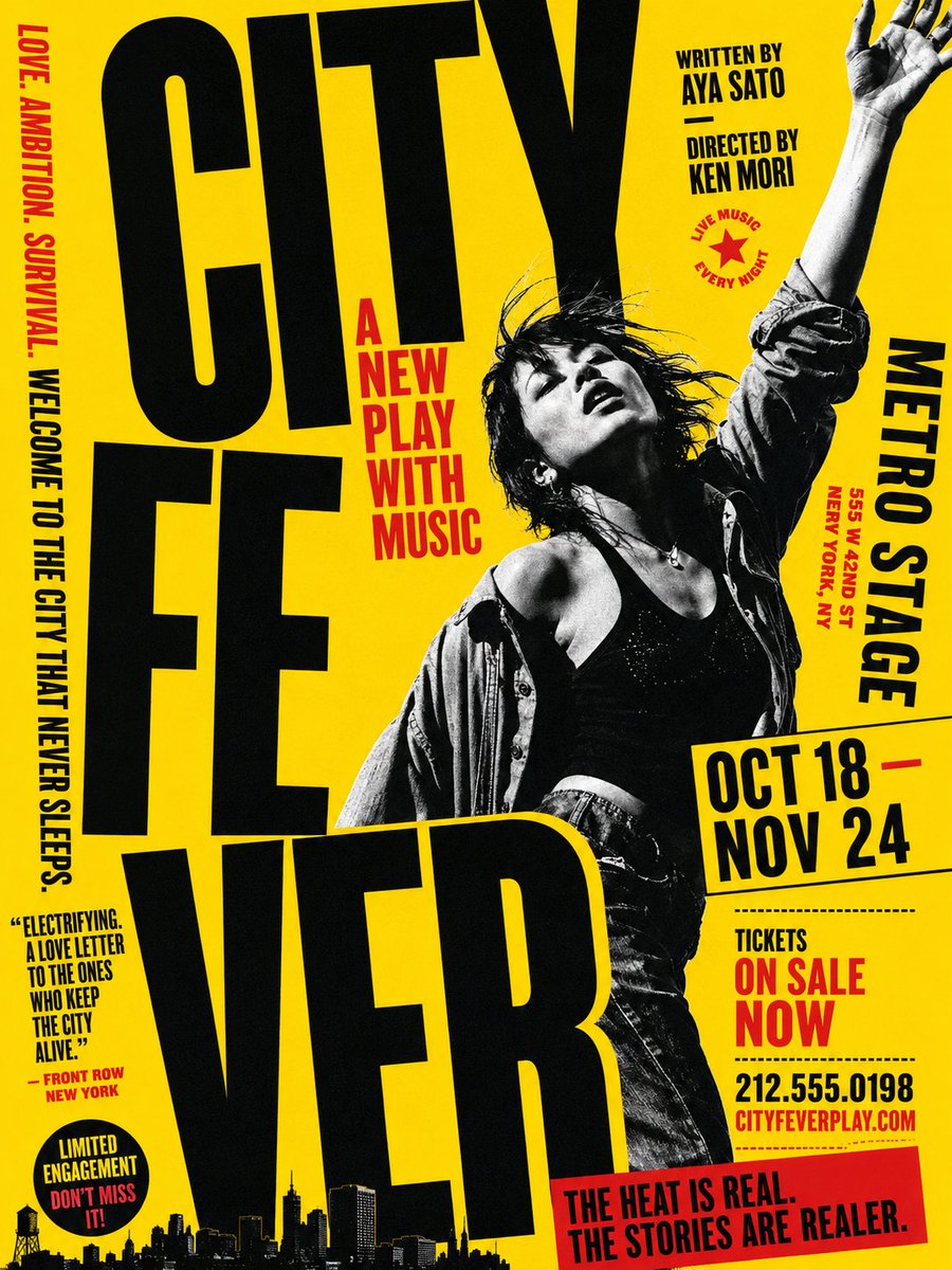
一张采用醒目的黄色、黑色和红色排版的城市音乐剧剧院海报,包含超大号字体和戏剧性的表演者剪影。
Goal: Create a bold typographic theater poster for an urban music play titled {argument name="play title" default="CITY FEVER"}, with a gritty late-1970s punk/Broadway energy and extreme oversized typography.

Canvas: Vertical poster, 3:4 aspect ratio. Bright saturated yellow background with black and red ink only, high-contrast risograph/screenprint texture, slightly distressed edges, photocopied grain, halftone shadows.

Layout: The title dominates the left and lower center in huge condensed black uppercase letters, split into exactly 3 stacked title blocks: “CITY” at the top, “FE” in the middle, and “VER” across the bottom. Letters are cropped by the poster edges and slightly tilted for a kinetic street-poster feel. Place a black-and-white cutout photo of a dramatic female dancer/singer on the right-center, overlapping the title: messy dark hair, head tilted back, one arm raised high out of frame, open shirt over a black tank top, jeans, expressive stage-performance pose.

Text content: Add exactly 11 distinct text groups around the poster: 1) left vertical red/black tagline: “LOVE. AMBITION. SURVIVAL. WELCOME TO THE CITY THAT NEVER SLEEPS.” 2) red subtitle near the center-left: {argument name="subtitle" default="A NEW PLAY WITH MUSIC"} 3) top-right credits: “WRITTEN BY AYA SATO” and “DIRECTED BY KEN MORI” 4) small red star badge reading “LIVE MUSIC EVERY NIGHT” 5) right vertical venue block: {argument name="venue" default="METRO STAGE"} with smaller red address “555 W 42ND ST NEW YORK, NY” 6) slanted date box: {argument name="dates" default="OCT 18 — NOV 24"} 7) ticket block: “TICKETS ON SALE NOW” 8) phone and website: “212.555.0198” and “CITYFEVERPLAY.COM” 9) lower-left review quote: “ELECTRIFYING. A LOVE LETTER TO THE ONES WHO KEEP THE CITY ALIVE.” with attribution “— FRONT ROW NEW YORK” 10) round black badge: “LIMITED ENGAGEMENT DON’T MISS IT!” 11) red bottom banner: {argument name="bottom banner" default="THE HEAT IS REAL. THE STORIES ARE REALER."}

Additional visual details: Add a black silhouette skyline along the bottom edge, including small buildings, skyscrapers, and a water tower. Use heavy condensed sans-serif typography similar to vintage theater bills, with red accent text for urgency. Keep all type uppercase, tightly kerned, with intentional overlaps and cropped margins. No extra people, no logos, no watermark.
目标:为一部名为 {argument name="play title" default="CITY FEVER"} 的城市音乐剧创作一张醒目的排版剧院海报,展现 20 世纪 70 年代末粗犷的朋克/百老汇风格,并使用极具视觉冲击力的超大字体。
画布:竖版海报,3:4 长宽比。明亮的饱和黄色背景,仅使用黑色和红色油墨,具有高对比度的孔版印刷/丝网印刷质感,边缘略显磨损,带有复印颗粒感和半色调阴影。
布局:标题占据左侧和中下部,使用巨大的压缩黑色大写字母,分为 3 个堆叠的标题块:顶部为“CITY”,中间为“FE”,底部为“VER”。字母被海报边缘裁剪并略微倾斜,营造出动感的街头海报氛围。在右中位置放置一张黑白剪影照片,主角为一位戏剧性的女舞者/歌手,与标题重叠:凌乱的深色头发,头部向后仰,一只手臂高举出画框,敞开的衬衫内搭黑色背心,穿着牛仔裤,呈现出富有表现力的舞台表演姿态。
文本内容:在海报周围添加 11 组不同的文本:1) 左侧垂直红/黑色标语:“LOVE. AMBITION. SURVIVAL. WELCOME TO THE CITY THAT NEVER SLEEPS.” 2) 中左侧红色副标题:{argument name="subtitle" default="A NEW PLAY WITH MUSIC"} 3) 右上角演职员表:“WRITTEN BY AYA SATO” 和 “DIRECTED BY KEN MORI” 4) 小型红色星形徽章,写着 “LIVE MUSIC EVERY NIGHT” 5) 右侧垂直场地信息块:{argument name="venue" default="METRO STAGE"},下方附带较小的红色地址 “555 W 42ND ST NEW YORK, NY” 6) 倾斜日期框:{argument name="dates" default="OCT 18 — NOV 24"} 7) 票务信息块:“TICKETS ON SALE NOW” 8) 电话和网址:“212.555.0198” 和 “CITYFEVERPLAY.COM” 9) 左下角评论引用:“ELECTRIFYING. A LOVE LETTER TO THE ONES WHO KEEP THE CITY ALIVE.”,署名为 “— FRONT ROW NEW YORK” 10) 圆形黑色徽章:“LIMITED ENGAGEMENT DON’T MISS IT!” 11) 底部红色横幅:{argument name="bottom banner" default="THE HEAT IS REAL. THE STORIES ARE REALER."}
视觉细节补充:在底部边缘添加黑色剪影天际线,包括小型建筑、摩天大楼和水塔。使用类似于复古剧院海报的粗体压缩无衬线字体,并用红色强调文本以增加紧迫感。所有字体均保持大写,字间距紧凑,并带有刻意的重叠和裁剪边缘。画面中不包含其他人物、Logo 或水印。