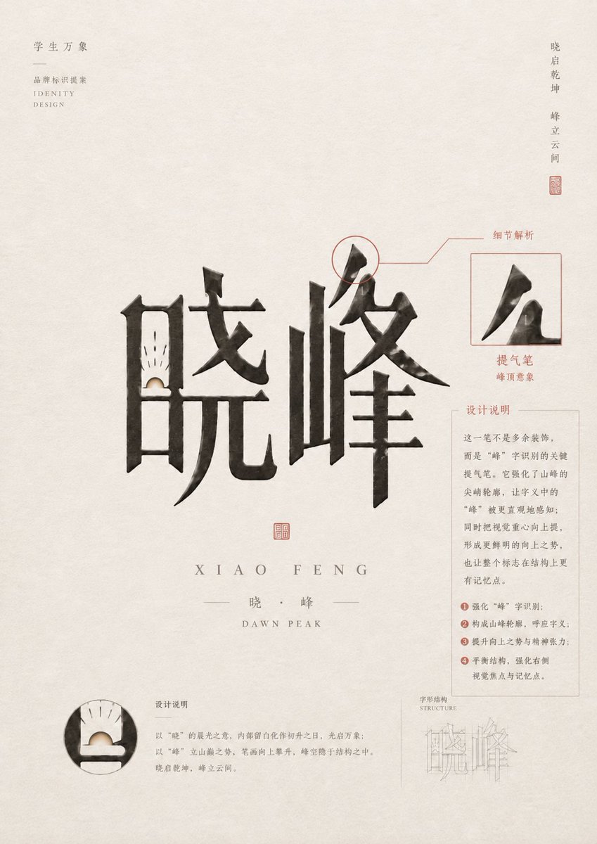
中式书法品牌形象海报
一张精致的竖版品牌形象展示海报,主体为大型中式水墨书法字标,配有红色标注、印章、局部放大图及说明性排版。
Goal: Create a refined Chinese identity-design poster for a calligraphic wordmark, centered on the two large brush characters {argument name="main Chinese wordmark" default="晓峰"}, with an elegant academy branding presentation and detailed typographic annotations.

Canvas: Portrait poster, approximately 3:4 aspect ratio, warm off-white rice-paper background with subtle fiber texture, light gray ink speckles, generous negative space, and a quiet minimalist premium design mood.

Layout: Place the oversized black ink calligraphy wordmark in the center, spanning most of the width. The two discrete main characters are: 1) left character “晓”, 2) right character “峰”. Below the wordmark, add a small red square seal centered, then widely spaced romanization “XIAO FENG”, then a thin divider line with “晓 · 峰”, then small English text “DAWN PEAK”. Use muted gray and cinnabar red for all annotation lines and seals.

Top-left branding: Add small vertical/stacked Chinese text “学生万象”, a short horizontal divider line, then “品牌标识提案”, and small English text “IDENTITY DESIGN”. Keep it light gray, tiny, and aligned near the upper-left margin.

Top-right motto: Add a narrow vertical Chinese phrase near the upper-right edge: “晓启乾坤  峰立云间”, with a tiny red seal stamp beneath it.

Annotation system: Use exactly 4 visible analysis modules around the main wordmark. 1) Upper-right stroke callout: circle the top peak-like stroke of the right character, connect it with thin red leader lines to the label “细节解析”. 2) Right inset box: a thin red square frame containing an enlarged cropped black brush stroke from the character “峰”, with the label “提气笔” and small text “峰顶意象” below. 3) Right explanatory card: a pale gray rectangular text box titled “设计说明”, containing several short Chinese paragraphs and exactly 4 numbered red bullet points. 4) Bottom-left circular detail: a round magnified crop of the lower-left internal structure of “晓”, showing a small sunrise-like white semicircle and fine black rays, with a nearby title “设计说明” and short explanatory paragraph.

Additional lower-right structure diagram: Add a very light technical construction sketch labeled “字形结构” and “STRUCTURE”, showing thin pale gray outline strokes of the wordmark, partially transparent and subordinate to the main design.

Subject details: The calligraphy should be bold, expressive, and architectural, with dry-brush texture, uneven ink density, sharp wedge-shaped terminals, and a mountain-peak silhouette emphasized in the right character. The left character should contain a subtle dawn/sunrise motif in its lower inner opening: a pale cream semicircle rising from a dark horizontal base, with fine short rays above it.

Typography and style: Use a tasteful mix of Chinese serif/Songti-style text and small spaced uppercase English letters. Keep annotation text delicate and readable but not dominant. Use black ink for the main wordmark, warm gray for body text, and muted red for seals, labels, leader lines, circles, and numbering.

Constraints: Preserve a high-end brand identity presentation style, no people, no photo realism, no bright colors, no clutter, no watermark. Keep all Chinese text as design elements, with the customizable academy label {argument name="top-left Chinese title" default="学生万象"}, the subtitle {argument name="proposal label" default="品牌标识提案"}, the romanized name {argument name="romanized name" default="XIAO FENG"}, and the English subtitle {argument name="English subtitle" default="DAWN PEAK"}.
目标:为书法字标创作一张精致的中式形象设计展示海报,以两个大型黑色水墨书法汉字 {argument name="main Chinese logotype" default="晓峰"} 为核心,采用优雅的品牌案例研究布局及说明性标注图形。
画布:3:4 比例的竖版海报,温暖的米白色宣纸背景,带有细腻的纤维纹理和浅米灰色陈旧感,留白充足,呈现极简的高级编辑排版风格。
主体构图:将巨大的黑色书法字标置于中心偏左位置,占据页面中部。笔触应富有表现力、棱角分明且具有建筑感,呈现干笔渐变、粗糙的墨迹边缘、锋利的钩笔末端以及笔画内细微的留白。在字标下方中心附近添加一枚红色方形印章。
文字层级:在主字标下方,设置间距宽阔的拼音 {argument name="romanized name" default="XIAO FENG"},随后是一条细长的水平分割线,两侧为较小的中文名称,再下方是小号大写英文字体 {argument name="English subtitle" default="DAWN PEAK"}。保持排版精致、字间距宽、灰色且低调。
左上角标识区:在左上角添加一个小型垂直对齐的品牌标题,包含中文和英文行。包含 4 行可见文字:“学生万象”、一条短横线、“品牌标识提案”以及“IDENTITY DESIGN”。使用微小的灰色衬线体或宋体。
右上角座右铭区:在右上角添加一段狭长的垂直中文短语 {argument name="vertical motto" default="晓启乾坤 峰立云间"},下方配有一枚小红印。
右侧标注系统:在字标右侧创建 3 个分析元素。首先,用一个细红圈高亮显示第二个字的顶部笔锋,通过红色引导线连接至标签“细节解析”。其次,一个红色轮廓的方形插图显示该笔锋的放大细节,下方标注“提气笔”及小字“峰顶意象”。第三,在其下方放置一张带有浅色边框的矩形说明卡,标题为“设计说明”,包含一段紧凑的中文段落和 4 个带红色圆圈编号的要点。
左下角细节标注:添加 1 个圆形放大插图,展示第一个字左下角内部的笔画细节,带有精细的黑色构造线和浅色半圆高亮。其右侧放置小标题“设计说明”及一段微小的灰色中文说明文字。
右下角结构标注:添加 1 个淡雅的技术构造图,标注为“字形结构”,下方附带英文“STRUCTURE”,展示细线条的几何辅助线及低透明度的字标轮廓。
视觉风格:高端中式品牌展示,学术性形象设计提案,克制的红色标注线,灰色微型排版,黑色水墨书法,细腻的印章红点缀,精致的网格状说明细节,博物馆目录般的静谧留白。
约束条件:使用 2 个主要中式书法汉字,2 枚红色印章,3 个右侧分析元素,1 个左下角圆形插图,以及 1 个右下角结构图。所有标注需保持精巧准确,避免现代 UI 风格,避免鲜艳色彩,避免杂乱,并保留海报优雅的留白。