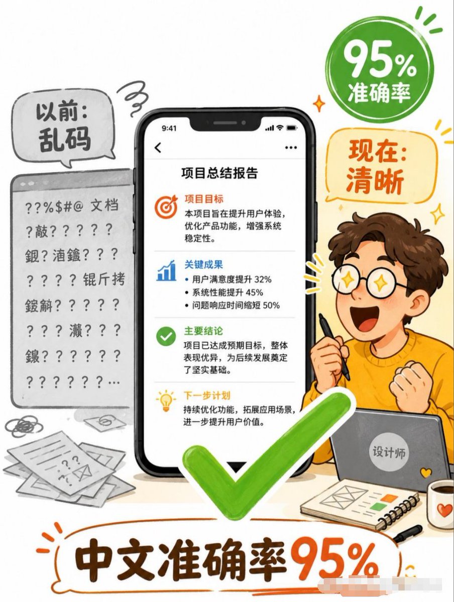
中文文本准确性信息图
制作一张竖版中文社交媒体信息图,展示 AI 生成的中文文本从乱码输出提升至 95% 准确率的过程。
Goal: Create a vertical Chinese business infographic poster explaining that AI image generation now achieves high Chinese text accuracy, transforming messy text into clear deliverables.

Canvas: Portrait 3:4 poster, clean white background, playful hand-drawn editorial style with orange, green, black, and gray accents. Use thick sketch outlines, rounded speech bubbles, energetic doodle marks, and a friendly tech-explainer tone.

Layout: Center the composition around one large smartphone mockup showing a clean Chinese report page. On the left, show a gray “before” document panel full of garbled symbols and unreadable Chinese-like text. On the right, show a cheerful cartoon designer sitting behind a laptop, holding a stylus, with an excited fist pose. Add a large bright green check mark overlapping the lower center of the phone and foreground. Add a green circular badge in the upper right and an orange speech bubble below it. Put a large bottom headline inside an orange hand-drawn outline bubble.

Text content: Use exactly 5 main text areas. 1) Left gray speech bubble: “以前:乱码”. 2) Upper-right green badge: “95% 准确率”. 3) Right orange speech bubble: “现在:清晰”. 4) Phone screen title: “项目总结报告”. 5) Bottom headline: “中文准确率95%”.

Phone screen details: Show an iPhone-like black smartphone with notch and status bar time 9:41. Inside the report page, include 4 stacked content sections separated by thin gray dividers. Section 1 has an orange target icon and heading “项目目标”, followed by short Chinese body text about improving user experience, optimizing product functions, and strengthening system stability. Section 2 has a blue bar-chart icon and heading “关键成果”, followed by 3 bullet points: user satisfaction increased 32%, system performance improved 45%, issue response time shortened 50%. Section 3 has a green check icon and heading “主要结论”, followed by body text saying the project achieved expected goals and laid a solid foundation. Section 4 has a yellow lightbulb icon and heading “下一步计划”, followed by body text about continuous optimization and expanding application scenarios.

Left “before” area: Render a gray browser/document card with a top bar and multiple lines of broken characters, question marks, punctuation, and scattered Chinese characters, clearly unreadable. Add messy paper sheets, scribbles, and an envelope icon near the bottom left to emphasize disorganized documents.

Right character details: Create a cute young male cartoon designer with curly brown hair, fair skin, orange sweater, and simple expressive pose; the face may be left blank or softly obscured. He holds a black stylus in one hand and sits behind a gray laptop with a round sticker reading “设计师”. On the desk add exactly 3 foreground accessories: a spiral notebook with simple layout sketches and small color blocks, a black pen, and a white mug with an orange heart.

Visual style: Friendly Chinese social-media explainer poster, semi-flat vector illustration mixed with marker-like hand-drawn lines, soft shadows, rounded shapes, high readability, vibrant green check mark and orange headline emphasis. Keep the composition busy but legible, with no photorealism.

Constraints: Preserve the Chinese text exactly as specified, keep the smartphone report text crisp and readable, use exactly one central phone, one left messy document card, one designer character, one green check mark, one green badge, one orange speech bubble, and one bottom headline. Do not add watermarks, logos, QR codes, or extra main claims.
目标:制作一张竖版中文商业信息图海报,解释 AI 图像生成目前已实现高中文文本准确率,将杂乱的文本转化为清晰的交付成果。

画布:3:4 竖版海报,简洁的白色背景,采用趣味手绘编辑风格,辅以橙色、绿色、黑色和灰色点缀。使用粗线条草图轮廓、圆形气泡框、充满活力的涂鸦标记,营造友好的科技说明风格。

布局:构图中心为一部大型智能手机模型,展示清晰的中文报告页面。左侧展示一个灰色的“之前”文档面板,上面布满乱码符号和无法辨认的类中文文本。右侧展示一位坐在笔记本电脑后、手持触控笔、做出兴奋握拳姿势的可爱卡通设计师。在手机下方中心和前景处添加一个巨大的亮绿色对勾。右上角添加一个绿色圆形徽章,下方添加一个橙色气泡框。底部的大标题置于一个橙色手绘轮廓气泡内。

文本内容:使用 5 个主要文本区域。1) 左侧灰色气泡:“以前:乱码”。2) 右上角绿色徽章:“95% 准确率”。3) 右侧橙色气泡:“现在:清晰”。4) 手机屏幕标题:“项目总结报告”。5) 底部大标题:“中文准确率 95%”。

手机屏幕细节:展示一部带有刘海屏和状态栏时间 9:41 的黑色 iPhone 风格智能手机。报告页面内包含 4 个由细灰色分割线隔开的堆叠内容区域。第 1 部分包含一个橙色目标图标和标题“项目目标”,后跟关于提升用户体验、优化产品功能和加强系统稳定性的简短中文正文。第 2 部分包含一个蓝色柱状图图标和标题“关键成果”,后跟 3 个要点:用户满意度提升 32%,系统性能提升 45%,问题响应时间缩短 50%。第 3 部分包含一个绿色对勾图标和标题“主要结论”,后跟说明项目达到预期目标并奠定坚实基础的正文。第 4 部分包含一个黄色灯泡图标和标题“下一步计划”,后跟关于持续优化和扩展应用场景的正文。

左侧“之前”区域:渲染一个带有顶部栏的灰色浏览器/文档卡片,上面有多行损坏的字符、问号、标点符号和散乱的汉字,清晰可见且无法阅读。在左下角添加杂乱的纸张、涂鸦和信封图标,以强调文档的无序状态。

右侧人物细节:创建一个可爱的年轻男性卡通设计师,留着棕色卷发,肤色白皙,身穿橙色毛衣,姿势简单生动;面部可留白或进行柔和处理。他一手拿着黑色触控笔,坐在写有“设计师”圆形贴纸的灰色笔记本电脑后。在桌面上添加 3 个前景配件:一本带有简单布局草图和色块的螺旋笔记本、一支黑笔和一个带有橙色爱心的白色马克杯。

视觉风格:友好的中文社交媒体说明海报,半扁平矢量插画与马克笔风格手绘线条相结合,柔和阴影,圆润形状,高可读性,强调鲜艳的绿色对勾和橙色标题。构图丰富但清晰易读,不使用照片写实风格。

约束条件:严格保留指定的中文文本,保持手机报告文本清晰易读,仅使用一个中央手机、一个左侧杂乱文档卡片、一个设计师角色、一个绿色对勾、一个绿色徽章、一个橙色气泡框和一个底部大标题。不要添加水印、Logo、二维码或额外的核心主张。