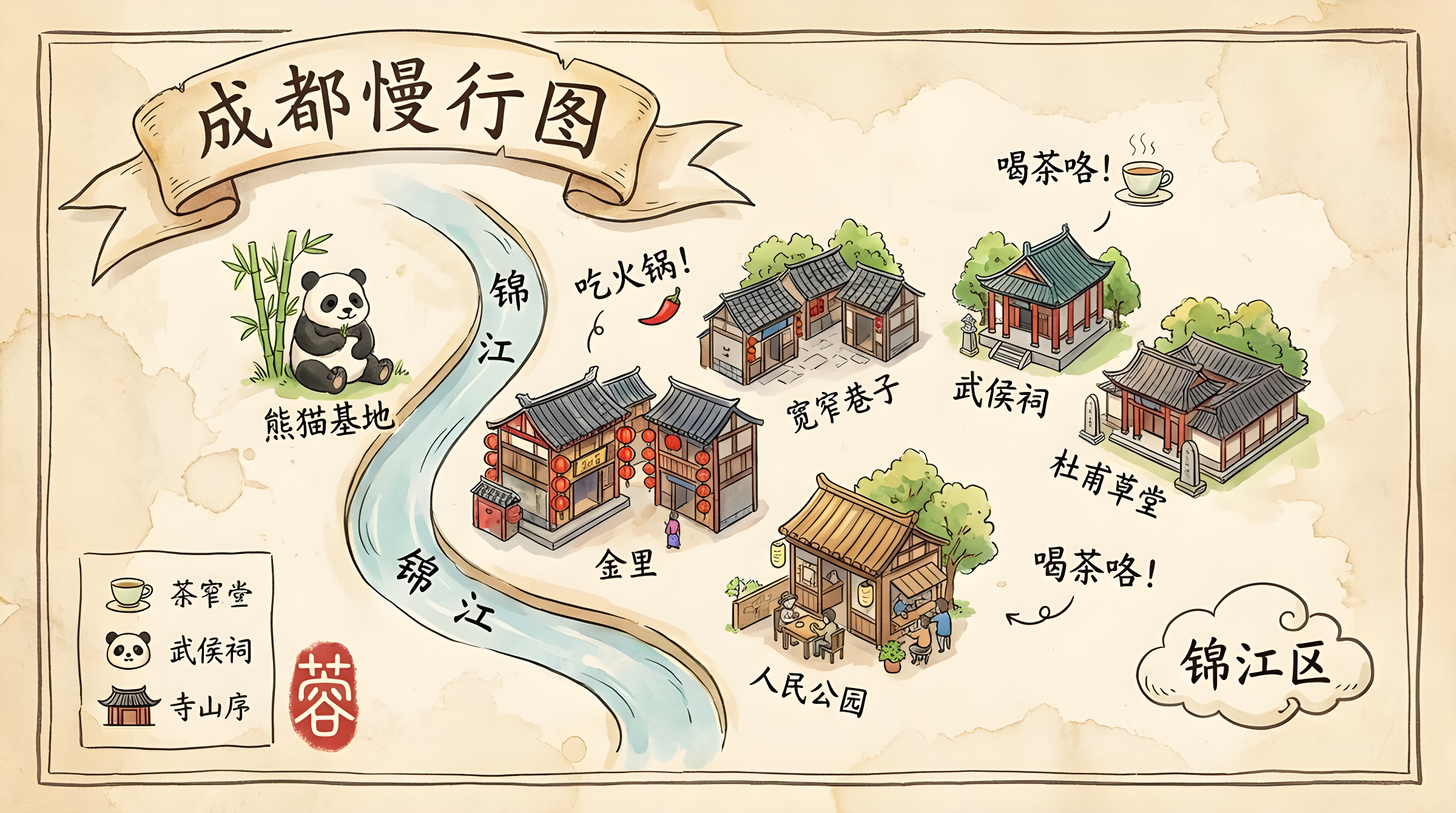
Aspect ratio 16:9, a charming and exquisite hand-drawn tourist map of Chengdu, in the style of Studio Ghibli art books. The entire image is a watercolor and pen-and-ink illustration on textured, aged parchment paper. The overall aesthetic is whimsical, vibrant, and full of life.

**Map Layout & Style:**
The map presents Chengdu's core landmarks in a stylized isometric perspective, depicted as adorable, finely detailed miniature buildings and icons (e.g., pandas for the Panda Base, lanterns for Jinli, teahouses for People's Park). The layout is organic and free-flowing, rather than rigidly grid-based.

**Critical Typography Challenge (High Difficulty):**
All text must be rendered in an elegant, slightly imperfect handwritten calligraphic style (Xingkai), appearing as if written with the same pen used for the illustrations.
1. **Main Title:** The main title "Chengdu Slow Travel Map" is artistically written on a flowing ribbon at the top.
2. **Angled Playful Labels:** Each landmark icon is accompanied by its name (e.g., "Kuanzhai Alley," "Wuhou Shrine," "Du Fu Thatched Cottage") written playfully at a slight tilt. Text placement should feel organic, not rigidly horizontal.
3. **Curved Text Along Paths:** A stylized Jinjiang River flows through the map. The river's name "Jinjiang" must gracefully follow the curved path of the river—a key test of execution.
4. **Integrated Annotations:** Scattered across the map are small, whimsical annotations combining text and icons. For example:
   - A note saying "Let's Eat Hotpot!" paired with a tiny red chili icon.
   - A label reading "Time for Tea!" alongside a miniature steaming teacup icon.
   - The district name "Jinjiang District" written inside a hand-drawn cloud shape.
5. **Hand-Drawn Legend:** In one corner, a hand-drawn "Legend" box contains small icons (e.g., teacup, panda face, temple roof) with corresponding handwritten labels.
6. **Seal Stamp:** A red, hand-carved-style seal stamped with the character "蓉" (Chengdu's abbreviated name) overlaps slightly with the border in a corner.

**Aesthetics:**
A masterpiece of illustrative cartography. Text and illustrations must blend seamlessly. Watercolor effects should be soft, with visible washes and textures, while pen lines remain confident and lively. The overall feel is warm, inviting, and full of character.

**Negative Prompts:**
Computer fonts, digitally generated text, straight lines, rigid grids, perfect alignment, exclusively horizontal text, text overlays, photographs, 3D, minimalism, generic icons, misspellings, garbled text, watermarks.
画幅比例16:9,一张迷人而精致的成都手绘旅游地图,具有吉卜力工作室艺术设定集般的风格。整个画面是在一张有纹理的、陈旧的羊皮纸上的水彩和钢笔淡彩插画。整体美学风格异想天开、充满活力和生活气息。

地图布局与风格:
地图以风格化的等轴测视角,展示了成都的核心地标,这些地标被描绘成可爱、精细的微缩建筑和图标(例如,熊猫基地的熊猫、锦里的灯笼、人民公园的茶馆)。布局是有机的、自由流动的,而非基于僵硬的网格。

至关重要的字体排版挑战 (高难度部分):
所有文字必须以一种优美的、略带不完美感的手写书法风格(行楷)呈现,看起来就像是用绘制插图的同一支钢笔写出来的。
1.  **主标题:** 主标题“成都慢行图”被艺术性地写在顶部一条飘逸的缎带上。
2.  **带角度的趣味标签:** 每个地标图标旁边,都以俏皮的、略带倾斜的方式写着它的名字(例如:“宽窄巷子”、“武侯祠”、“杜甫草堂”)。文字需要感觉是有机放置的,而不是死板的水平线。
3.  **沿路径弯曲的文字:** 一条风格化的锦江贯穿地图。河流的名字“锦江”二字,需要沿着河流的弯曲路径优雅地书写。这是一个关键测试点。
4.  **融合性的注释:** 地图上散布着小小的、异想天开的注释,这些注释结合了文字和图标。例如:
    - 一条写着“吃火锅!”的注释,旁边画着一个小小的红辣椒。
    - 一个“喝茶咯!”的标签,旁边有一个冒着热气的微型茶杯图标。
    - 区域名称“锦江区”被写在一个手绘的云朵形状里。
5.  **手绘图例:** 在一个角落,有一个手绘的“图例”方框,里面有小图标(如茶杯、熊猫脸、寺庙屋顶)和它们对应的手写标签。
6.  **印章:** 一枚红色的、仿佛手工篆刻风格的印章,印着“蓉”字(成都的简称),被盖在角落,并与边框有轻微的重叠。

美学:
一幅插画地图学的杰作。文字和插图的融合必须天衣无缝。水彩效果要柔和,有可见的水渍和纹理,而钢笔线条则要自信而生动。整体感觉温暖、诱人,充满个性。

负面提示词:
电脑字体, 计算机生成的文字, 直线, 僵硬的网格, 完美对齐, 只有水平文字, 文字浮层, 照片, 3D, 极简, 通用图标, 拼写错误, 乱码, 水印。
비율 16:9, 스튜디오 지브리 아트북 스타일의 매력적이고 정교한 청두의 손으로 그린 관광 지도. 전체 이미지는 질감 있는 오래된 양피지에 수채화와 펜-잉크 일러스트로 구성. 전체적인 미학은 기발하고 생동감 넘치며 활기차다.
**지도 레이아웃 및 스타일:**
지도는 청두의 주요 랜드마크를 스타일화된 등각 투시도로 제시하며, 귀엽고 세밀하게 묘사된 미니어처 건물과 아이콘(예: 판다 기지의 판다, 진리의 등불, 인민공원의 찻집)으로 표현. 레이아웃은 유기적이고 자유롭게 흐르며, 엄격한 격자 기반이 아니다.
**중요한 타이포그래피 도전 (고난도):**
모든 텍스트는 우아하고 약간 불완전한 손글씨 서예 스타일(Xingkai)로 렌더링되어, 일러스트와 같은 펜으로 쓴 것처럼 보여야 한다.
1. **메인 타이틀:** 메인 타이틀 "Chengdu Slow Travel Map"은 상단의 흐르는 리본에 예술적으로 쓰여 있다.
2. **기울어진 장난스러운 라벨:** 각 랜드마크 아이콘은 약간 기울어진 채로 장난스럽게 쓰여진 이름(예: "Kuanzhai Alley," "Wuhou Shrine," "Du Fu Thatched Cottage")과 함께 한다. 텍스트 배치는 유기적으로 느껴져야 하며, 엄격하게 수평적이지 않아야 한다.
3. **경로를 따라 곡선 텍스트:** 스타일화된 진장 강이 지도를 가로지른다. 강의 이름 "Jinjiang"은 강의 곡선을 우아하게 따라가야 하며, 이는 실행의 핵심 테스트이다.
4. **통합된 주석:** 지도 곳곳에 텍스트와 아이콘이 결합된 작고 기발한 주석이 흩어져 있다. 예를 들어:
- 작은 빨간 고추 아이콘과 함께 "Let's Eat Hotpot!"이라고 적힌 메모.
- 미니어처 김이 나는 찻잔 아이콘과 함께 "Time for Tea!"라고 읽히는 라벨.
- 손으로 그린 구름 모양 안에 쓰여진 "Jinjiang District"라는 구역 이름.
5. **손으로 그린 범례:** 한쪽 구석에는 작은 아이콘(예: 찻잔, 판다 얼굴, 사원 지붕)과 해당 손글씨 라벨이 포함된 손으로 그린 "범례" 상자가 있다.
6. **도장:** 모서리에서 약간 경계와 겹치는 "蓉"(청두의 약칭) 글자가 새겨진 빨간 손으로 조각한 스타일의 도장이 찍혀 있다.
**미학:**
일러스트 지도 제작의 걸작. 텍스트와 일러스트가 매끄럽게 어우러져야 한다. 수채화 효과는 부드럽고, 세척과 질감이 보이며, 펜 라인은 자신감 있고 생동감 있어야 한다. 전체적인 느낌은 따뜻하고 매력적이며 개성이 넘친다.
**네거티브 프롬프트:**
컴퓨터 폰트, 디지털 생성 텍스트, 직선, 엄격한 격자, 완벽한 정렬, 독점적 수평 텍스트, 텍스트 오버레이, 사진, 3D, 미니멀리즘, 일반 아이콘, 철자 오류, 난잡한 텍스트, 워터마크.