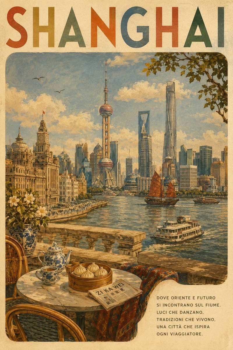
Create a premium vintage travel poster for LOCATION.

Visual Style

Create a nostalgic mid-century European travel-poster illustration with a hand-painted lithograph/screen-print aesthetic. Use warm cream paper, muted naturally faded pigments, subtle paper grain, visible brush texture, gentle ink imperfections, and softly weathered edges. The artwork should feel collectible, sophisticated, tactile, and authentic rather than digitally rendered.

Composition

Use a tall portrait layout. At the top, place LOCATION in large uppercase, hand-drawn geometric lettering. Give each letter a slightly different muted vintage color, with spacious, elegant, and subtly imperfect printed character.

Below the title, create one large rounded-rectangle illustrated scene occupying most of the poster. Build a cohesive panoramic composition around the recognizable identity of LOCATION, featuring 3–5 genuine local landmarks or architectural elements.

Include, where appropriate:

the city’s most recognizable landmark

characteristic local architecture

a distinctive landscape, waterfront, river, square, mountain, or skyline

authentic local transportation

regional vegetation and atmospheric details

small background figures when useful

Keep all landmarks geographically and architecturally plausible. Do not invent landmarks or combine buildings from unrelated cities.

Foreground

Create an inviting terrace, balcony, café table, or stone viewpoint inspired by LOCATION. Add 2–4 culturally appropriate local details such as traditional pottery, regional food or pastry, coffee or tea, textiles, flowers, decorative tiles, or characteristic architectural materials. Keep these elements secondary to the main scenery.

Atmosphere & Palette

Use warm golden-hour lighting, a soft blue sky, cream-colored clouds, and gentle atmospheric haze. Use a refined palette of terracotta, ochre, muted blue, olive green, cream, and earthy brown, naturally adapted to LOCATION. Add subtle details such as birds, foliage, boats, street activity, and architectural shadows where appropriate.

Poster Text

In the lower-right cream area, add a short poetic Italian slogan specifically written for LOCATION. Format it as 5–7 short uppercase lines. The wording should feel elegant, poetic, timeless, and travel-oriented—not like advertising copy.

Accuracy & Final Look

The poster must immediately communicate LOCATION to someone familiar with the city. Prioritize authentic landmarks, architecture, landscapes, cuisine, materials, colors, and cultural details. Avoid generic tourist imagery when a distinctive local alternative exists.

The finished artwork should resemble a beautifully preserved vintage travel poster from the golden age of illustrated tourism: painterly, tactile, slightly imperfect, warm, cinematic, sophisticated, and suitable for a premium travel-art collection.
创作“复古旅行手绘海报”图像。忠实保留以下完整创作说明中的主体身份、构图、光线、材质、风格、画幅、画面文字与负面约束。

Create a premium vintage travel poster for LOCATION.

Visual Style

Create a nostalgic mid-century European travel-poster illustration with a hand-painted lithograph/screen-print aesthetic. Use warm cream paper, muted naturally faded pigments, subtle paper grain, visible brush texture, gentle ink imperfections, and softly weathered edges. The artwork should feel collectible, sophisticated, tactile, and authentic rather than digitally rendered.

Composition

Use a tall portrait layout. At the top, place LOCATION in large uppercase, hand-drawn geometric lettering. Give each letter a slightly different muted vintage color, with spacious, elegant, and subtly imperfect printed character.

Below the title, create one large rounded-rectangle illustrated scene occupying most of the poster. Build a cohesive panoramic composition around the recognizable identity of LOCATION, featuring 3–5 genuine local landmarks or architectural elements.

Include, where appropriate:

the city’s most recognizable landmark

characteristic local architecture

a distinctive landscape, waterfront, river, square, mountain, or skyline

authentic local transportation

regional vegetation and atmospheric details

small background figures when useful

Keep all landmarks geographically and architecturally plausible. Do not invent landmarks or combine buildings from unrelated cities.

Foreground

Create an inviting terrace, balcony, café table, or stone viewpoint inspired by LOCATION. Add 2–4 culturally appropriate local details such as traditional pottery, regional food or pastry, coffee or tea, textiles, flowers, decorative tiles, or characteristic architectural materials. Keep these elements secondary to the main scenery.

Atmosphere & Palette

Use warm golden-hour lighting, a soft blue sky, cream-colored clouds, and gentle atmospheric haze. Use a refined palette of terracotta, ochre, muted blue, olive green, cream, and earthy brown, naturally adapted to LOCATION. Add subtle details such as birds, foliage, boats, street activity, and architectural shadows where appropriate.

Poster Text

In the lower-right cream area, add a short poetic Italian slogan specifically written for LOCATION. Format it as 5–7 short uppercase lines. The wording should feel elegant, poetic, timeless, and travel-oriented—not like advertising copy.

Accuracy & Final Look

The poster must immediately communicate LOCATION to someone familiar with the city. Prioritize authentic landmarks, architecture, landscapes, cuisine, materials, colors, and cultural details. Avoid generic tourist imagery when a distinctive local alternative exists.

The finished artwork should resemble a beautifully preserved vintage travel poster from the golden age of illustrated tourism: painterly, tactile, slightly imperfect, warm, cinematic, sophisticated, and suitable for a premium travel-art collection.
“빈티지 여행 일러스트 포스터” 이미지를 제작한다. 아래의 전체 제작 사양에 있는 인물 정체성, 구도, 조명, 재질, 화풍, 화면비, 화면 속 문자와 금지 조건을 충실히 유지한다.

Create a premium vintage travel poster for LOCATION.

Visual Style

Create a nostalgic mid-century European travel-poster illustration with a hand-painted lithograph/screen-print aesthetic. Use warm cream paper, muted naturally faded pigments, subtle paper grain, visible brush texture, gentle ink imperfections, and softly weathered edges. The artwork should feel collectible, sophisticated, tactile, and authentic rather than digitally rendered.

Composition

Use a tall portrait layout. At the top, place LOCATION in large uppercase, hand-drawn geometric lettering. Give each letter a slightly different muted vintage color, with spacious, elegant, and subtly imperfect printed character.

Below the title, create one large rounded-rectangle illustrated scene occupying most of the poster. Build a cohesive panoramic composition around the recognizable identity of LOCATION, featuring 3–5 genuine local landmarks or architectural elements.

Include, where appropriate:

the city’s most recognizable landmark

characteristic local architecture

a distinctive landscape, waterfront, river, square, mountain, or skyline

authentic local transportation

regional vegetation and atmospheric details

small background figures when useful

Keep all landmarks geographically and architecturally plausible. Do not invent landmarks or combine buildings from unrelated cities.

Foreground

Create an inviting terrace, balcony, café table, or stone viewpoint inspired by LOCATION. Add 2–4 culturally appropriate local details such as traditional pottery, regional food or pastry, coffee or tea, textiles, flowers, decorative tiles, or characteristic architectural materials. Keep these elements secondary to the main scenery.

Atmosphere & Palette

Use warm golden-hour lighting, a soft blue sky, cream-colored clouds, and gentle atmospheric haze. Use a refined palette of terracotta, ochre, muted blue, olive green, cream, and earthy brown, naturally adapted to LOCATION. Add subtle details such as birds, foliage, boats, street activity, and architectural shadows where appropriate.

Poster Text

In the lower-right cream area, add a short poetic Italian slogan specifically written for LOCATION. Format it as 5–7 short uppercase lines. The wording should feel elegant, poetic, timeless, and travel-oriented—not like advertising copy.

Accuracy & Final Look

The poster must immediately communicate LOCATION to someone familiar with the city. Prioritize authentic landmarks, architecture, landscapes, cuisine, materials, colors, and cultural details. Avoid generic tourist imagery when a distinctive local alternative exists.

The finished artwork should resemble a beautifully preserved vintage travel poster from the golden age of illustrated tourism: painterly, tactile, slightly imperfect, warm, cinematic, sophisticated, and suitable for a premium travel-art collection.