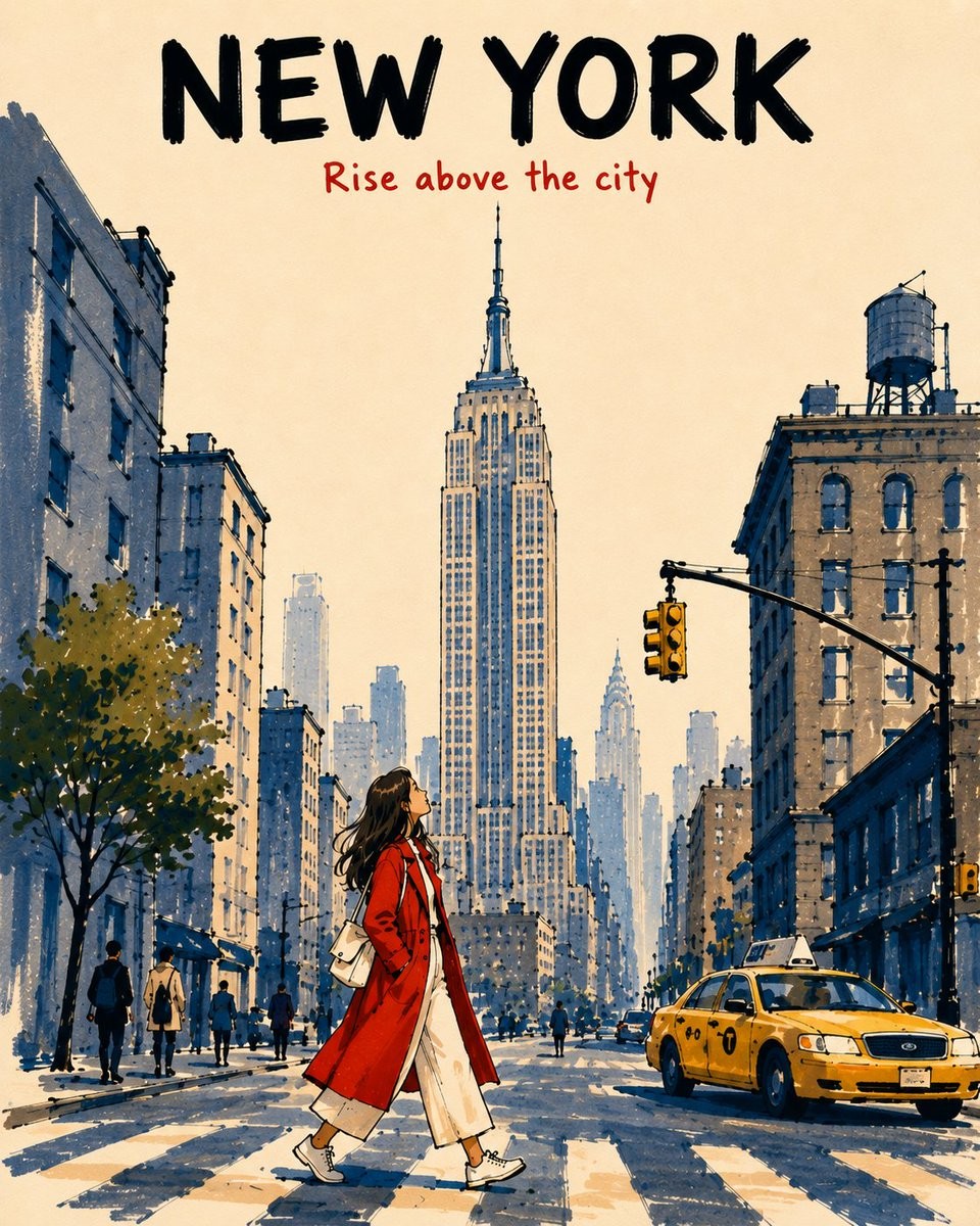
Alcohol Marker Travel Poster
A comprehensive prompt for generating vertical travel posters with a mid-century alcohol marker aesthetic, featuring customizable city names and landmarks.
[DESTINATION] = {argument name="city name" default="[CITY NAME]"}
[LANDMARK] = {argument name="primary landmark" default="[PRIMARY LANDMARK]"}

Create a vertical 4:5 alcohol-marker travel poster of [LANDMARK] in [DESTINATION], viewed from a low pedestrian viewpoint. Make it feel like an affectionate, imperfect travel memory, not a photorealistic rendering, postcard, map, landmark collage, or cinematic panorama.

TYPOGRAPHY

Keep the top 14–16% open warm ivory paper.

At the top center, write exactly:

“[CITY NAME]” — large, bold black marker capitals.

Below it:

“[SHORT TRAVEL PHRASE]” — smaller vermilion-red handwritten marker lettering.

Keep both lines highly legible and separate from the landmark. No additional text.

SCENE

Place [LANDMARK] prominently in the upper-center, preserving its most recognizable silhouette and defining features while simplifying unnecessary detail.

Reduce surrounding architecture to 2–3 broad building masses. Add one simple local vehicle, a few tiny pedestrians, and a young female traveler walking across the lower-center foreground while looking upward.

Dress her in a vivid vermilion-red coat over cream clothing, with natural warm-peach skin tones. Make her warm colors contrast against the cool slate-blue and pale blue-gray architecture.

DEPTH & MARKER STYLE

Foreground: saturated colors, 2–3 overlapping marker passes, visible chisel-tip strokes, darker shadow overlaps, and thick broken black contours.

Midground: medium-density slate-blue / blue-gray marker strokes, 1–2 passes, moderately thick broken outlines.

Background: progressively reduce saturation, density, contrast, detail, and contour weight. Use pale blue-gray single-pass strokes with thin, incomplete outlines that gently merge into the ivory sky.

Use broad vertical strokes for buildings and short directional strokes for streets. Leave approximately 40% of the warm ivory paper exposed.

STYLE CONSTRAINTS

Keep the illustration simplified, tactile, graphic, airy, nostalgic, and slightly imperfect, with only major architectural forms and a few window suggestions.

Avoid: photorealism, repetitive window grids, dense skyline detail, realistic reflections, uniform outlines, digital gradients, watercolor effects, black-filled shadows, excessive detail, clutter, or extra typography.

Overall: sophisticated mid-century-inspired travel-book illustration recreated with expressive alcohol markers, with strong foreground-to-background atmospheric perspective and an unmistakable sense of place.
[DESTINATION] = London [LANDMARK] = Big Ben Create a vertical 4:5 alcohol-marker travel poster of [LANDMARK] in [DESTINATION], viewed from a low pedestrian viewpoint. Make it feel like an affectionate, imperfect travel memory, not a photorealistic rendering, postcard, map, landmark collage, or cinematic panorama. TYPOGRAPHY Keep the top 14–16% open warm ivory paper. At the top center, write exactly: “[CITY NAME]” — large, bold black marker capitals. Below it: “Wish You Were Here” — smaller vermilion-red handwritten marker lettering. Keep both lines highly legible and separate from the landmark. No additional text. SCENE Place [LANDMARK] prominently in the upper-center, preserving its most recognizable silhouette and defining features while simplifying unnecessary detail. Reduce surrounding architecture to 2–3 broad building masses. Add one simple local vehicle, a few tiny pedestrians, and a young female traveler walking across the lower-center foreground while looking upward. Dress her in a vivid vermilion-red coat over cream clothing, with natural warm-peach skin tones. Make her warm colors contrast against the cool slate-blue and pale blue-gray architecture. DEPTH & MARKER STYLE Foreground: saturated colors, 2–3 overlapping marker passes, visible chisel-tip strokes, darker shadow overlaps, and thick broken black contours. Midground: medium-density slate-blue / blue-gray marker strokes, 1–2 passes, moderately thick broken outlines. Background: progressively reduce saturation, density, contrast, detail, and contour weight. Use pale blue-gray single-pass strokes with thin, incomplete outlines that gently merge into the ivory sky. Use broad vertical strokes for buildings and short directional strokes for streets. Leave approximately 40% of the warm ivory paper exposed. STYLE CONSTRAINTS Keep the illustration simplified, tactile, graphic, airy, nostalgic, and slightly imperfect, with only major architectural forms and a few window suggestions. Avoid: photorealism, repetitive window grids, dense skyline detail, realistic reflections, uniform outlines, digital gradients, watercolor effects, black-filled shadows, excessive detail, clutter, or extra typography. Overall: sophisticated mid-century-inspired travel-book illustration recreated with expressive alcohol markers, with strong foreground-to-background atmospheric perspective and an unmistakable sense of place.
创作“马克笔旅行海报”主题图像,精准呈现主体、构图、光线、材质、画面文字与整体情绪,并严格执行下方英文细节。

[DESTINATION] = London
[LANDMARK] = Big Ben

Create a vertical 4:5 alcohol-marker travel poster of [LANDMARK] in [DESTINATION], viewed from a low pedestrian viewpoint. Make it feel like an affectionate, imperfect travel memory, not a photorealistic rendering, postcard, map, landmark collage, or cinematic panorama.

TYPOGRAPHY

Keep the top 14–16% open warm ivory paper.

At the top center, write exactly:

“[CITY NAME]” — large, bold black marker capitals.

Below it:

“Wish You Were Here” — smaller vermilion-red handwritten marker lettering.

Keep both lines highly legible and separate from the landmark. No additional text.

SCENE

Place [LANDMARK] prominently in the upper-center, preserving its most recognizable silhouette and defining features while simplifying unnecessary detail.

Reduce surrounding architecture to 2–3 broad building masses. Add one simple local vehicle, a few tiny pedestrians, and a young female traveler walking across the lower-center foreground while looking upward.

Dress her in a vivid vermilion-red coat over cream clothing, with natural warm-peach skin tones. Make her warm colors contrast against the cool slate-blue and pale blue-gray architecture.

DEPTH & MARKER STYLE

Foreground: saturated colors, 2–3 overlapping marker passes, visible chisel-tip strokes, darker shadow overlaps, and thick broken black contours.

Midground: medium-density slate-blue / blue-gray marker strokes, 1–2 passes, moderately thick broken outlines.

Background: progressively reduce saturation, density, contrast, detail, and contour weight. Use pale blue-gray single-pass strokes with thin, incomplete outlines that gently merge into the ivory sky.

Use broad vertical strokes for buildings and short directional strokes for streets. Leave approximately 40% of the warm ivory paper exposed.

STYLE CONSTRAINTS

Keep the illustration simplified, tactile, graphic, airy, nostalgic, and slightly imperfect, with only major architectural forms and a few window suggestions.

Avoid: photorealism, repetitive window grids, dense skyline detail, realistic reflections, uniform outlines, digital gradients, watercolor effects, black-filled shadows, excessive detail, clutter, or extra typography.

Overall: sophisticated mid-century-inspired travel-book illustration recreated with expressive alcohol markers, with strong foreground-to-background atmospheric perspective and an unmistakable sense of place.
“알코올 마커 여행 포스터”을 주제로 피사체, 구도, 조명, 질감, 화면 속 문구와 분위기를 정확히 표현하고 아래 영어 세부 조건을 엄격히 따른다.

[DESTINATION] = London
[LANDMARK] = Big Ben

Create a vertical 4:5 alcohol-marker travel poster of [LANDMARK] in [DESTINATION], viewed from a low pedestrian viewpoint. Make it feel like an affectionate, imperfect travel memory, not a photorealistic rendering, postcard, map, landmark collage, or cinematic panorama.

TYPOGRAPHY

Keep the top 14–16% open warm ivory paper.

At the top center, write exactly:

“[CITY NAME]” — large, bold black marker capitals.

Below it:

“Wish You Were Here” — smaller vermilion-red handwritten marker lettering.

Keep both lines highly legible and separate from the landmark. No additional text.

SCENE

Place [LANDMARK] prominently in the upper-center, preserving its most recognizable silhouette and defining features while simplifying unnecessary detail.

Reduce surrounding architecture to 2–3 broad building masses. Add one simple local vehicle, a few tiny pedestrians, and a young female traveler walking across the lower-center foreground while looking upward.

Dress her in a vivid vermilion-red coat over cream clothing, with natural warm-peach skin tones. Make her warm colors contrast against the cool slate-blue and pale blue-gray architecture.

DEPTH & MARKER STYLE

Foreground: saturated colors, 2–3 overlapping marker passes, visible chisel-tip strokes, darker shadow overlaps, and thick broken black contours.

Midground: medium-density slate-blue / blue-gray marker strokes, 1–2 passes, moderately thick broken outlines.

Background: progressively reduce saturation, density, contrast, detail, and contour weight. Use pale blue-gray single-pass strokes with thin, incomplete outlines that gently merge into the ivory sky.

Use broad vertical strokes for buildings and short directional strokes for streets. Leave approximately 40% of the warm ivory paper exposed.

STYLE CONSTRAINTS

Keep the illustration simplified, tactile, graphic, airy, nostalgic, and slightly imperfect, with only major architectural forms and a few window suggestions.

Avoid: photorealism, repetitive window grids, dense skyline detail, realistic reflections, uniform outlines, digital gradients, watercolor effects, black-filled shadows, excessive detail, clutter, or extra typography.

Overall: sophisticated mid-century-inspired travel-book illustration recreated with expressive alcohol markers, with strong foreground-to-background atmospheric perspective and an unmistakable sense of place.